I’m Johanna Morariu, a Director at Innovation Network, an evaluation consulting firm that works with nonprofit organizations and foundations.
Rad Resources: I want to share two extremely useful network analysis and mapping tools: Gephi and NodeXL. I use NodeXL for collecting, organizing, and analyzing network data and Gephi for attractively presenting sociograms or network maps.
In a past post, Shelly Engelman and Tom McKlin introduced NodeXL when they wrote about assessing the evolution of Social Networks Using NodeXL. In addition to the functionality they discussed, NodeXL can also be used to collect social network data from Twitter, Flickr, YouTube, and email, and NodeXL can open/read other network analysis file formats. (And with the recently released Social Network Importer, you can also work with Facebook social networks.) But for all its strengths and utility, the network maps that can be made in NodeXL leave something to be desired.
Lessons Learned: Visually observing network structural features is a critical component of network analysis. And for evaluation stakeholders to effectively discern features, it is important to create well-designed network maps—and that is exactly what Gephi does!
Gephi allows for unprecedented control and options while creating network maps. For example, groups of network nodes can be coded by color, or degree can be represented by increasing node size. Gephi also has the capacity to incorporate longitudinal data, to show changes over time.
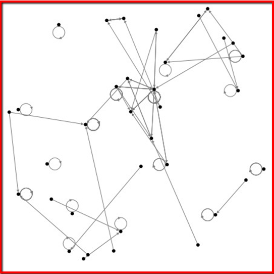
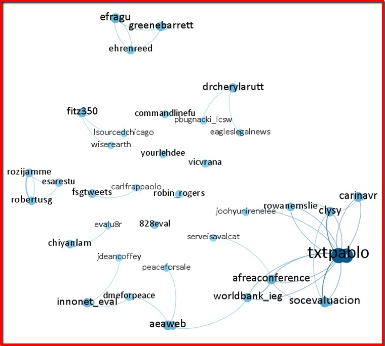
Since a picture is worth a thousand words, here is the progression from NodeXL to Gephi drawn from a twitter search of the hashtag #eval on January 17, 2011.
First, the basic NodeXL map:
After exporting the data from NodeXL to a GraphML file, uploading to Gephi, and tweaking, here is the new map:
And with another simple change (turning on automatic resizing by node degree), voilà!
Rad Resources: And since this is the DVRTIG week, I can’t help but share three other essential tools for creating visually appealing presentations:
- Design Seeds for color palette inspiration.
- Instant Eyedropper to get RGB values (for example, from a Design Seeds color palette) to use in visualizations.
- Color Oracle to simulate color blindness to ensure visualization and design retain their meaning for every viewer.
Rad Resources: Interested in learning more about network analysis? Check out these great posts:
- Maryann Durland on Network Analysis and Measurements and Sociograms in Social Network Analysis – Why Both Are Important
- Oliwier Dziadkowiec and Trish Peaster on Using Social Network Analysis in Evaluation
We’re celebrating Data Visualization and Reporting Week with our colleagues in the DVR AEA Topical Interest Group. The contributions all this week to aea365 come from our DVR members and you may wish to consider subscribing to our weekly headlines and resources list where we’ll be highlighting DVR resources. Do you have questions, concerns, kudos, or content to extend this aea365 contribution? Please add them in the comments section for this post on the aea365 webpage so that we may enrich our community of practice.


Pingback: Monitoring and Evaluation NEWS » Blog Archive » AEA resources on Social Network Analysis and Evaluation
Hello!
Thanks for the interest in NodeXL and SNA tools like Gephi!
You may be interested in sharing your data and work with the http://nodexlgraphgallery.org – an archive of social media data sets and visualizations.
I agree that Gephi produces the best looking visualizations available today, but I hope you will explore some of NodeXL’s more advanced features that allow it to come a close second. Try downloading one of the data sets in Graph Gallery. Many come with an “Options” file that can be imported into your own data sets. This can turn your graphs into the visual style of anygraph you see that you like.
Regards,
Marc Smith
(for Team NodeXL at the Social Media Research Foundation).
Thanks Marc!