

We are Kristin Giordano and Carise Mitch of Equal Measure, where we partner with foundations, nonprofits, and government organizations to apply new ways of thinking and learning to advance social change.
In 2020, Equal Measure launched an internal Data Visualization Learning Circle, combining discussion and reflection with the invaluable Ann Emery’s Depict Data Studio online courses. As we dove deeper into the subject, an “aha” moment emerged: the question we needed to ask first was not “how do we visualize data,” but “how do we find the story in the data? Who needs to know that story, and how can we best tell it to make the information actionable and accessible?”
Hot Tip
An evaluation team makes many choices on the way to visualizing data: as Equal Measure has evolved our practices to become more equitable, we have aimed to make our data collection choices as thoughtful and intentional as possible. We want to become equally as intentional in designing our visualizations.
Lessons Learned
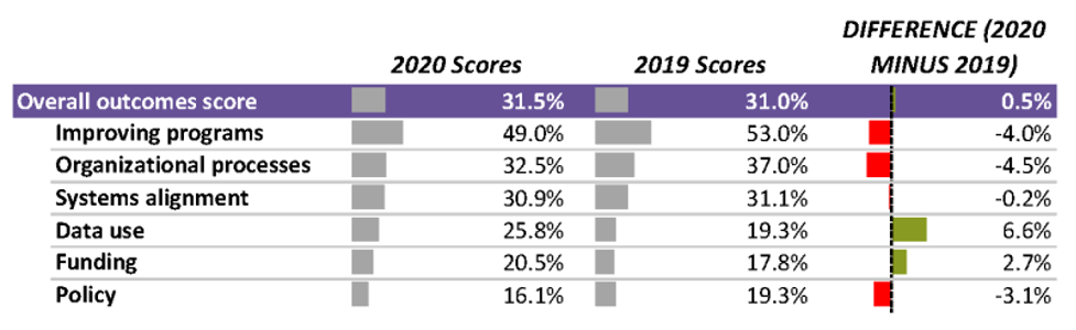
Use quick, messy visualizations to interrogate the data.
It can be challenging to identify meaningful trends in a large set of data. We’ve found using simple visualizations like heat tables or data bars helps our team quickly comprehend the direction of the data as a group—were scores going up or down, for example? Using these less polished visualizations lets our teams spend less time understanding the “what,” and more time unpacking the meaning, or the “so what.”
Ask: Who can benefit from hearing this story, and how will they best absorb it? How can the story be useful?
“This is all about unlearning what we learned in graduate school,” said one participant in the Data Viz Learning Circle.
Our formal education trained many of us to present information to technically sophisticated audiences, using standards and language that demonstrate our own facility with an academic field. Findings from our work, however, are often relevant to audiences who don’t have a technical background in evaluation: members of staff and leadership at foundations and nonprofits, as well as residents, students, teachers, and patients.
Considering the needs and interests, and time available of a broad audience and designing with them in mind makes information less opaque, more accessible, and more equitable.
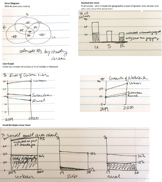
Before designing your public-facing data visualization, get a napkin.
There are so many exciting tools for visualizing data, but we found that sometimes the most useful tool is a scrap of paper. Sketching lets us test our stories, think about audiences, and explore relationships in the data before investing time and effort to make the visuals “pretty.”
Sketching requires getting comfortable with messiness and iteration—for example, we decided NOT to visualize the data in these sketches at all, because it wasn’t part of the broader story. This choice was made easier because we spent less time exploring and designing different options than if we’d done the same process in Excel or another program.
Use these three steps to get to something beautiful and useful.
These three steps can help find a useful story in the data and prepare a team to design easy-to-comprehend data visualizations that bring the story and the evidence to life. The steps let learnings emerge from behind a wall of opaque “expertise” and enhance use of the data. After moving through these steps, feel free to open the software of your choice and design a visual for a broad audience that will make findings both beautiful and useful.
Rad Resources
For more tips, read our Five First Steps to Data Visualization.
The American Evaluation Association is hosting Data Visualization and Reporting (DVR) Week with our colleagues in the DVR Topical Interest Group. The contributions all this week to AEA365 come from DVR TIG members. Do you have questions, concerns, kudos, or content to extend this AEA365 contribution? Please add them in the comments section for this post on the AEA365 webpage so that we may enrich our community of practice. Would you like to submit an AEA365 Tip? Please send a note of interest to AEA365@eval.org. AEA365 is sponsored by the American Evaluation Association and provides a Tip-a-Day by and for evaluators. The views and opinions expressed on the AEA365 blog are solely those of the original authors and other contributors. These views and opinions do not necessarily represent those of the American Evaluation Association, and/or any/all contributors to this site.