My name is Rachel Schechter, Director of Research at Lexia Learning Systems LLC, A Rosetta Stone company. At Lexia, our mission is to improve student literacy by leveraging technology to personalize learning and simplify the use of data to drive instruction. The research team at Lexia is committed to evaluating the efficacy and validity of our products, informing product design, partnering with customers to evaluate their implementations and student progress, and disseminating research findings and best practices.
A large part of my job is to develop dashboards and data visualizations to help communicate findings to evaluation stakeholders. In an effort to be more personalized in our reporting, I’ve been thinking a lot about the balance between scalability and customization – relying on templates vs. creating fresh content for each project or constituency.
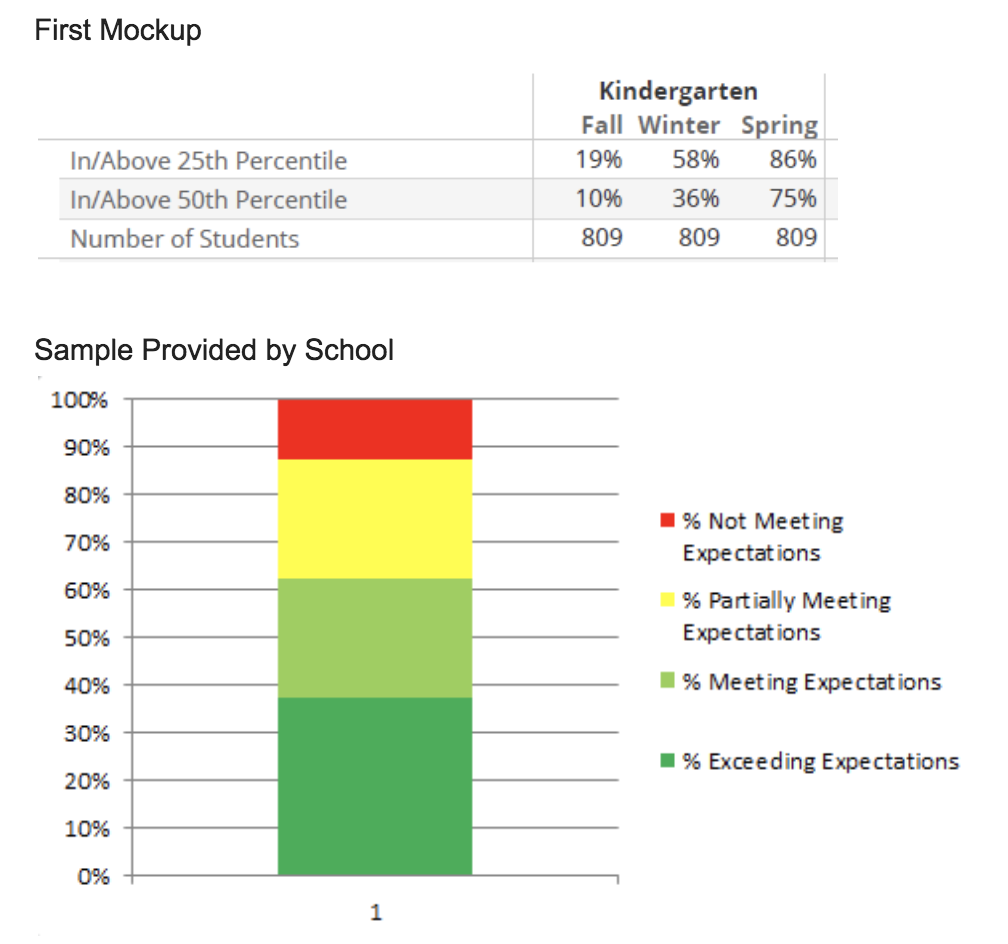
Recently, one of the largest school districts in the country requested custom reporting for Lexia® RAPIDTM Assessment, my company’s online literacy screener. The request came through internal Lexia staff working with the district. Initially, I was told that they “just need the basic info” organized into networks of schools. I took our existing templates and mocked up what seemed like a small adjustment.
The following week I presented samples to the district leaders, and they said that the graphs and tables didn’t look like the report designs that they were used to. I shifted quickly and turned their attention to characteristics like format, levels of summaries (grade, network, district, school) and graph type (stacked columns, bar) to better understand what resonated with them. Then I asked for samples of their commonly used reporting so I could pull design elements that were familiar.
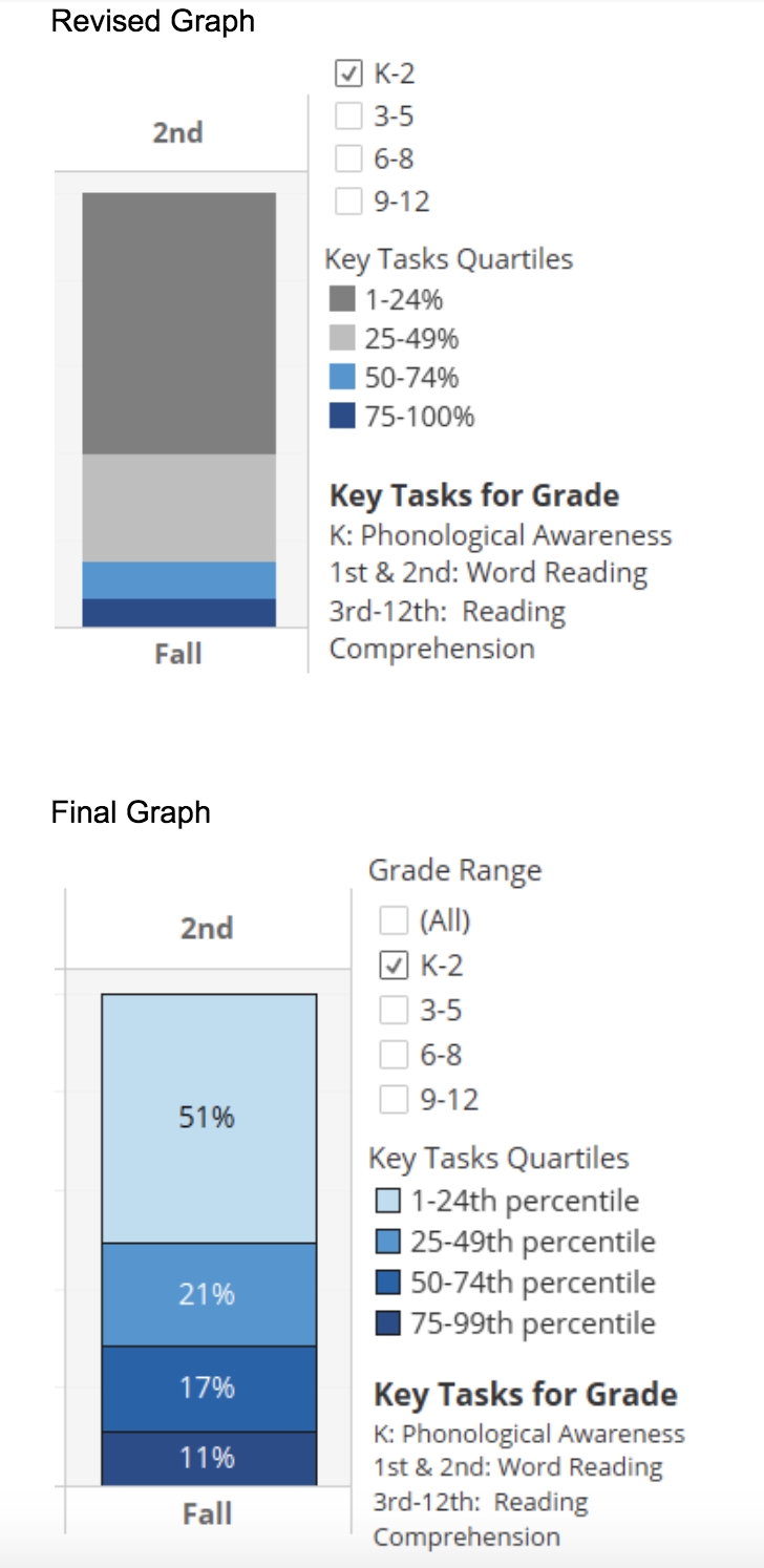
A few weeks later I presented the updated reporting to the district leader. She commented that she “saw her feedback” in the revisions and how “heard” she felt by our team. Success! She provided a final round of feedback related to color choice and ordering of groups – easy to adjust in time for the final report delivery. The training for all administrators is this week, and I feel confident that they will be able to use the information in the customized reporting to make instructional decisions at the network and school level — the whole point of assessment!
Lesson Learned:
No matter what you’ve heard from your colleagues or others involved in a relationship, always start with a needs assessment to start “from the beginning” with the evaluation end-user.
Hot Tip:
Get samples from clients/customers of reports created by their internal team! Using chart types and dashboard setups that stakeholders are familiar with will facilitate their understanding and support usefulness.
Pay attention to details, something as small as a color choice or the order of the items in a stacked bar chart bring meaning to the information. Check assumptions about those qualities along your design journey.
Note: Data in each image do not match, are not from a single district, and are not reflective of the district mentioned in the story.
The American Evaluation Association is celebrating Data Visualization and Reporting (DVR) Week with our colleagues in the DVR Topical Interest Group. The contributions all this week to aea365 come from DVR TIG members. Do you have questions, concerns, kudos, or content to extend this aea365 contribution? Please add them in the comments section for this post on the aea365 webpage so that we may enrich our community of practice. Would you like to submit an aea365 Tip? Please send a note of interest to aea365@eval.org. aea365 is sponsored by the American Evaluation Association and provides a Tip-a-Day by and for evaluators.


Hi Rachel.
Thank you for sharing your experience working with a large school district. When developing a reporting system, it can be a tough balance between being efficient and using templates, or spending more time and customizing the information to the user. The value of receiving feedback from users (district leaders) and then using that feedback to adjust the final reporting system not only increases the likelihood that the system will be used consistently by the teachers within the district, but also increases the likelihood that the use will increase because the teachers will be willing to share their positive experiences with the system.
A few years ago, our district created a new reporting system to coincide with a curriculum change. A working group of teachers (chosen through application) and district leaders was created to develop a new report card. We reviewed templates used in other districts and worked collaboratively to develop our ‘perfect’ report card. The final version was developed and it included most of our feedback. A pilot was then completed, which resulted in more tweaks. The final version will never meet the needs of every teacher, but I do believe the process should have involved more input from all teachers within the district. There were only 45 teachers involved and I believe it would have been more valuable to collect data through surveys and then the smaller group of teachers could have used that data as a guide when creating the new report cards. As you state in your post, “always start with a needs assessment”. This is so important as it helps us better understand where to begin.
Your other ‘Hot Tips’ about using visuals that are familiar, and “paying attention to the details” can make all the difference in ensuring the end product is user friendly. Visuals are extremely valuable when presenting information as allows more users to easily comprehend the information they are seeing. The visuals you created are for district leaders and teachers, but the data can also be shown to parents to explain how their child is progressing when using Lexia.
Thank you so much for your comment and story! The teacher voice is incredibly important, and I wish that we got more insights directly from teachers in this evaluation. There are times we must rely on district leaders to collect and synthesize the info for us, but hearing it straight from the users of the report can’t really be replaced.
Yes, sharing with parents it also critical. As a parent of a new kindergartner I know I’m craving information!
Hi Rachel,
I was drawn to this post as I am currently designing an evaluation where data needs to be collected and its analysis needs to be communicated with stakeholders. My husband works as a graphic designer and I am well aware of how visuals can be both effective and ineffective in communicating information. I am evaluating the impact of oral language instruction on literacy levels and will need to build some graphs similar to the ones you have created. I appreciate your tips on meeting users where they are at and creating something that is both effective and familiar for them. I can see from the post that it’s been almost a year since these visuals were created and I wondered if over the year you have learned anything through their application and use that has improved or changed their design. Have you worked on any new projects where you have gained additional insight in this area? I look forward to hearing back from you,
Sincerely,
Angie Salmon
Thank you so much for your comment and question Angie. Another insight that I’m trying to make more actionable is creating the right report for each user persona. There’s an entire line of research that supports creating user personas, and the org I’ve been working with is called Pragmatic Marketing. They have a lot of free resources on their website I believe, but you can search for that term and get some good information about what makes strong user personas, how many to make, and how to leverage them in your design process.
It all starts from a need! I can appreciate this post because I have experienced a similar lesson when I began substitute teaching. The required orientation and training only prepared me for what the expectation is. Once I was in the classroom I discovered the real need and I figured out how to help solve that problem after I addressed the need. After I checked back with a regular teacher about my method, her feedback reassured me that I was on track and a very helpful sub to have in class. I am sure the district orientation and training is essential for many of the substitute teachers in the district, however, getting into the needs of the students and teachers proved to be more helpful in my situation.
Thanks for the comment Arielle. Getting feedback from students and teachers is great feedback to be sure that their needs are being met. Thank you!
I found this article interesting because you talk about the impact that the visual representation of data can have on people. This year the Ministry of Education in BC has provided us with new language for reporting purposes. Since I use Freshgrade (an eportfolio program) for my reporting to parents I quickly inputed a new “Assessment tool” into the software so that I could be efficient in how I relate assessment data to my parents. However, I had to choose colours to correspond to each Proficiency level on the reporting scale. I found myself very aware of what different colours might represent to parents, even before they read the assessment. I realized that putting “Emerging” in red might be interpreted as a stop signal and amplify parents concern over why their child is at the lower end of the assessment scale. I was also aware that connecting “Extending” with green may also unnecessarily amplify the assessment being given. This article helped solidify my decision to be cautious about what the visual representation of assessment data is when communicating with parents.
Further, a colleague and I were discussing that maybe we should be consistently using the same colours across the grades in order to easier transition that information to another teacher. Before the use of eportfolios we never would have needed to consider this because everything was written down. However, with this shift to eportfolio recording we need to be aware of the visual representation of this information.
Thank you for your comment Heather. Choosing colors to represent performance levels can be a necessity in reporting, so thank you for pointing out your care in considering the impact those colors have on parents and students. I’ve heard of cases where students in Emerging were called “the red kids” — which would be a negative experience for them and also put them into a fixed mindset point of view. I do like the term “Emerging” better than below grade level!
Awesome reasoning and practical tips Rachel!!!
I really appreciate how you used communication with the user to help them be able to best understand and interpret the data set, and how they were able to give you feedback about this approach. I think the best use of research is when it can be applied, which you identified in your post. I like how you keep your eyes on the ultimate goal, which is to be able to use the information to make decisions that will help the students.
Awesome job Rachel!
I’d like to join the DVR TIG and receive the regular updates and news.
Best,
Hello Ahmed! You can join TIGs with your membership through the AEA homepage at: eval.org