
Hello! My name is Christy King. I am the Internal Evaluator for Pennsylvania’s State GEAR UP grant. Since I began working on the grant almost 8 years ago, one of my endeavors has been to provide data visualizations that are useful to a variety of roles. One aspect of this endeavor is being open to continual improvement and feedback about created visualizations.
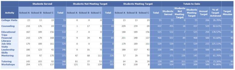
Here is a sample table, nicknamed the blue report, available to staff so that they could monitor progress on yearly goals based on the number of students participating in an activity and whether students met the time goal. While all the information is present in the table, staff struggled to fully grasp where they were at with their goals.
While the report was better than having nothing, staff needed something visual, so I developed this visualization.
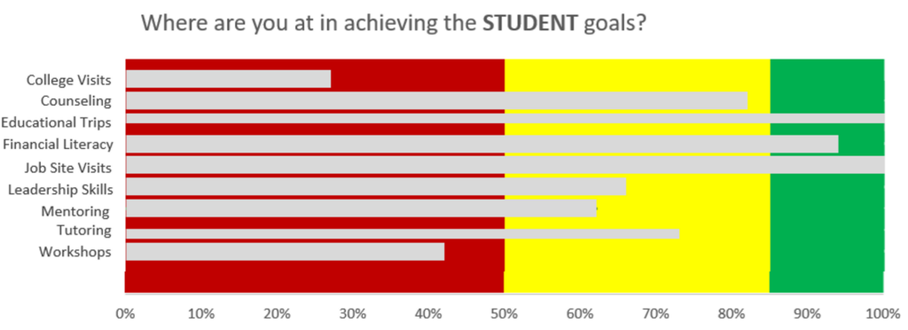
Staff easily interpreted this visualization, and their initial reaction was positive. However, as you can see, there is a lot, I mean a lot, of color. I was proud of this visualization at the time until I went to share it with another evaluator and I wrote in the email “While there’s lots of color, the visualization has been helpful to staff.” And then I went DUH! Time to do something about this thing.
So, I set off to find another way to display the data. Here is my next step in the journey.
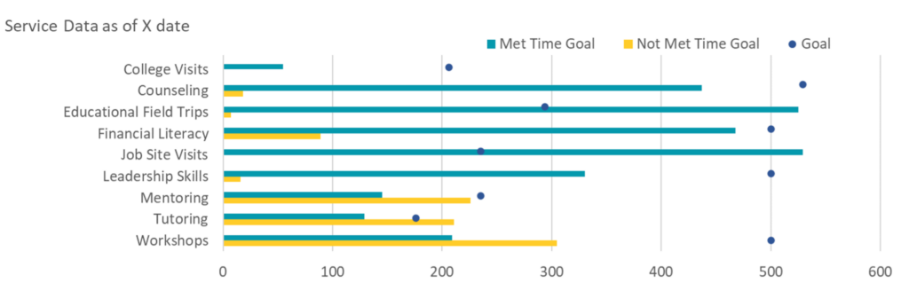
I asked for feedback from an office colleague who focuses on program implementation prior to sharing it with staff. This person immediately liked it as not only did the visualization show students meeting the time goal, but also those who did not and there was a dot to indicate the actual goal.
I should have taken more time to seek input though as after a year of sharing this visualization, only now is one person fully able to interpret it. This person loves the visualization now that it’s understood, but if I had that feedback in the beginning, who knows what I might have done differently or created. And, yes, there is room for improvement.
Lessons Learned
Take the time to seek feedback on data visualizations. Here are some suggestions on how to do that:
- Do your own review first. A few questions you might reflect about include: What do you think of the visualization? Does it convey what you want it to? Does it adhere to the style guide for the project? Did you check the colors on a color blindness test? Etc.
- Rate your visualization using Stephanie Evergreen’s Rate My Visualization tool.
- Check with a colleague for feedback. Does the person understand what you’re trying to convey? How do they react to the colors? Do they understand what’s being presented? Etc.
- Ask a small group of people who will be using the data visualization for feedback. I’m now able to do this via a group I formed of program staff who also have an interest in data and evaluation.
- If there are a few of you that work on data visualizations where you work, carve out some time of regularly scheduled meetings to review and enhance a visualization.
- If you’re like me and the only person creating visualizations, maybe you can find like-minded people and form a professional learning community to discuss ways to enhance data visualizations.
What other ways do you seek out feedback for data visualizations?
The American Evaluation Association is hosting Data Visualization and Reporting (DVR) Week with our colleagues in the DVR Topical Interest Group. The contributions all this week to AEA365 come from DVR TIG members. Do you have questions, concerns, kudos, or content to extend this AEA365 contribution? Please add them in the comments section for this post on the AEA365 webpage so that we may enrich our community of practice. Would you like to submit an AEA365 Tip? Please send a note of interest to AEA365@eval.org. AEA365 is sponsored by the American Evaluation Association and provides a Tip-a-Day by and for evaluators. The views and opinions expressed on the AEA365 blog are solely those of the original authors and other contributors. These views and opinions do not necessarily represent those of the American Evaluation Association, and/or any/all contributors to this site.