
Hello! I’m Amelia Kohm of Data Viz for Nonprofits (DVN). DVN helps organizations to quickly grasp their data, improve their work, and show their impact and offers up weekly 60-Second Data Tips to those in the nonprofit world.
Rad Resources
Have you played around with charts in Canva? It’s a great, free online design tool. It includes lots of images and gifs and is easy to learn. Canva has a number of simple chart designs that you can adapt to your needs. After starting a design in Canva, click on “Elements” and then type in “charts” in the search window to see the chart options. Each allows you to customize the chart by entering a few data points.
But I wondered how I could use other options in Canva to hack out some fun charts. Scroll down to see what I came up with.
Cool Tricks
Start a design in Canva by clicking on the “Create A Design” button (upper right corner of screen), selecting a size (such as presentation), and then try one of these hacks.
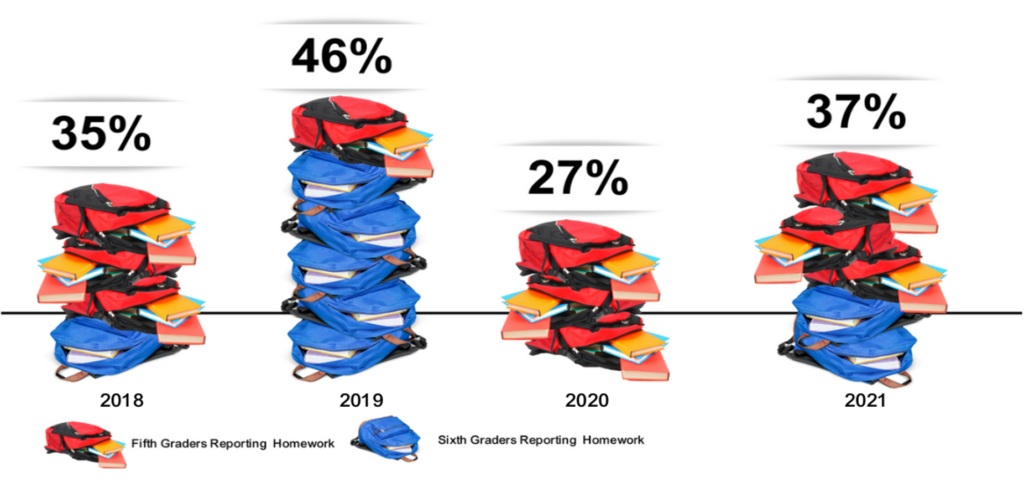
Hack 1: Use images to build bars.
For this bar chart hack, I selected “Elements” and then searched for images of backpacks and then stacked them (by dragging and dropping) to create a bar chart about homework completion. You can use the “Show Rulers and Guides” option on the File menu to make the bars the right length.
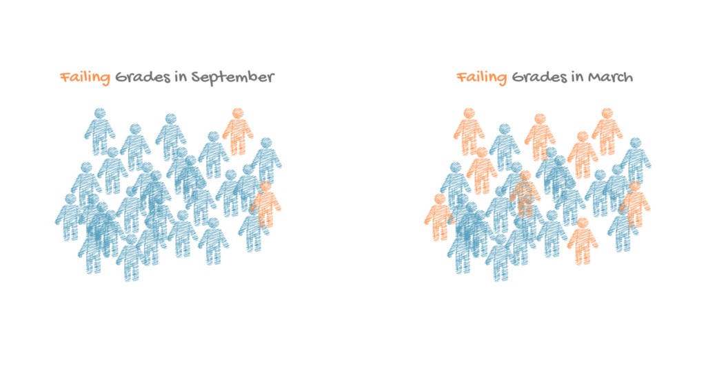
Hack 2: Use icons to make a pictogram chart.
Pictogram charts use icons to represent small sets of data. Each icon can represent one unit or any number of units (e.g. each icon represents 10). For this chart, I found a human graphic by selecting “Elements” and then searching for “human.” Then I colored the icons to show the number of students with failing grades and added labels using the text option on the left.
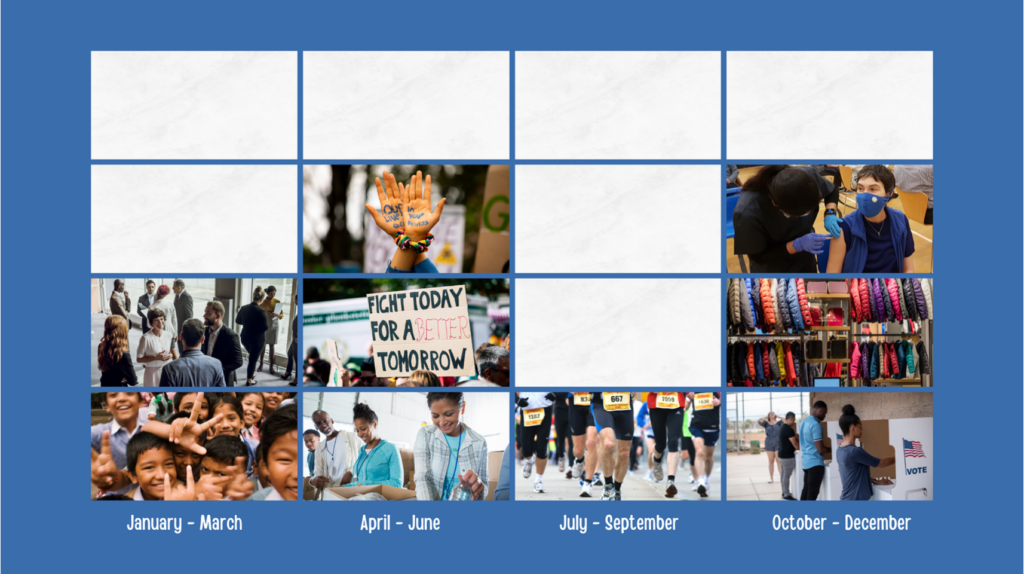
Hack 3: Use grids and photos to create a timeline of programs and events.
Select “Elements” and type in “grid” in the search window. Canva will give you a bunch of frame options. Choose one and then select “uploads” to import photos of your organization’s events and programs. Then simply drag and drop photos into the grid and label bars using the text option on the left as in this example. Drag in a photo of something white for the empty cells.
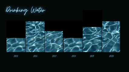
Hack 4: Use frames and videos to create moving charts.
For a bar chart like the one shown below, select “Elements” and type in “frame” in the search window. Canva will give you a bunch of frame options. Choose a rectangle shaped frame and place in the design, using the “Show Rulers and Guides” option on the File menu to make your bars the right length. Then select “Elements” and type in a key word for the type of image you want. I typed in “water.” Under the search window, click on “Videos” to show only video elements. Then drag and drop videos into the frames and label using the text option on the left.
The American Evaluation Association is hosting Data Visualization and Reporting (DVR) Week with our colleagues in the DVR Topical Interest Group. The contributions all this week to AEA365 come from DVR TIG members. Do you have questions, concerns, kudos, or content to extend this AEA365 contribution? Please add them in the comments section for this post on the AEA365 webpage so that we may enrich our community of practice. Would you like to submit an AEA365 Tip? Please send a note of interest to AEA365@eval.org. AEA365 is sponsored by the American Evaluation Association and provides a Tip-a-Day by and for evaluators. The views and opinions expressed on the AEA365 blog are solely those of the original authors and other contributors. These views and opinions do not necessarily represent those of the American Evaluation Association, and/or any/all contributors to this site.
Thanks – very helpful tips. Small things matter!