

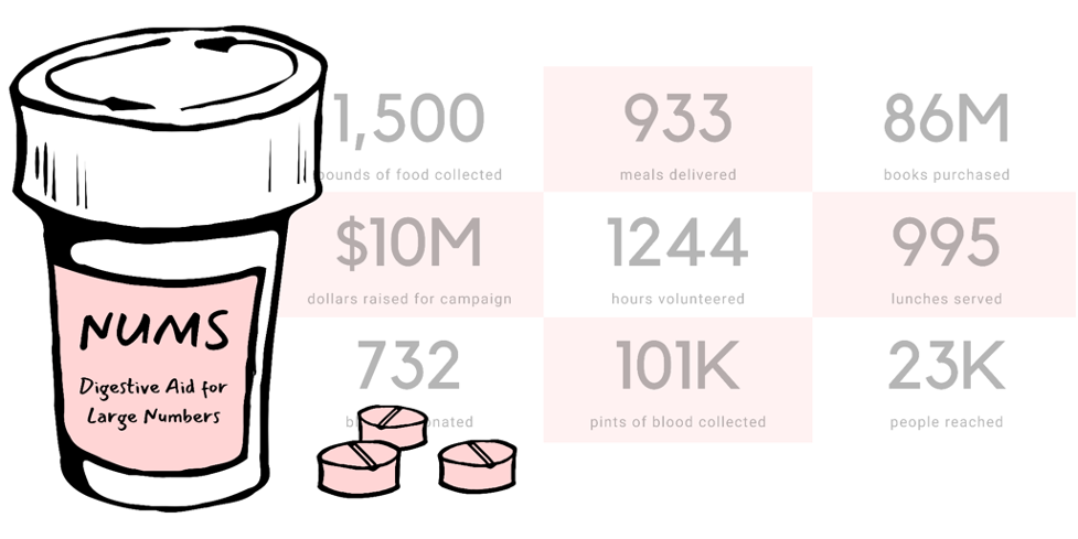
Hello! I’m Amelia Kohm of Data Viz for Nonprofits (DVN). DVN helps organizations to quickly grasp their data, improve their work, and show their impact and offers up weekly 60-Second Data Tips to those in the nonprofit world. Today, I’m here to talk about BANs (Big A** Numbers) and aids for digesting them.
BANs are gaining prominent positions in data dashboards, websites, social media, and EVALUATION reports. Also known as “KPIs” or “vanity metrics,” BANs often are meant to impress or raise alarm. Wow! 120,234 meals served! Really? 5,332 homeless adults?
But there is a problem with big numbers. Our brains can’t fully digest them. As noted in a 2017 Wall Street Journal article, “Big numbers befuddle us, and our lack of comprehension compromises our ability to judge information about government budgets, scientific findings, the economy and other topics that convey meaning with abstract figures…”
Hot Tips
So what can we do to make BANs more digestible? Here are some digestive aids for large numbers to make your next evaluation report more meaningful to your audience:
- Add perspective. Researchers at Columbia University and Microsoft found that they could improve numerical comprehension by using “perspectives,” which are simple sentences that relate a large number to something more familiar to us. They found, for example, that when told that the number of registered firearms in the U.S. is about 300 million, study participants not only had trouble comprehending this number but also recalling it and assessing its likely accuracy. However, when told that there is about one firearm per person in the U.S., significantly more people could comprehend, assess, and recall the quantity. The New York Times recently made good use of perspectives to convey the magnitude of Jeff Bezo’s wealth. My favorite: if the height of a piece of Toblerone is the median U.S. household net worth, Bezo’s net worth is the height of Mount Everest–if you climb it five times.
- Use shapes or icons (rather than bars) to represent one or more people, programs, etc. It can be difficult to grasp the aggregate that a bar represents. By using multiple icons or shapes, the individual units that comprise the aggregate become more tangible. The inspiration for this and the following tips came from the data-driven documentaries of Neil Halloran, specifically his first documentary called The Fallen of World War II. But you don’t need to be a filmmaker to use them. You can apply them to simple data presentations on websites, reports, and PowerPoints. Halloran uses a human figure shape to represent 1,000 people.
- Show an aggregate and then break it down by subgroups and time periods. Halloran shows aggregates, such as the total number of U.S. soldiers who died in the war and then, using animation, redistributes the human figures to show how many soldiers died in the European and Pacific theaters and then redistributes them again to show how many died over time. The animation is cool, but not necessary. You can do the same thing with a series of static images. See example below.
- Juxtapose photos and charts. To keep the discussion from becoming too abstract, Halloran reminds the audience what actual soldiers (rather than icons) look like by incorporating photos into his presentation. Again, animation is not necessary. Static photos can be placed alongside charts.
- Walk the audience through the data. To give the audience a sense of scale, the video progresses from smaller to larger numbers. Halloran first walks us through casualty stats for the U.S. and European countries. These numbers seem quite high, so by the time Russian stats are shown, we are astounded.
Rad Resources
If you are not among the 10 million + who have viewed it already, I highly recommend that you check out The Fallen of World War II. It’s 18 minutes long, but the techniques listed above all appear in the first 7 minutes.
The American Evaluation Association is hosting Data Visualization and Reporting (DVR) Week with our colleagues in the DVR Topical Interest Group. The contributions all this week to AEA365 come from DVR TIG members. Do you have questions, concerns, kudos, or content to extend this AEA365 contribution? Please add them in the comments section for this post on the AEA365 webpage so that we may enrich our community of practice. Would you like to submit an AEA365 Tip? Please send a note of interest to AEA365@eval.org. AEA365 is sponsored by the American Evaluation Association and provides a Tip-a-Day by and for evaluators. The views and opinions expressed on the AEA365 blog are solely those of the original authors and other contributors. These views and opinions do not necessarily represent those of the American Evaluation Association, and/or any/all contributors to this site.