

Hi. I am David Fetterman, President of Fetterman & Associates, an international evaluation consultation firm. I am a past-president of the American Evaluation Association and a co-chair of the Collaborative, Participatory, and Empowerment Evaluation TIG. In addition, I have 25 years of experience at Stanford University as an administrator and faculty member. I am also the founder of empowerment evaluation, and as such I like to find free or inexpensive tech tools to help people monitor and evaluate their own programs.
One of the more useful tools we have been using to facilitate empowerment evaluations is Google’s Geographical Map Chart. This is a free Google application built on Google Sheets that enables you to visually map out frequency of occurrences, scale of a problem, and community assets by geographical location.
Cool Trick
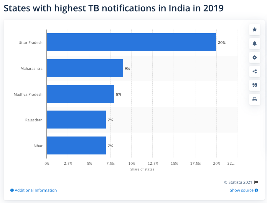
The USAID-funded Resource Group for Education and Advocacy for Community Health (REACH) is using an empowerment evaluation approach to eliminate tuberculosis (TB) in India.
Geographical map charts visually map out the frequency of tuberculosis by geographical location, helping us develop a plan of attack concerning the disease in the country. A visual display also helps prioritize tuberculosis prevention initiatives and rights-based training activities to make the health care system more sensitive to TB survivors’ rights. Comparing maps over time can be used to monitor progress in reducing tuberculosis in cities or regions.
Here’s how to create one:
- Open Google Sheets
- Enter data – such as the top states in India with the highest TB notifications with their corresponding percentages
- Select the data by dragging your cursor over the states and percentages boxes
- Select – insert graph or chart
- Select the map with markers option
- Select Asia for the region
The computer screen snapshots below visually highlights how useful this tool is to map out TB, TB rights based trainings planned and completed, and so on. You can use it to visually highlight assets and less than optimal conditions in the communities you work with.
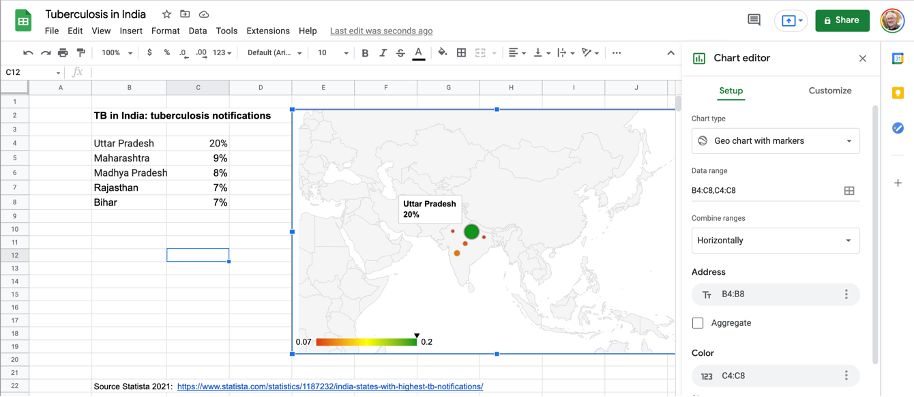
You can always add to the data with other states or percentages, and it will add it to the geographical map chart.
Rad Resources
How to create a geographical map chart in Google Sheets: Provides step-by-step directions on how to implement.
The American Evaluation Association is hosting Data Visualization and Reporting (DVR) Week with our colleagues in the DVR Topical Interest Group. The contributions all this week to AEA365 come from DVR TIG members. Do you have questions, concerns, kudos, or content to extend this AEA365 contribution? Please add them in the comments section for this post on the AEA365 webpage so that we may enrich our community of practice. Would you like to submit an AEA365 Tip? Please send a note of interest to AEA365@eval.org. AEA365 is sponsored by the American Evaluation Association and provides a Tip-a-Day by and for evaluators. The views and opinions expressed on the AEA365 blog are solely those of the original authors and other contributors. These views and opinions do not necessarily represent those of the American Evaluation Association, and/or any/all contributors to this site.