
Welcome to Day 4 of Inclusive Evaluation Design hosted by the Disabilities and Underrepresented PWe are June Gothberg and Caitlyn Bukaty, the chairs of the TIG. During the last three years at AEA we have hosted annual Think Tanks to gather insights on lessons learned, tips, and resources for designing inclusive evaluations. This week of AEA365 is dedicated to sharing the insights gathered from the DUP TIG Think Tanks. Today, we share information on Universal Design for Evaluation Principle 4: Perceptible Information. That is, the importance of ensuring the information you wish to relay in an evaluation is effectively communicated to any user.
Lesson Learned
Many times in our aim to make our materials pretty or interesting to the viewer, we forget we may be excluding people.
Millions of people live with color vision deficiencies or color blindness Did you know there are an estimated 300 million people in the world with color vision deficiency affecting 1 in 12 men and 1 in 200 women? This means they have trouble seeing and distinguishing some or all colors. Many people with color blindness cannot tell that the power connector on a MacBook changes color. Lots of color-blind people are surprised to find out that peanut butter is not green. While colorblindness can vary greatly from one person to the next, the most commonly challenging colors are red and green.
What does this mean for evaluation design? Do you like to color-code, or use color as an indicator (e.g., read the directions in the green box before you begin, stop when you reach the red “X”)? Use of color comes naturally to people who see color, we’ve been doing it since preschool. But colors can become a barrier for those who cannot accurately see and interpret them. What can we do to fix this? You may not need to forego color entirely, but here are some tips to help make colorful materials accessible in other ways:
- Aim for high contrast. Even with color, a strong contrast between items can go a long way to help users distinguish.
- Black on white and white on black are the most inclusive!
- Keep it simple – just like today’s theme, avoid busy visuals or patterned backgrounds which can compound confusion.
- Differentiate in other, or additional ways. Consider adding patterns, symbols, or text to help users understand differences between items you color-code.
- Avoid red and green. As we mentioned above, those colors pose the most frequent challenges to people who are colorblind.
- Be cautious of “vibrating” color combinations. Colors opposite each other of the color wheel can seem to “vibrate” or ripple when objects are placed edge to edge.
Hot Tips
Is a design accessible? Does it communicate necessary information effectively to the user, regardless of ambient conditions or the user’s sensory abilities? Here are some ideas that can help you answer “yes” to those questions:
- Use different modes (pictorial, verbal, tactile) for redundant presentation of essential information.
- Provide adequate contrast between essential information and supporting context.
- Maximize “legibility” of essential information.
- Differentiate elements in ways that can be described (i.e., make it easy to give instructions or directions).
- Provide compatibility with a variety of techniques or devices used by people with sensory limitations.
The sign being presented below includes the universally recognized symbols for a woman, a man, a gender neutral, and an outline of a person using a wheelchair, a symbol frequently used to designate something as physically accessible. Incorporating universally accepted symbols helps users gain understanding of information, even if they face challenges with written language. This placard also includes braille adding perceptibility for braille users.

Lesson Learned: Descriptive Text
We’ve all heard the saying, “a picture is worth a thousand words”, but what happens when a user can’t see the picture? Descriptive text (also referred to as alt text) can be added to a digital version of an image to make it accessible to users who cannot see it. Effective descriptive text provides users with an accurate account of the contents of a picture, with any pertinent details noted.
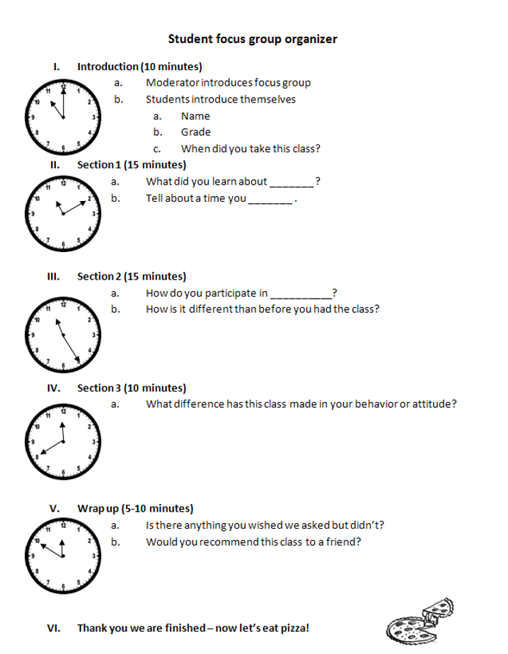
The focus group organizer guide included below was created to assist people who are neurodiverse or deal with anxiety. At each step the passage of time for that activity is depicted using an analog clock. At the end, users can see the image of pizza corresponding with the wrap up to the session.
Rad Resources
- Microsoft Microsoft Office products make it easy to add alt text (descriptive text) to an image. Look here for easy steps: https://bit.ly/MSAddAltText and best practices https://bit.ly/MSEffectiveAltText.
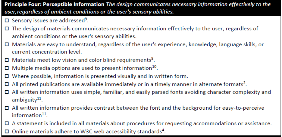
- Universal Design for Evaluation Checklist (5th Ed) Principle 4 Perceptible Information – this research-based checklist was developed specifically for evaluators by the DUP TIG at AEA to assist evaluators in designing inclusive evaluations.
The American Evaluation Association is hosting the Disabilities & Underrepresented Populations TIG (DUP) Week. The contributions all week come from DUP members. Do you have questions, concerns, kudos, or content to extend this AEA365 contribution? Please add them in the comments section for this post on the AEA365 webpage so that we may enrich our community of practice. Would you like to submit an AEA365 Tip? Please send a note of interest to AEA365@eval.org . AEA365 is sponsored by the American Evaluation Association and provides a Tip-a-Day by and for evaluators. The views and opinions expressed on the AEA365 blog are solely those of the original authors and other contributors. These views and opinions do not necessarily represent those of the American Evaluation Association, and/or any/all contributors to this site.