My name is Steve Fleming, and I work for the National Center for Educational Achievement, a department of ACT, Inc. whose mission is to help people achieve education and workplace success. I also earned an M.S. in Statistics from the University of Texas at Austin.
I have been thinking a lot lately about how to explain statistical significance. Leaving behind the problem of overemphasis on statistical significance compared to practical significance of results, my objective for this post is to provide a visual explanation of statistical significance testing and suggest a display for the statistical significance of results.
Statistical significance testing begins with a null hypothesis, which we typically want to show not to be true, and an alternative hypothesis. From sample data, a p-value is generated which summarizes the evidence against the null hypothesis. The p-value is compared to a fixed significance level, a. If the p-value is smaller than the significance level, the null hypothesis is rejected; otherwise the null hypothesis is accepted.
Hot Tip: What effect does choosing a different significance level have? In the following diagram the combined blue and red regions represent the possible sample data results if the null hypothesis is true. The blue regions show where we would accept the null hypothesis and the red regions where we would reject. It is clear that smaller levels of a make it less likely to reject the null hypothesis. In terms the language of errors, smaller levels of a offer more protection against false positives.
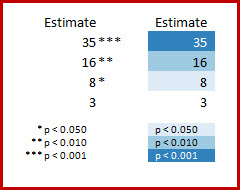
Hot Tip: The APA style guide suggests using asterisks next to the sample estimates to indicate the p-value when space does not allow printing the p-value itself. Using increasing intensities of color as an alternative way to indicate the most significant results saves even more space. Consider:
Rad Resource: How do you choose a consistent set of colors of increasing intensity? I have found Color Brewer to be a good source for this information.
What do you think? Does this vision clarify or obfuscate the meaning of statistical significance? I look forward to the discussion online.
Do you have questions, concerns, kudos, or content to extend this aea365 contribution? Please add them in the comments section for this post on the aea365 webpage so that we may enrich our community of practice. Would you like to submit an aea365 Tip? Please send a note of interest to aea365@eval.org. aea365 is sponsored by the American Evaluation Association and provides a Tip-a-Day by and for evaluators.


Shelly, good point about the importance of effect size. I think you could also apply a color gradient to reporting effect sizes. I think this is known as a heat map.
I wonder what an effective joint display of effect size and statistical significance might be.
I hadn’t heard that one before–I look forward to trying it out soon! Thanks!
I’m all for the visual display of information, and particularly using gradients to convey intensity or magnitude. Thanks for the tip about Color Brewer!
Steve, great post! Often times, my clients confuse significance with effect size. That is, they interpret a significance of **p<.01 as being of more "importance" than a significance of *p<.05. Have you given any thought to visually explaining effect size to clients with little to no statistical background? It seems to me that communicating effect size is often of greater value to clients than p-value as effect size captures the strength of the intervention (which is ultimately what we want to evaluate).
Elena, I agree the statistical jargon can be overwhelming to some folks. Have you tried a legal proceedings metaphor? The defendant is either innocent or guilty with the American system presuming (null hypothesis) innocence. The preponderance of evidence (p-value) is used to make a decision.
Thank you for your post. I think the graphic you present would be useful with audiences with a beginner level statistics background. For me the larger challenge is how to explain statistical significance to folks with no statistical background (e.g., for whom the terms “null hypothesis,” “alpha” are meaningless), who see a large difference in means and think it is significant despite statistical analysis indicating otherwise. Any tips for this conversation?