
This week members of Washington Evaluators are sharing stories from their careers. From their pathways to evaluation to reflections from the field, these anecdotes, recommendations, and lessons learned remind us of the power of the story and the important storytelling role we play as evaluators.
I’m Amy Kracker Selzer, and I’m a Senior MEL Specialist working with USAID. I’ve worked in international development research for many years. Through that work, I’ve found that while some qualitative data collection participants embrace the opportunity to share their perspectives and tell their stories, for others, sharing the depth of information that makes for rich qualitative work doesn’t come as naturally. In these instances, I’ve found maps to be a particularly useful tool to help people organize their thoughts about a topic and generate conversation, especially when collecting data about community evolution and change.
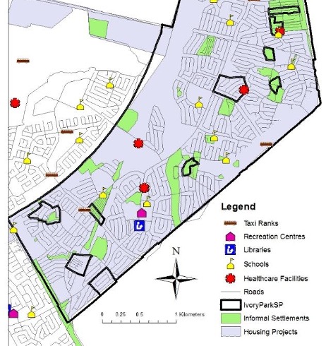
I spent many years working in South Africa studying local governance and public service delivery since the end of apartheid. The goal of this research was to understand how and when civil society activism was able to contribute to community-level changes in service delivery. This research entailed interviewing community leaders, public officials, activists, and academics to better understand community histories and evolution.
I found that starting the interviews by showing maps illustrating local changes over the post-apartheid period was a particularly effective way to begin the dialogue. I had been able to access census data that allowed me to create micro-level depictions of where there had been public investment in services over the decades since apartheid. These data were localized enough that the maps were able to illustrate broad municipal patterns as well as micro-level changes showing how even within a single neighborhood, patterns of investment varied block to block and decade to decade.
With these maps as a visual cue, the level of detail I started getting about how communities accessed public services skyrocketed. When stakeholders looked at the geographic variation over place and time, they were reminded of the specific community efforts to pressure public officials to expand access to water, electricity, or health facilities. These descriptions of the geographic patterns led into deeper discussions about the coalitions they had built to lobby for services and the ways in which their efforts were able to scale to broader community efficacy.
More importantly than enriching my own research, the maps became tools that the communities could use to visualize how their own trajectories might have compared with some of their neighbors and further engage with the government around much-needed additional local investment.
The American Evaluation Association is hosting Washington Evaluators (WE) Affiliate Week. The contributions all this week to AEA365 come from WE Affiliate members. Do you have questions, concerns, kudos, or content to extend this AEA365 contribution? Please add them in the comments section for this post on the AEA365 webpage so that we may enrich our community of practice. Would you like to submit an AEA365 Tip? Please send a note of interest to AEA365@eval.org. AEA365 is sponsored by the American Evaluation Association and provides a Tip-a-Day by and for evaluators. The views and opinions expressed on the AEA365 blog are solely those of the original authors and other contributors. These views and opinions do not necessarily represent those of the American Evaluation Association, and/or any/all contributors to this site.
I love this example because it’s visuals with a purpose! Are there any RAD resources for creating such visuals?