

I’m Stephanie Chasteen, an external evaluator on NSF-funded projects aiming to improve STEM education at the university level. This is part 2 of a 2-part series on evaluative rubrics. In yesterday’s post, I shared how I developed an analytic rubric to evaluate program structures. In today’s post, I’ll share how we produced meaningful visuals of rubric results to inform program organizers.
Lesson Learned:
As a utilization-focused evaluator, my ultimate aim for the rubric is that it be useful for the end-user (busy physics faculty members). Faculty need the rubric results to point to the gaps and strengths of local programs, to help them in action planning.
People are used to a rubric “score” but I refused to assign points to the rubric levels (e.g., Not Present = 0, Developing = 1) as the items are not independent, levels are not equally spaced, and I found “scoring” programs across such diverse items to be meaningless at best, and unethical practice at worst (e.g., could a program with a poor score be faced with funding cuts?).
So, I did two things to make things easier for my users:
- Created visualizations that make gaps and strengths apparent.
- Found a number that could serve users’ desire for a single number representing the results.
Hot Tip:
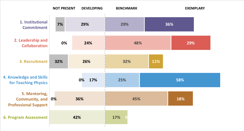
To develop meaningful visuals, I went straight to Stephanie Evergreen’s “Effective Data Visualization” book to find visuals that help viewers make comparisons between numbers. We used a bidirectional bar chart (example shown below), directly created in Excel from the Excel version of the rubric. “Right is good, left is bad” is the advice that I give users as they look at these charts. For example, the program below is strong in “Knowledge and Skills for Teaching Physics” and weak in “Recruitment.” A center dotted line helps to anchor the difference between areas that have met the minimum suggested level (“Benchmark”) and those which have not. Darker colors for higher ratings provide some additional ease of interpretation, as do some other features recommended by Evergreen (such as white space).
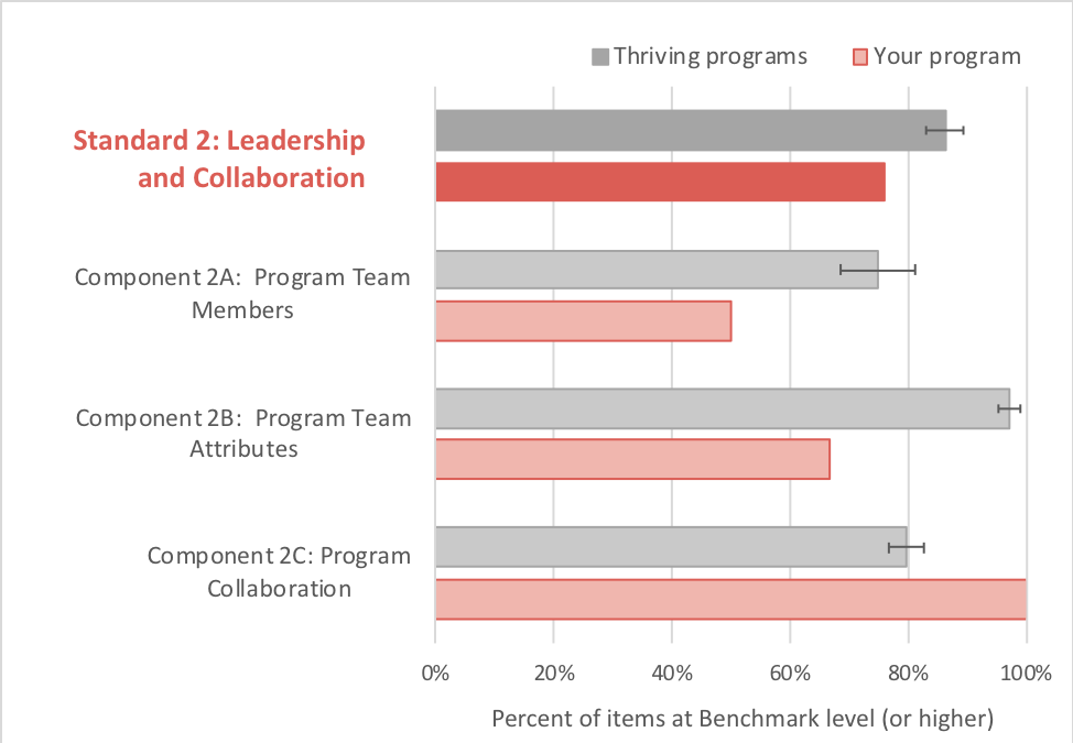
This visualization has worked well. Still, users were asking for a single number to aid interpretation. I decided that I could give them a number without compromising my integrity as an evaluator. Since we hope that programs will achieve Benchmark level (and achieving Exemplary level is “gravy”), we decided that providing users with the percent of items at least Benchmark (i.e., the percent of Benchmark plus percent Exemplary) was OK and useful.
Below is a sample of the resulting visualization. One nice bonus is that this number allows us to compare programs more easily – both program to program, and a single program over time.
Together, these two visualizations have provided rich interpretive information for the users, and for me as an evaluator.
Rad Resources:
- The project website, http://phystec.org/thriving, has our Excel rubric. You can also see some of the custom visuals created within the PTEPA Rubric User’s Guide on that page.
- Stephanie Evergreen’s blog has many more tips on effective visuals, but I highly recommend her book (“Effective Data Visualization”) to help shop for visuals, and how they can be created directly in Excel.
Acknowledgements: We acknowledge funding from NSF-0808790 for development of the rubric and visuals.
Do you have questions, concerns, kudos, or content to extend this aea365 contribution? Please add them in the comments section for this post on the aea365 webpage so that we may enrich our community of practice. Would you like to submit an aea365 Tip? Please send a note of interest to aea365@eval.org. aea365 is sponsored by the American Evaluation Association and provides a Tip-a-Day by and for evaluators.
Hi Stephanie,
I really enjoyed reading your article on effective data visualizations in order to modernize the typical numerical rubric. It’s interesting that you had to reinstate numeric values on the bar graph after feedback from your test audience.
One question do you think that reinstating these numbers was related to fact your audience was accustomed to it being that way?
I’ve studied some of the design principles of user experience/user interface (UX/UI) for application design and it’s consistent with your findings that dark colours draw your eye’s attention first. Other principles you touched on is our natural inclination to read from left to right and top to bottom (at least in the West). This is another main principle in Marketing where you never put the most important part of your message at the bottom right hand corner of your page otherwise your readers will be rushing to flip the page and completely missed your main point!
Thanks again for an interesting read,
Craig