
Hello, we’re Anthony Oboh, an I/O Psychology Doctoral candidate at Keiser University and Consulting Research Intern, and Sy Islam, Principal Consultant with Talent Metrics, a data-driven consulting firm. It is often said, “a picture is worth a thousand words” and that means using visuals can help people understand data more effectively. At Talent Metrics, we help professional organizations evaluate the effectiveness of their meetings. Visualizations can help professional organizations evaluate the quality of their meetings. Data visualization is an easy way for people to understand and interpret information. The simpler and more dynamic the visualization, the easier it is for people to interpret. Often, professional organizations evaluate their meetings based on content, relevance, and the satisfaction of the participated members. Such data can be presented in a simple yet powerful data visualization that can help these organizations evaluate their events more effectively.
Hot Tip: Use data visualization to report multiple pieces of data in a concise and simple manner.
A data visualization like a bar chart or stacked graph such as the one below is an easy way of presenting and communicating information about participants’ experience of a meeting or events. Most meeting feedback is collected after the meeting and can be presented in a simple visual like the stacked bar chart. However, more meaningful findings could be discovered by using longitudinal data. Professional organizations can evaluate how effective different subjects or meeting topics are over time.
Stacked Bar Indicating Members’ Reactions/Outcome of a Meeting
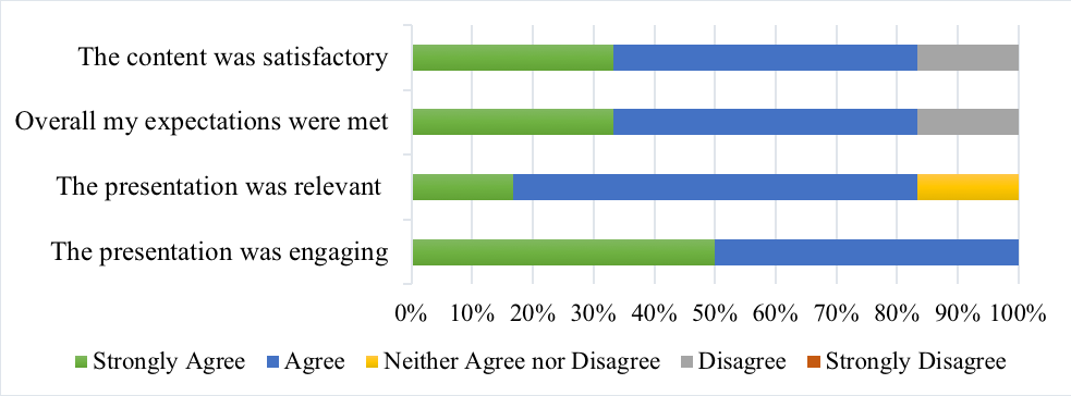
A survey conducted at the end of a networking event, used to understand how well the event was, particularly to have a better understanding of the impact the event had made on the attendees.
You can use a simple line graph to track these same results over time. Review the line graph below. From this line graph we can evaluate the effectiveness of meetings on these criteria over time and provide appropriate content curation for future professional meetings.
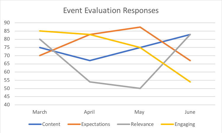
Lessons Learned: Using a longitudinal data such as the line graph above is extremely beneficial to understand how the content of professional networking events is perceived by audience members.
Rad Resources: Check out these resources to learn more about data visualization!
- Data visualization: The top Five Advantages of Data Visualization
- Data visualization: What it is and why it Matters
- Check out Dr. Evan Sinar’s post about data visualizations you should be using more often
Do you have questions, concerns, kudos, or content to extend this aea365 contribution? Please add them in the comments section for this post on the aea365 webpage so that we may enrich our community of practice. Would you like to submit an aea365 Tip? Please send a note of interest to aea365@eval.org. aea365 is sponsored by the American Evaluation Association and provides a Tip-a-Day by and for evaluators.
There are a few improvements that can be made to these visualisations that would make them even better at communicating the information to readers. For the stacked bar chart:
– Flipping the axis so that responses run from “Strongly Disagree” to “Strongly Agree” left to right will make it more natural to understand as this follows the typical negative to positive x-axis construction.
– Using a colour-blind friendly scheme will help for visually impaired readers. Avoid red and green.
– Since the question is using a five-point Likert response scale, consider using a divergent stacked bar in place of a stacked bar chart as this shows comparative differences between question responses much more clearly. See https://www.datarevelations.com/sentiment.html and https://www.datarevelations.com/rethinkingdivergent.html for examples of how this is done (and latest debate on the best way to order data).
For the line chart, clarifying what is being measured on the y-axis will help the reader immensely. It might also be worth making the base of the y-axis start at zero to avoid the risk of misleading the reader if changes in metrics over time are small.
Thank you for the helpful comments. For the purposes of our assessment (in this case a local professional networking group) we found these visualizations beneficial. But your suggestions are quite sound especially the one about color-blind readers.