Hey! I’m Stephanie Evergreen and among other things I run AEA’s Potent Presentations Initiative. Lately we’ve been working with eStudy presenters to reboot just five of their slides. Great speakers and solid content need to be reflected in polished slides. Here is the reboot for Scott Chaplowe.
Scott’s workshop is a great comparison between monitoring and evaluation – where they overlap and where they are similar. Scott also interacts with his attendees quite often when he presents. I wanted to make his slidedeck reflect those same dynamic elements. Scott already knew how to use animation to guide attention to certain parts of his slide, so I continued to build on that where possible.


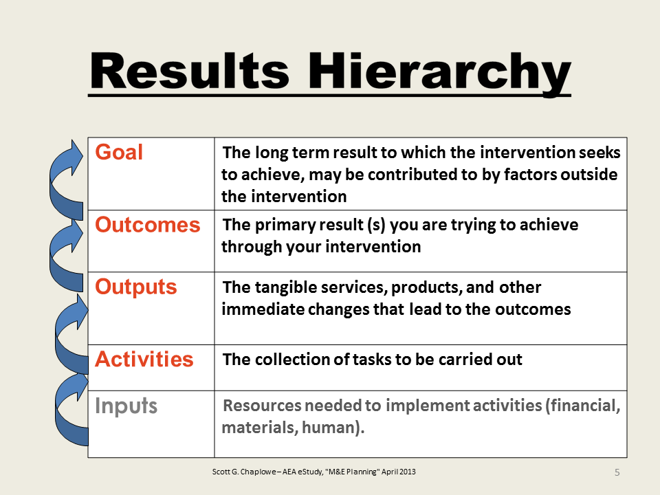
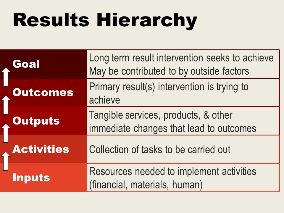
I gradated the red color for the Results Hierarchy slide, so that the color change and the slow build of the slide via animation make the idea of a hierarchy more clear. With the removal of some unnecessary text on that slide, the explanatory material can be put into a larger font, too. Each row in the table is animated to appear one-at-a-time. Each arrow is also animated, so Scott can talk about the way Inputs feeds back to Activities for as long as needed without other distractions.


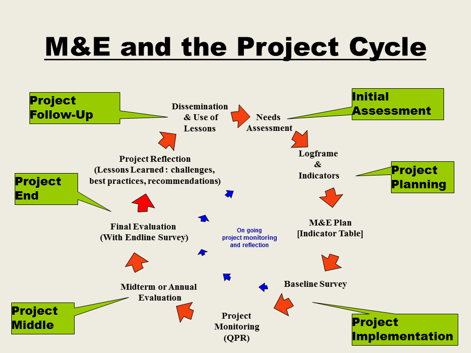
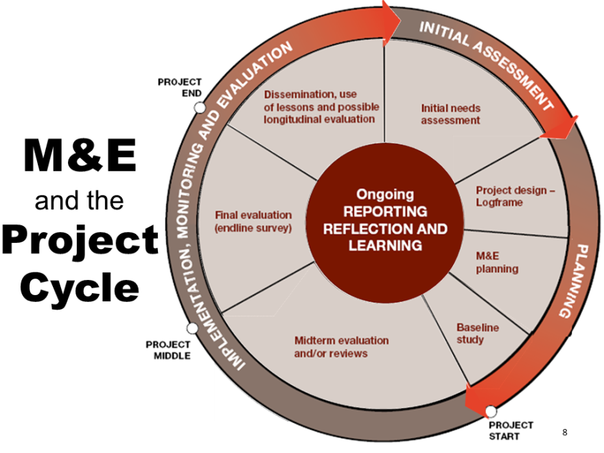
When I told Scott I wanted to remake his slide on M&E and the Project Cycle, he let me know that there existed a somewhat better diagram but that he strongly preferred the use of animation to build each component of the diagram one at a time. Understandable. How can one get a single image file to become animated? Well, I used a lot of leg work but I cropped out each element of the better looking diagram and reassembled the individual pieces into a coherent whole. Then I added in the animation. Now, let me be clear that this was an enormous amount of work to get each piece cropped and I still see some things about it that I don’t like, where I could have done a better job. It will not always be worth the effort it took to make the diagram animated. It is probably only justified in cases like this, where it is an essential slide for the talk, a real centerpiece (and you don’t have access to the original file used to make the image).
Read about all 5 revised slides on the Potent Presentations Initiative site and look for Scott at this year’s conference.
Do you have questions, concerns, kudos, or content to extend this aea365 contribution? Please add them in the comments section for this post on the aea365 webpage so that we may enrich our community of practice. Would you like to submit an aea365 Tip? Please send a note of interest to aea365@eval.org. aea365 is sponsored by the American Evaluation Association and provides a Tip-a-Day by and for evaluators.

This is fantastic. I’m a new Stephanie Evergreen enthusiast!
Thank you for the makeovers. I enjoy see the different perspectives. Do consider when using colors – especially red – persons who are color blind.