
Hello. We are Cindy Char, Jennifer Jewiss, Jody Kamon, Lisa Natkin, and Qing Ren, members of the Vermont SCENE Communication Collaboration. Our subgroup was formed in response to SCENE’s encouragement to create self-organized, collaborative groups of 3-5 people who work together to deepen understanding and practice on a topic of particular interest. The timing and spirit of SCENE’s call to create workgroups aligned with an existing effort within the Vermont Evaluation Network (VEN) to identify ways to increase equity in evaluation in a small, rural, predominantly white state.
Rad Resources
The VT SCENE group focused on identifying new ways of thinking about and approaching equitable evaluation with a specific focus on data visualization. From December to May, we met monthly for one hour and engaged in lively dialogue informed by our reading of the three following resources:
- Unfair Comparisons: How Visualizing Social Inequality Can Make It Worse, a 2022 article by Eli Holder published in Nightingale, the journal of the Data Visualization Society.
- Data Feminism, Chapter 3: On Rational, Scientific, Objective Viewpoints from Mythical, Imaginary, Impossible Standpoints, by Catherine D’Ignazio and Lauren Klein, published by MIT Press in 2020.
- Do No Harm Guide: Applying Equity Awareness in Data Visualization, a 2021 report by Jonathan Schwabish and Alice Feng published by the Urban Institute.
Lessons Learned
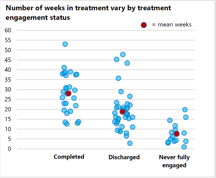
To document key takeaways, we chose excerpts from the written materials we found to be especially informative and thought provoking. We then annotated the excerpts with our comments and reflections. For instance, from Unfair Comparisons, we discussed the idea that showing both between and within group differences can help remove biases. This is important because viewers may incorrectly and harmfully attribute differences in the data to inherent characteristics of the group. One of our members provides an example below from their own evaluation efforts utilizing beeswarm charts to highlight both within and between group differences. While the means between those who successfully completed treatment and those who were discharged prior to treatment completion are different, the range of variability within each group is comparable, suggesting greater complexity in understanding what helps individuals to remain in treatment longer and finish successfully versus being excused from the program early.
Get Involved
To find out more about the Vermont Evaluation Network, contact vermontevaluationnetwork@gmail.com.
Do you have questions, concerns, kudos, or content to extend this aea365 contribution? Please add them in the comments section for this post on the aea365 webpage so that we may enrich our community of practice. Would you like to submit an aea365 Tip? Please send a note of interest to aea365@eval.org . aea365 is sponsored by the American Evaluation Association and provides a Tip-a-Day by and for evaluators. The views and opinions expressed on the AEA365 blog are solely those of the original authors and other contributors. These views and opinions do not necessarily represent those of the American Evaluation Association, and/or any/all contributors to this site.