My name is Sarah Rand and I am an Associate Project Director for Research and Evaluation at the Center for Elementary Mathematics and Science Education at the University of Chicago. Our team is currently working on a few efforts to share research and evaluation findings in useful and creative ways (see my November aea365 post about online evaluation reports).
One avenue we have explored is data visualization. Many of our projects result in large, complex data sets and our goal with data visualization is to create useful tools and products that highlight the story we want to tell.
Rad Resources:
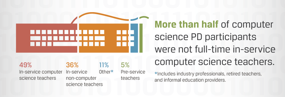
- We recently used Visual.ly’s Marketplace service , which paired us up with a designer and a project manager to create an infographic for a recent project on the current landscape of computer science professional development for high school teachers. Click here to see the infographic, and a small excerpt is included below right in this post. This is a very useful service for evaluators who have limited experience creating infographics.

- Visual.ly will also help with distribution of our infographic and will reach large audiences through social media, their website and a weekly newsletter.
- Easl.ly is another resource that allows you to create your own infographics at no cost.
- The Knight Center for Journalism in the Americas in currently offering a MOOC (a massive open online course) that offers an introduction infographics and data visualization. The current course is full, but they will offer it again soon.
Lessons Learned:
- Creating good data visualizations is very challenging! Find an expert to help you through the process.
- Infographic development requires intense collaboration between researchers and designers.
- Infographic development requires careful selection and crafting of the story you wish to tell.
- Iteration is part of the process. Our process included many rounds of feedback to the designer.
- The infographic was inspiration for an online report that we created. We applied the design of the infographic for the website and used each visual from the infographic to in conjunction with text about the findings. You can see our online report here.
Feel free to get in touch with any questions or comments: srand@uchicago.edu.
Do you have questions, concerns, kudos, or content to extend this aea365 contribution? Please add them in the comments section for this post on the aea365 webpage so that we may enrich our community of practice. Would you like to submit an aea365 Tip? Please send a note of interest to aea365@eval.org. aea365 is sponsored by the American Evaluation Association and provides a Tip-a-Day by and for evaluators.

Thanks for valuable sharing. I would like to add some points. Marketing the infographic can be done through various methods. But the infographic we create should have good concept. You can create an infographic to visualize your complex data. Check some of the infographs from http://graphs.net
Thanks for writing about your experience Sarah. I’m on the marketing team of a fashion brand and we’re interested in using data visualization too (here and there). It was great hearing about the process, your lessons learned, and seeing the end results of the collaboration :).
Pingback: Infographic Design Tools #1 | Communicating Data