Hey there! I’m Stephanie Evergreen, AEA’s eLearning Initiatives Director and the lead of the Potent Presentations Initiative. We merged those two things in a project to revamp five slides from five of AEA’s eStudy presenters. This month I’ll share the reboot we did to Michael Quinn Patton’s slides.
Michael is somewhat predispositioned toward use, so his slides have always been a visual support, a way to make the material more useful to the audience. This redesign was about making them better reflect Michael and the nature of his content.
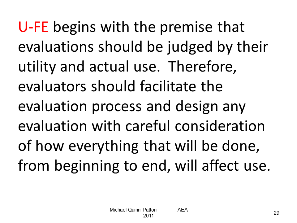
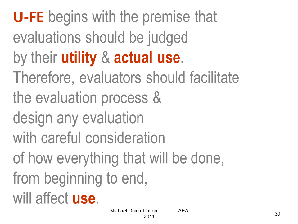
Michael’s slides needed to be made at least a little more consistent with the design choices in his book, Utilization-Focused Evaluation. This is why I brought in the orange color. Then I applied that orange color to the key words in the whole quote. I put the other text in gray so as not to compete with the orange (black would be too dark). I switched to a condensed font that’s still readable to give more white space on the slide and make it feel less overwhelming. And speaking of readable, I normally would argue for removing text when a slide contains this much but since this is the actual definition, it needs to be conveyed word-for-word. So I broke lines into conceptual chunks of text & animated each so they appear as he speaks. This way, what people can read at a glance will match what Michael says. Together these strategies make the slide easier to digest.
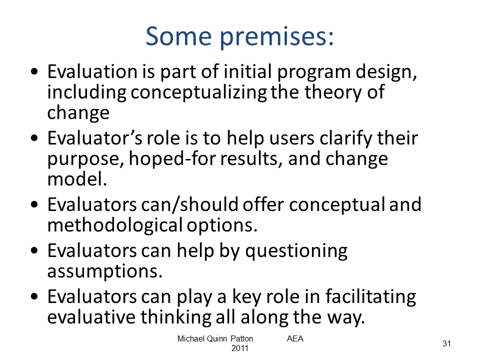
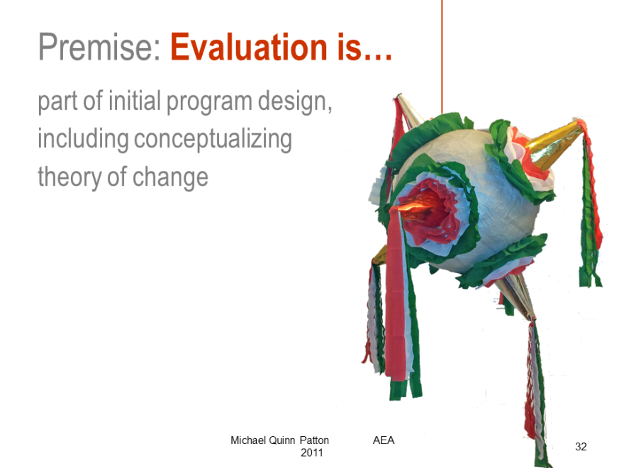
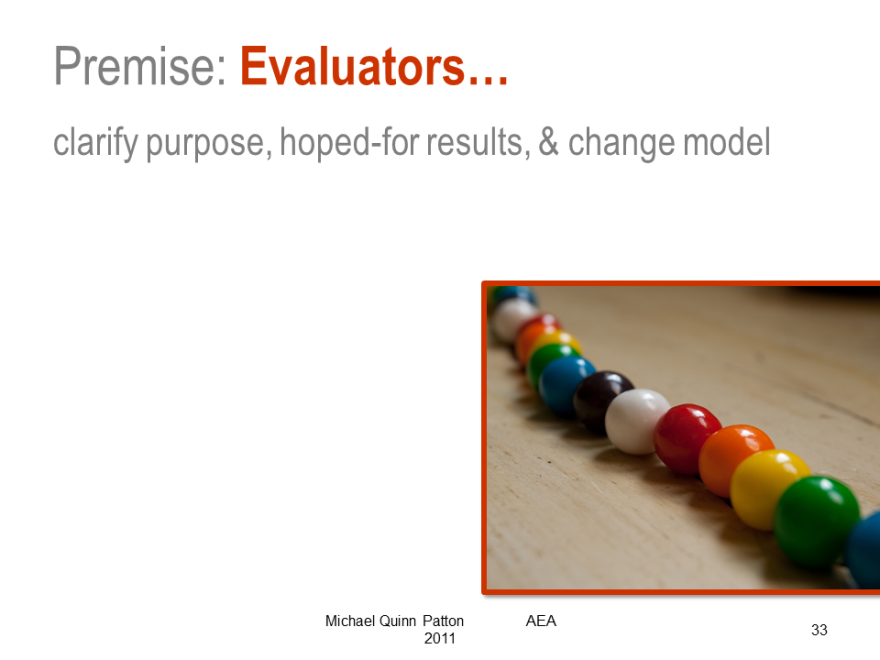
For bullet-heavy slides like this, one good strategy is to break up the content so there’s just one bullet per slide. But as I was reading this slide content, I realized the relationship between these bullet points. The first bullet was providing a definition of sorts and the rest were illustrating how an evaluator enacts that definition. This was the perfect type of content for an overarching visual metaphor. The first After slide introduced the overarching definition and a picture of a piñata. Then the slides that explained how an evaluator deals with the evaluation-equivalent of the exploded piñata were represented with different pictures of candy, which accurately reflected their associated bullet point.
Each added piece of text and its corresponding picture are on their own slide so that as Michael works through the slide deck it looks like one chunk of text is added and the picture is changed.
Read about all 5 of Michael’s redesigned slides on the Potent Presentations Initiative. Michael will be giving workshops on Development Evaluation and Utilization-Focused Evaluation at the annual conference – check him out!

Thanks, Megan! He’s got fantastic content – so easy to make it shine.
Stephanie we are already using some of the concepts I learned in your class at my organization! I love what you did with Michael’s slides. And I love the content too; his concepts are something else we are implementing. 🙂