
Hi there! I’m Sara Vaca (frequent Saturday contributor to this blog), independent consultant, and I recently started working for ImpactMapper as the Evaluation and Client Success Manager. As many of you know, since 2011, rather than English, I use Data Visualization as my second language (my first language is text 😉 ).
Early on, I thought I needed to learn Adobe Illustrator to do visuals and infographics, as everything I tried in Powerpoint looked awful. But with time (often moved by the need to share easy-to-edit versions to my clients), I use Powerpoint more and more. Some examples are my little infographic visually playing with AEA competences or my Visual CVs. So I thought of sharing a few features that helped me find in Powerpoint much of what I needed.
Cool Tricks: These are my favorite features in Powerpoint to make things look good (or at least better):
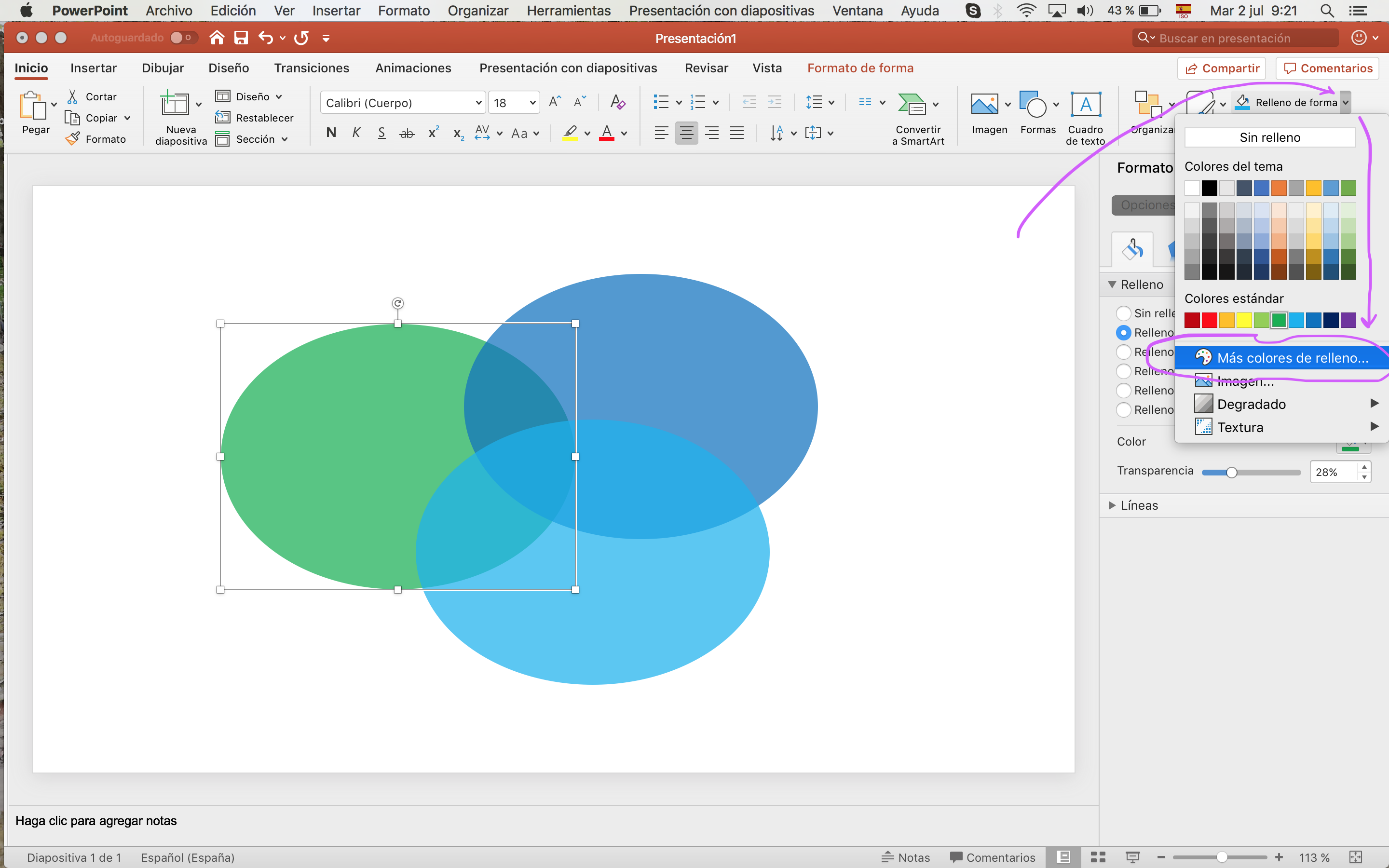
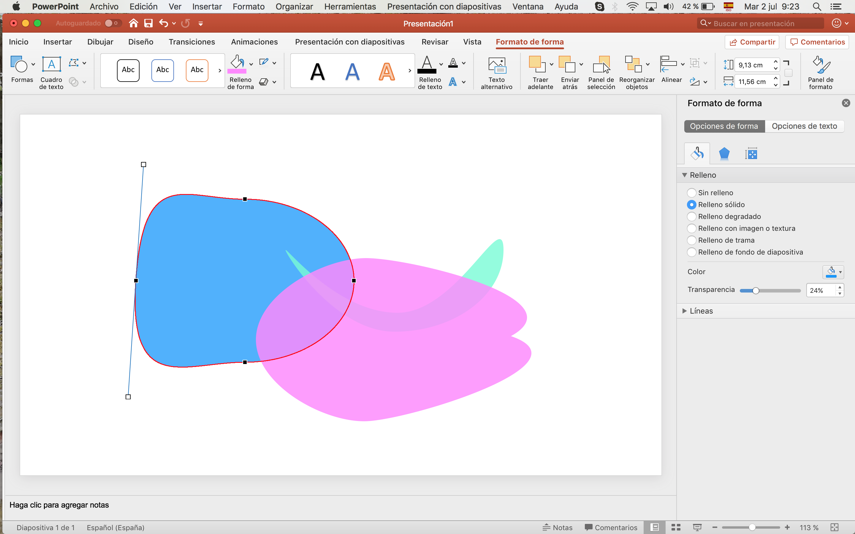
1. Transparency
I often use Venn diagrams either with circle or rectangles (examples Overlaps between evaluation criteria and Evaluation and other fields) to explain similarities and differences between things, and making the shapes transparent is key.
![]()
(My Powerpoint version is in Spanish, but you’ll find the same tools in the English version in about the same places, depending on the software version).
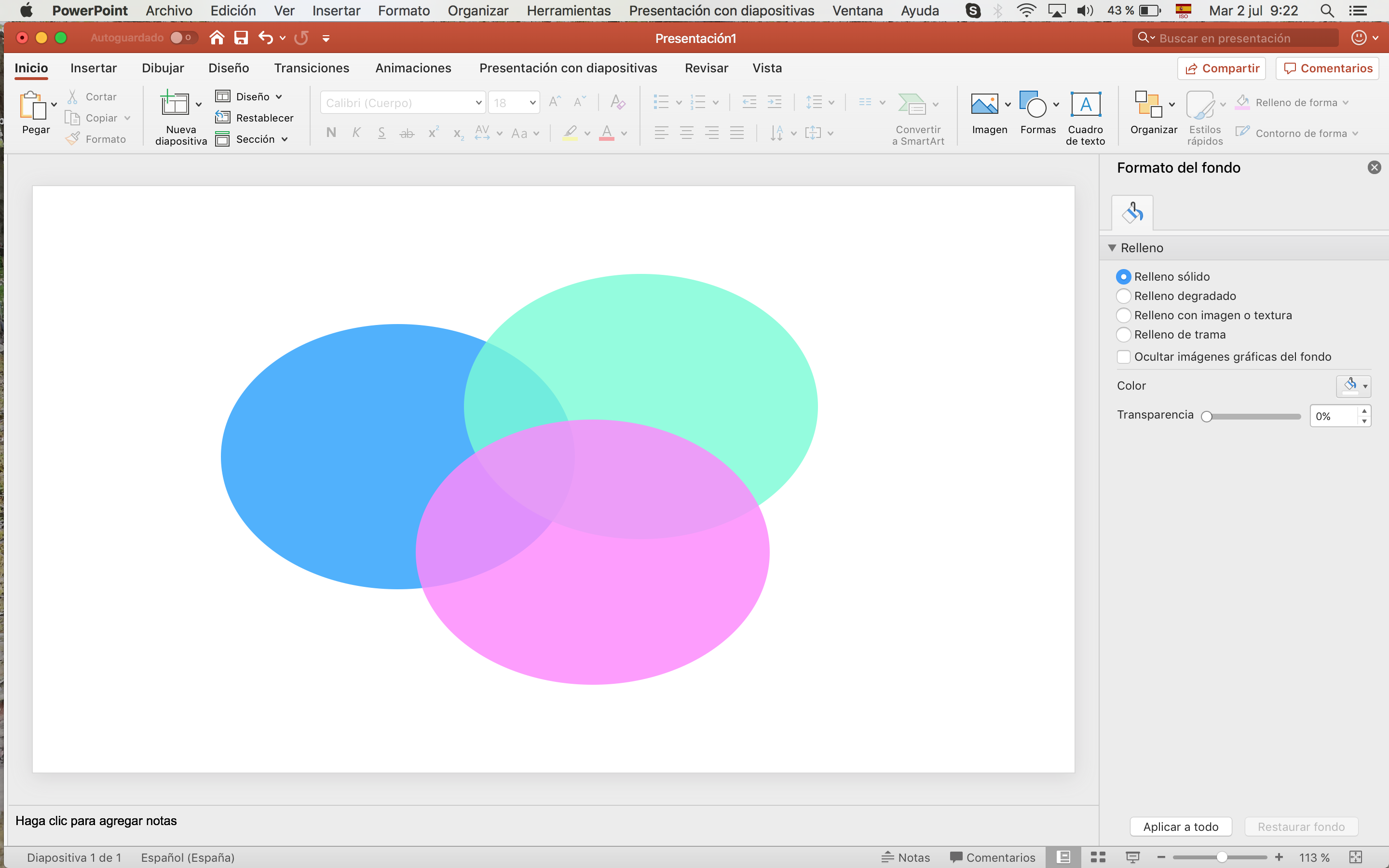
2. Alternative color palette
I realized something that was making my visuals look “old-fashioned” was colors. The palette Powerpoint offers by default is very basic. But I discovered a hidden one in this feature that allows me to choose colors used in present design trends (such as the flat design trend).
Possible result:
3. Edit shape
Working with circles, squares and rectangles is fine, but sometimes you wish you could be more creative. The Edit shape feature allows you to do so many different shapes by modifying the classic ones!
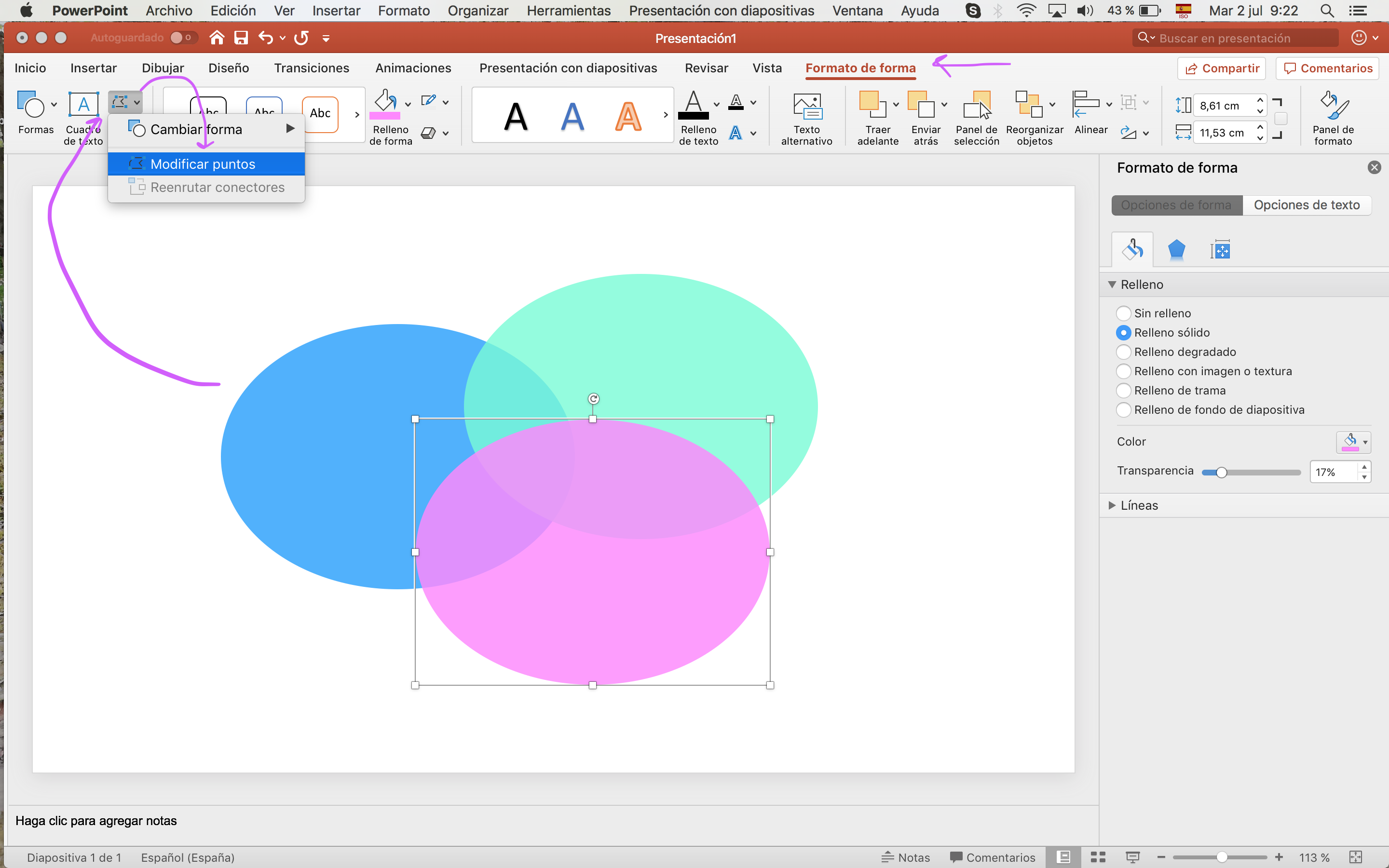
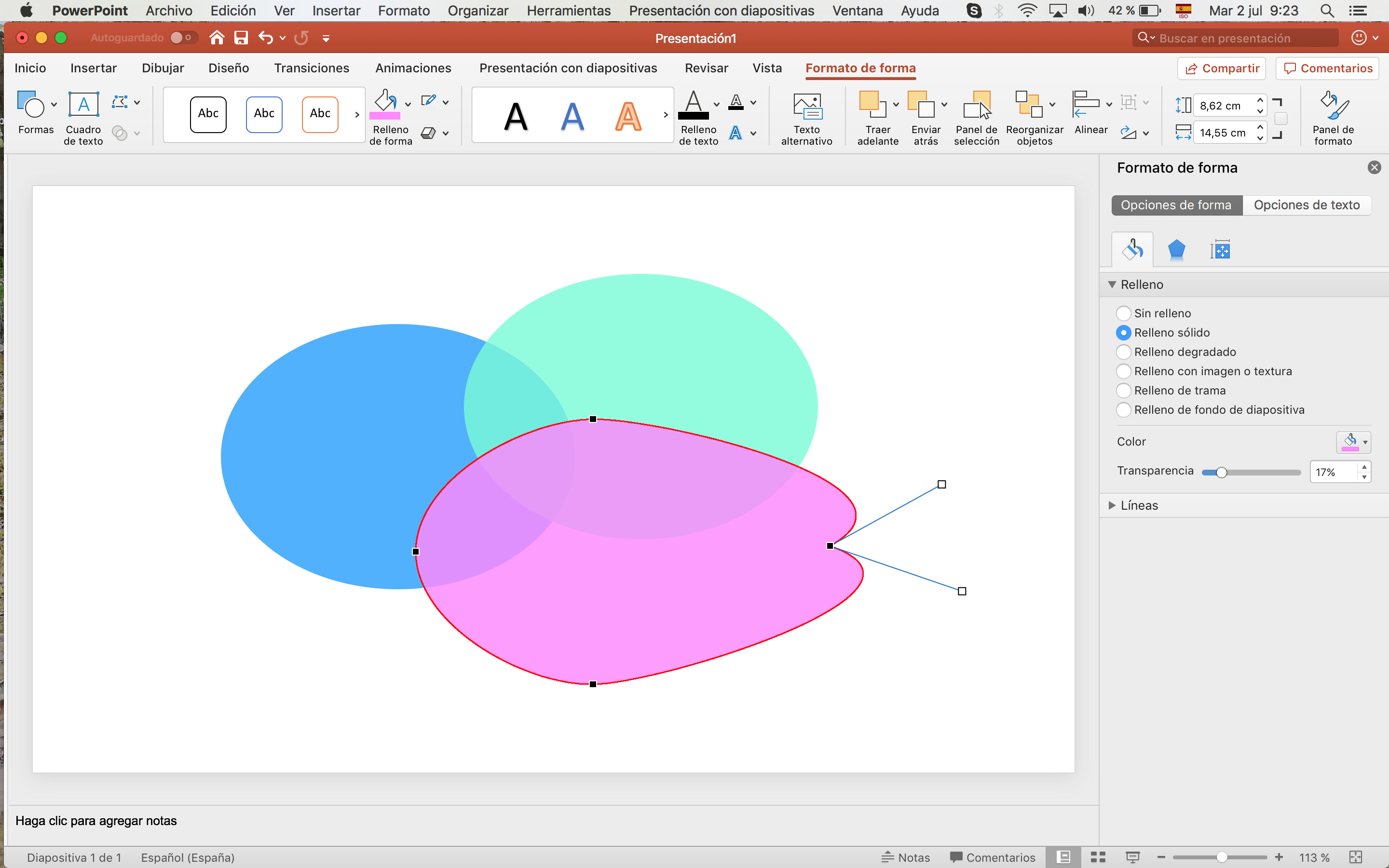
Here is a clear example of distorting classic shapes in powerpoint (representation of Displaced populations flows).
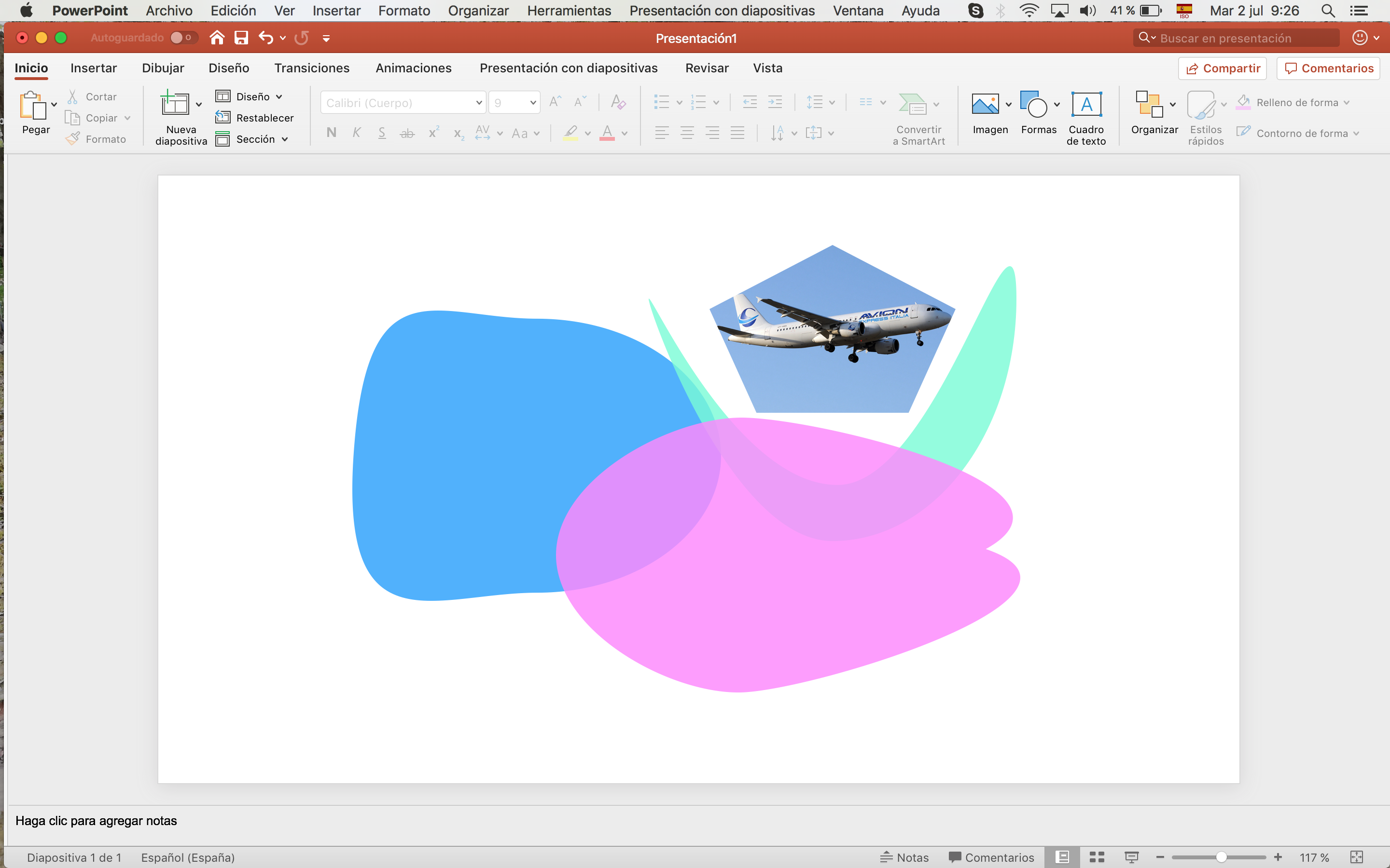
4. Crop images
Also when using icons or other images I download from Google images (be sure to filter for usage rights), I need to reshape the image for a variety of reasons. Powerpoint allows you to do it too:
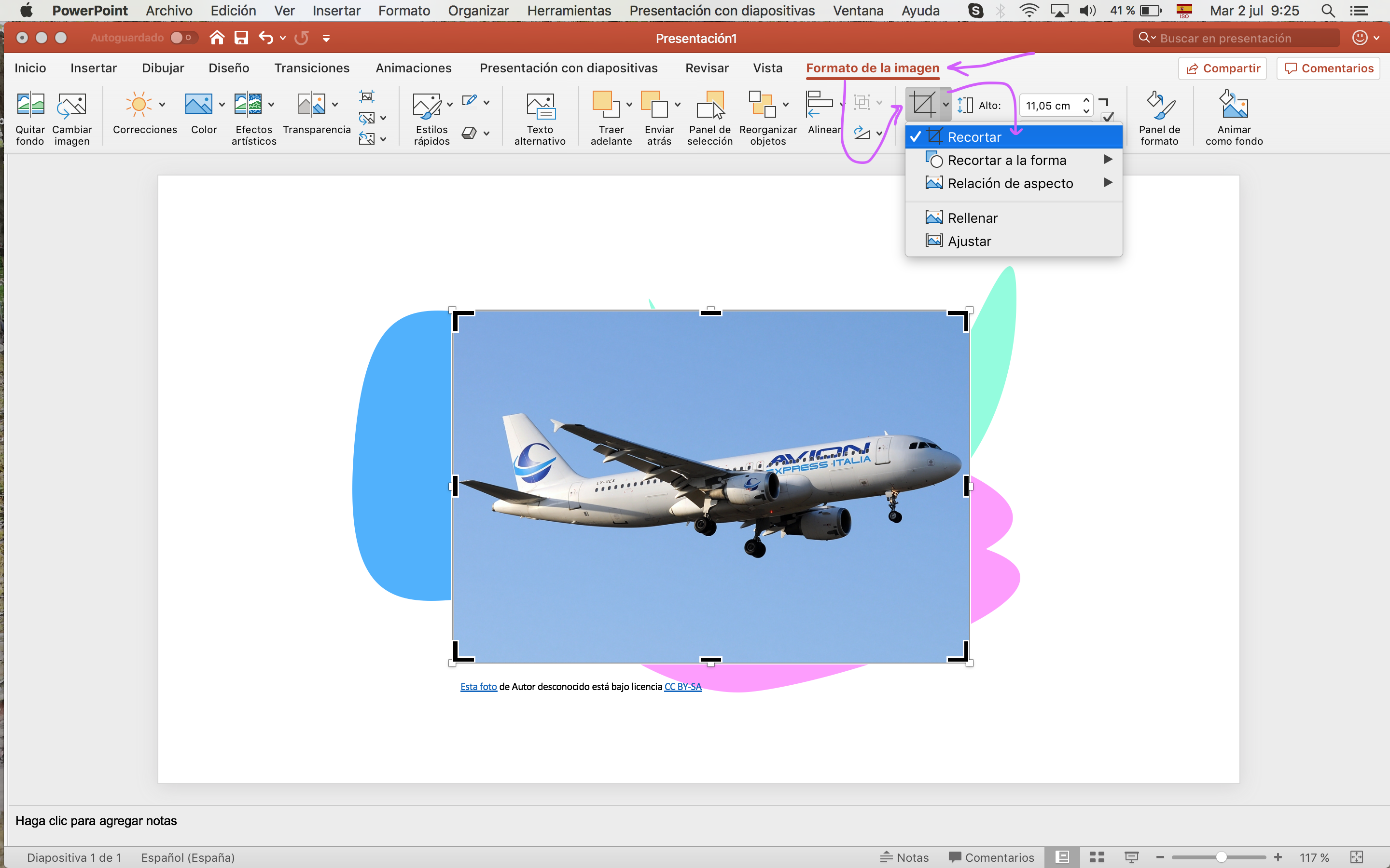
You can crop images either manually or to predetermined shapes as this:
Rad Resource: Needless to say, Illustrator as the go-to tool for designers, has many more features to excel at illustrations. I know some of them a bit, but most of them I still haven’t figured out. The one feature I still miss in Powerpoint though would be the Layers:
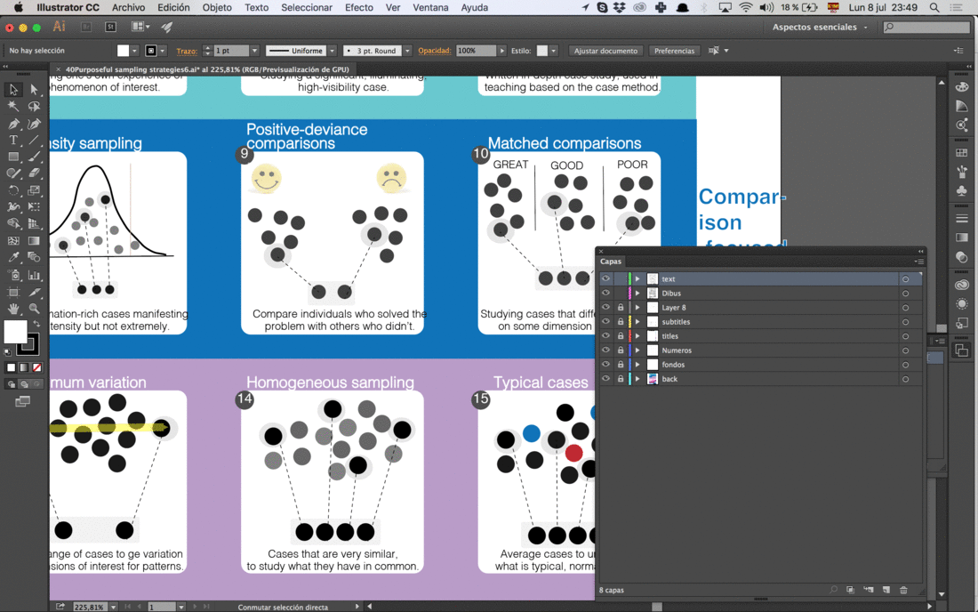
They allow you to classify the elements by layers, and you can individually block them or hide them, so it is easier to work.
Lessons Learned: This by no means is an endorsement of any particular tool, but rather realizations of how to make things more accessible to everybody with tools many of us use already. Cheers!
Do you have questions, concerns, kudos, or content to extend this aea365 contribution? Please add them in the comments section for this post on the aea365 webpage so that we may enrich our community of practice. Would you like to submit an aea365 Tip? Please send a note of interest to aea365@eval.org . aea365 is sponsored by the American Evaluation Association and provides a Tip-a-Day by and for evaluators.
Thanks for your post Sara, very useful. One suggestion that could substitute the layers feature from Illustrator, maybe you could try the option “agrupar” not sure if it translates as”grouping” in PowerPoint that allows you to group different elements and work on them separately.