My name is Melissa Biel and I am an independent consultant. I frequently work with hospitals, clinics and community organizations to conduct community health needs assessments. A common component of a community needs assessment is identifying access to primary health care. I have found the Uniform Data System (UDS) and the associated UDS Mapper to be useful resources to assess access to health care.
Rad Resource #1: Did you know that all Federally Qualified Health Centers (FQHCs)/Community Health Centers are required to collect and report data to the Bureau of Primary Health Care? The Uniform Data System (UDS) tracks a variety of information, including patient demographics, services provided, staffing, clinical indicators, utilization rates, costs, and revenues. UDS data are collected from Community Health Centers and reported at clinic, state, and national levels. http://bphc.hrsa.gov/healthcenterdatastatistics/index.html
Hot Tip: On the Bureau of Primary Health Care’s Health Center Data webpage, check out the navigation options on the left side of the page for some useful data tools. Demographic trends can be shown by category and state, and data can be compared by year and by state or national geography.
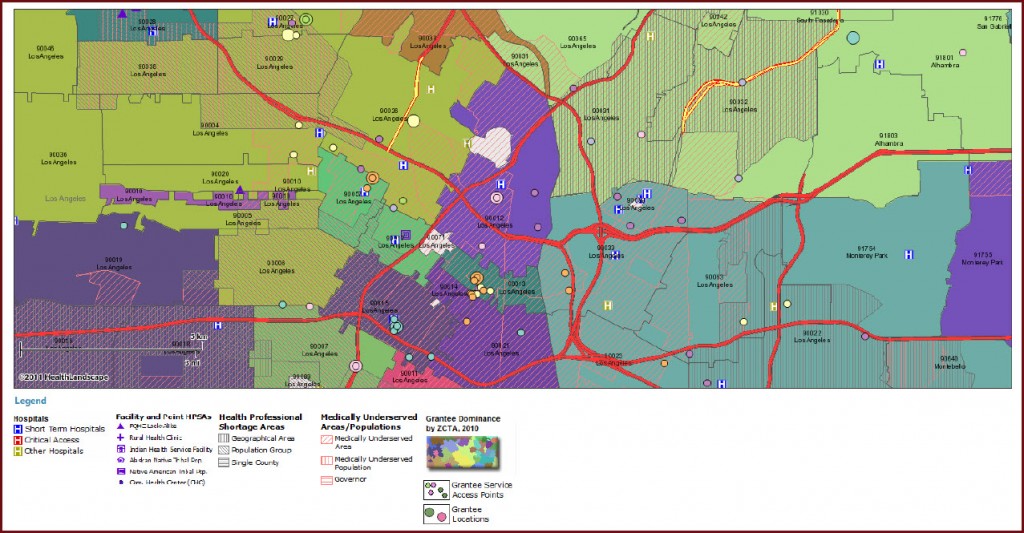
Rad Resource #2: The UDS Mapper presents data from the UDS reports in map and table format. To access the UDS Mapper, you must register for a free account. Data can be viewed by Zip Code, ZCTA, County or State. The UDS Mapper incorporates 2010 Census data with Community Health Center report data. By mapping the total population, low-income population, and number of residents served and unserved by Health Centers, I am able to identify the percentage of the population that lacks access to primary health care in a given geographic area.
Hot Tip: In addition to colorful, detailed maps, the site offers a table tab that shows the selected geographic area data in table form. The site has functions that allow the addition of lines, shapes and text to the maps. The maps can be saved as a pdf and the tables saved as an Excel spreadsheet or pdf. Both maps and tables can be emailed through a site-generated URL.
Hot Tip: Move your cursor over the map and detailed pop up boxes with Census and Health Center data appear on the map at the Zip Code level. The map also shows overlays of Health Professional Shortage Areas (HPSA) and Medically Underserved Areas (MUA).
Hot Tip: While on the UDS Mapper website, click on the Other Resources tab for access to tools and data, articles and references, and to download state and county data.

Do you have questions, concerns, kudos, or content to extend this aea365 contribution? Please add them in the comments section for this post on the aea365 webpage so that we may enrich our community of practice. Would you like to submit an aea365 Tip? Please send a note of interest to aea365@eval.org. aea365 is sponsored by the American Evaluation Association and provides a Tip-a-Day by and for evaluators
