
Hi! I’m Josh Twomey, evaluation specialist at UMass Medical School’s Center for Health Policy and Research (in the Office of Clinical Affairs). As evaluators, we are often tasked with providing participants in our evaluations with individualized results. This can be challenging as results must be easy to interpret, display individual results in the context of the entire evaluation, and, where appropriate, show performance over time. My colleagues and I are concluding an evaluation of the Massachusetts Patient-Centered Medical Home Initiative focused on transforming traditional primary care into a more patient-centered care delivery model. Over the course of this evaluation, we faced the challenges above and found a basic, yet sometimes overlooked, solution to effectively communicate results to our participants.
Boxplots (aka: box and whisker plots) have the advantage of displaying a lot of valuable information within a simple easy-to-understand graphic. A variable’s mean, median, 25th percentile, 75th percentile, and highest/lowest values can all be assessed at a glance. Extreme values (i.e., outliers) can be highlighted as well. The bottom of the ‘box’ represents the 25th percentile of all values in your data, whereas the top represents the 75thpercentile. The median value is within the box and is displayed via a straight line. Extending from the top and bottom of the box are ‘whiskers’, representing the highest and lowest values of the distribution, respectively.
Hot Tip:
- Boxplots are ideal when you must highlight a single participant’s results among participants’ results. Check out this example, where patient satisfaction from Dr. Smith’s office is shown in the context of other individual primary care practices.
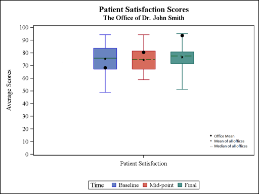
Looking at the blue boxplot, notice that Dr. Smith’s patient satisfaction score (i.e., 68) hovers just above the 25th percentile of all the offices’ scores. Another advantage of boxplots is that data can easily be tracked over time. Here, Dr. Smith’s score improves from about the 30th percentile at baseline to the near 100th percentile by the final measurement.
Hot Tip:
- Interpreting a boxplot is easy, after you’re shown how. When presenting boxplots, be sure to include some basic instructions on how to read one.
Cool Trick:
- The end of the whiskers do not always have to represent the data’s highest/lowest points. Whiskers can be set to represent scores that are high/low, but not outliers. Outliers can be displayed by dots falling above/below the whiskers’ ends.
- When constructing boxplots for numerous participants, macro variables can simplify production. Within your graphics generator, macro variables can simultaneously insert a single participant’s data and other information (e.g., participant’s name) into the boxplot. This technique allows you to generate graphs quickly and accurately, without manually entering data.
In total, boxplots can be a quick, clear, and effective way of providing participants with the information they need.
Do you have questions, concerns, kudos, or content to extend this aea365 contribution? Please add them in the comments section for this post on the aea365 webpage so that we may enrich our community of practice. Would you like to submit an aea365 Tip? Please send a note of interest to aea365@eval.org . aea365 is sponsored by the American Evaluation Association and provides a Tip-a-Day by and for evaluators.
Thanks for this amazing post. Keep up the good work. I have some queries regarding boxplots. Please can you help me out?
Thanks for this awesome post. keep posting like this post in the future… !!! Can we use boxplot for displaying the distribution of data based on a five number summary.!!
Very unique and interesting post!!! Using boxplots to showcase the varied individualise results was a fact really unknown… Quite informative .. Thanks !!!