
Greetings, fellow evaluation enthusiasts! My name is John Murphy and I am an Evaluation Associate on the Education Research and Measurement team at Cincinnati Children’s Hospital Medical Center. We provide evaluative support to various forms of learning and career development, ranging from clinical orientation to leadership and management training. One of our clients does extensive work surrounding quality improvement education. While we have provided them with evaluations of their courses, we have been fortunate enough to glean important tips and advice from their wealth of knowledge in measurement theory. One of the most basic tools used in improvement science is the annotated run chart, a simple form of the line chart. What makes the annotated run chart different from the typical line chart are annotations, small text snippets that show when an intervention or event has taken place.
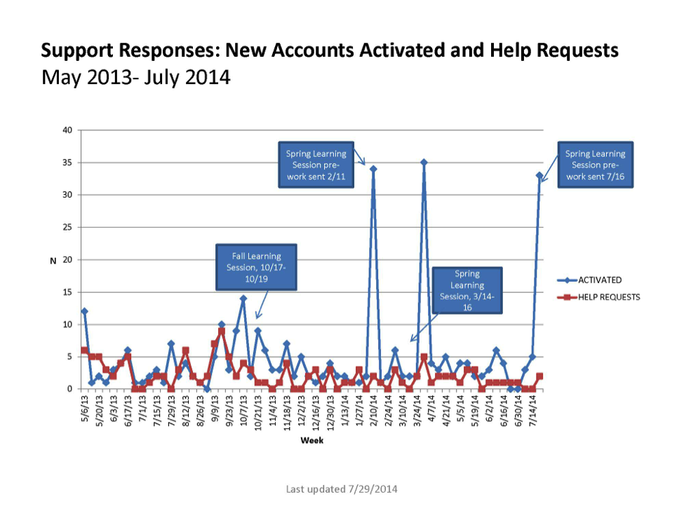
More and more, I have embraced annotations as being crucial to providing context and a story to a data representation. As an aficionado of data visualization, I have begun the quest for the perfect annotation. Here is what I have found so far:
Rad Resource: Stephanie Evergreen and Ann Emery provided an amazing resource within the virtual pages of this very blog! Their data visualization checklist not only reaffirmed my enthusiasm for the annotation, it also gave concrete guides for font size and text direction.
Rad Resource: What discussion about data visualization would be complete without mentioning Edward Tufte? The first chapter of his 2006 book Beautiful Evidence, entitled “Mapped Pictures”, discusses, in rich detail, the benefits of various techniques of providing context to images. Placing content in its proper space, scale, and time is crucial for making all genres of data representation tell a compelling story.
Hot Tip: If you are creating many annotated run charts that are updated frequently, consider investing in BI software such as Tableau. While Excel data labels are functional for one-shot data representations, more dynamic software can save time and provide more flexibility so annotations fit the story instead of being limited by the medium.
Good luck in telling your data stories!
Do you have questions, concerns, kudos, or content to extend this aea365 contribution? Please add them in the comments section for this post on the aea365 webpage so that we may enrich our community of practice. Would you like to submit an aea365 Tip? Please send a note of interest to aea365@eval.org . aea365 is sponsored by the American Evaluation Association and provides a Tip-a-Day by and for evaluators.