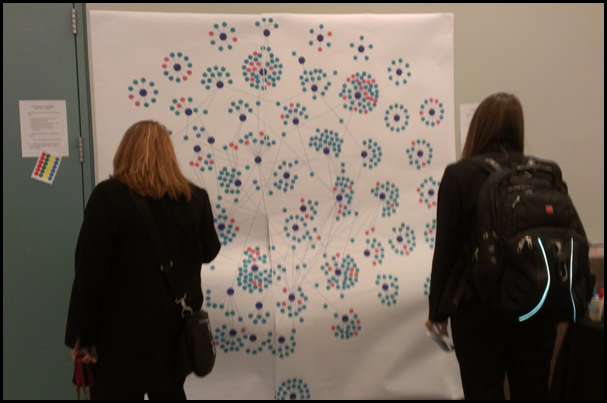
Hi! Our names are Kirsten Anderson, Anika Taylor, and Tatyana Venegas Swanson. We are students from the University of Minnesota who were tasked with designing an innovative method of evaluating the AEA Conference. Originally we wanted to display the connections that formed between individuals over the course of the conference. However, due to time constraints and the size of the network, a visualization map of all 2,500 attendees was not feasible. So given the data we had access to, we chose to use conference sessions and TIGs as the data points in our map. The goal was to create an interactive display that could both collect and display data as it changed.
 The large blue dots represent the various TIGs while the green and pink represented the sessions. Conference attendees were encouraged to place a dot sticker next to a presentation from which they took away something particularly interesting or helpful.
Rad Resource – Cytoscape: To create the visualization we used Cytoscape, an open-source bioinformatics software. This software is incredibly easy to use even for those unfamiliar with writing code but it does require the users to create precisely formatted excel spreadsheets for importing data.
Lessons Learned:
- If replicating this evaluation, we would like to get permission to use data from all conference attendees as that would have allowed us to complete the project as originally intended and allow for more complex analysis.
- Printing an image of this size and resolution proved problematic and is costly. Furthermore, the image was still too small for many people to effectively use. A potentially better option would be to project the image from a computer and digitize the interactive element. Participants could enter their connections into the computer as well as interact more closely with the map itself, aside from the projection.
- An initial finding is that the Data Visualization TIG was a center of participation on the map, unsurprisingly.
Feel free to post to the comments section of aea365 if you have any questions regarding the details of this visualization experiment.
We’re learning all this week from the University of Minnesota Innovative Evaluation Team from Evaluation 2012. Do you have questions, concerns, kudos, or content to extend this aea365 contribution? Please add them in the comments section for this post on the aea365 webpage so that we may enrich our community of practice. Would you like to submit an aea365 Tip? Please send a note of interest to aea365@eval.org. aea365 is sponsored by the American Evaluation Association and provides a Tip-a-Day by and for evaluator.

