Hello, readers! Liz DiLuzio here, Lead Curator of AEA365. We didn’t have the heart to leave Pi Day unacknowledged, so here’s a special second release of the day. It comes from our own Ann K. Emery, here to talk to us about pie charts and their alternatives.

It’s March 14th, which means… Happy Pi(e) Day!
Hi, it’s Ann K. Emery, dataviz designer at Depict Data Studio.
Recently, I was working with an organization to improve their report.
The draft had a page of pie charts.
Pages, actually. One per school times dozens of schools in the project.
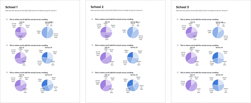
(These are made-up numbers, but you get the idea.)
I know what you’re thinking: “Pie charts are evil! Just delete them!”
Novices avoid pies.
Vizards embrace them (sometimes; here’s when pie charts are okay).
More importantly, vizards know what to use instead.
Let’s transform from novice to vizard when it comes to dealing with pages and pages of pie charts.
Page of Pies
I only use pie charts for two-slice binary data, and when I’m looking at a single pie.
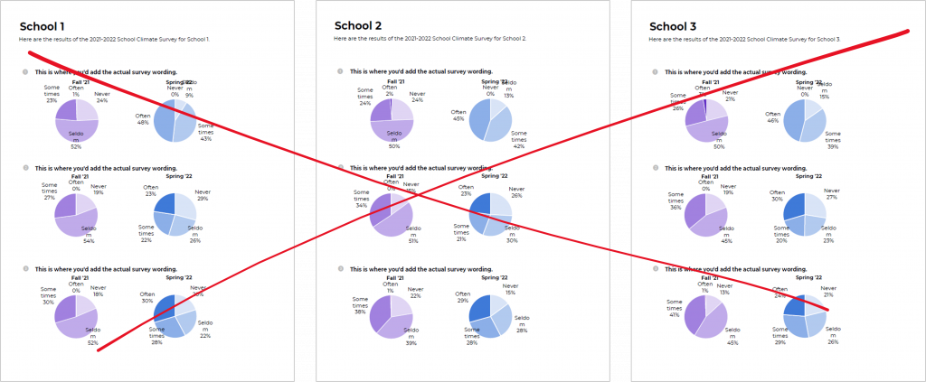
This dataset had 4-slice ordinal data, and we’re asking the viewers to compare across multiple pies.
Red X.
Heat Tables
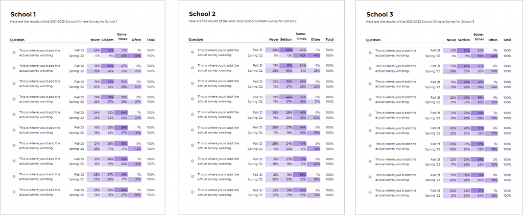
Next, I went back to the basics: A table.
I used percentages instead of numbers since we’re dealing with a “big n” (bigger than 100; my cutoff for choosing percentages over numbers).
Then, I added a heat table to draw attention to larger numbers.
It’s not terrible. And it might actually be perfect for the visual appendix of a report.
Let’s try some more vizzes.
Stacked Bars
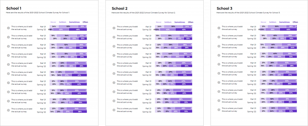
The researcher-turned-dataviz-designer in me wanted to try stacked bars. These used to be my go-to chart.
There’s a lot going on.
Sometimes, 0% of survey respondents chose an option. Stacked bars can’t show zeros.
I don’t love switching between white and black ink. Consistency is such a value-add. But, we often have to switch ink colors to make sure our graphs have enough color contrast.
Small Multiples Bars
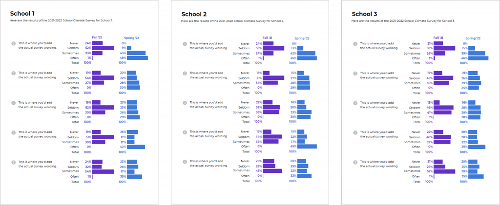
Small multiples bars can show zeros. (Well, the label is legible next to the absence of a bar.)
We don’t have to switch back and forth between white and black ink.
There’s plenty of white space; it’s not as dense as the stacked bars.
We can see how the distribution has shifted over time.
I didn’t want to love this one…
I tend to have way too many bar charts in my draft datavizzes.
But, it’s my favorite. 🙂
Area Charts
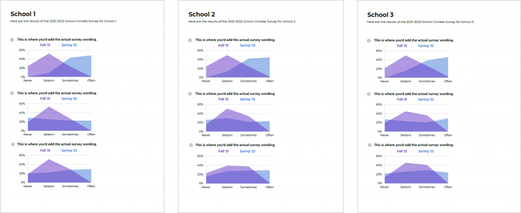
When I was brainstorming ideas in my head, I thought this was going to be the winner.
The small multiples bars showed the distribution side by side; this option places them on top of one another.
Overlapping designs can be powerful when we want to see how the numbers have shifted over time.
But… it was tough to fit on a page. I tried making smaller charts, but the Never Seldom Sometimes Often labels tilted themselves diagonally.
I never shrink font sizes to get everything to fit onto the page. Too many people wear glasses.
With more editing time, I probably could’ve figured out how to arrange everything on the page better.
Behind the Scenes
Want to continue learning about the pros and cons of each visualization?
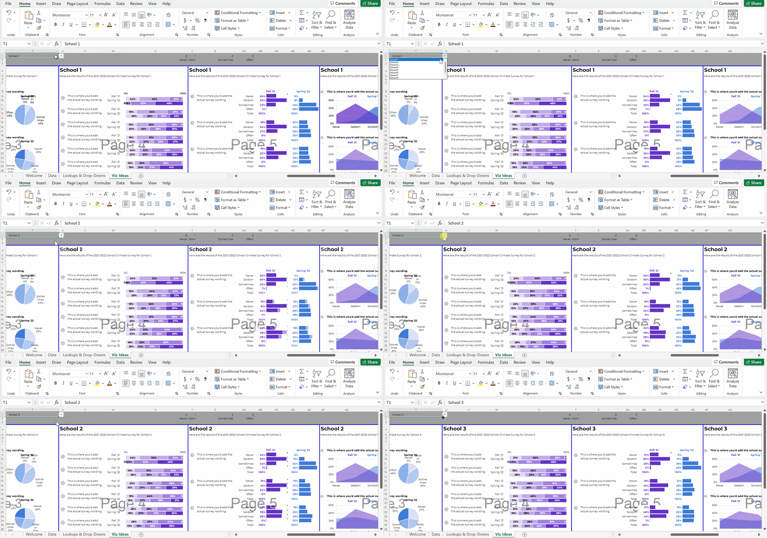
Want to see how I arranged my spreadsheet to create these charts?
Let’s explore the viz ideas in more detail:
Download My Spreadsheet
Bonus! Download the dataset and click through the spreadsheet yourself: https://depictdatastudio.gumroad.com/l/page-of-pie-charts
You’ll see how I made one template and then populated it with each school’s data.
Your Turn
This isn’t an exhaustive list. What additional ideas do you have for revamping the page of pies? Which viz idea was your favorite, and why?
Do you have questions, concerns, kudos, or content to extend this aea365 contribution? Please add them in the comments section for this post on the aea365 webpage so that we may enrich our community of practice. Would you like to submit an aea365 Tip? Please send a note of interest to aea365@eval.org . aea365 is sponsored by the American Evaluation Association and provides a Tip-a-Day by and for evaluators. The views and opinions expressed on the AEA365 blog are solely those of the original authors and other contributors. These views and opinions do not necessarily represent those of the American Evaluation Association, and/or any/all contributors to this site.

Ann,
Thanks for sharing this walkthrough. This is the type of data I have to work with all the time. I remember way back when I came across your book and first learned about small multiples. I was immediately hooked! Such a great way to display a lot of data.
Thanks, Chris! Small multiples are such a great strategy for displaying lots of breakouts. Glad you like them, too.
I love those options, Ann! Thanks for sharing. One thing I’m wondering about is if the approach might be different if this were for a report, rather than a series of one-pagers for multiple schools. Specifically, I’m thinking about the fact that none of these approaches have a “story-telling” component, where you have a title saying what the takeaway finding is, and where you use color to emphasize the part of the chart where that takeaway finding can be seen. I don’t think that that would work in this instance, because the takeaway finding could be different for every school, so it makes sense to just have the survey item be the title and just present the data without interpretation. But could you comment how the approach might be different for a report, where the data are just for a single program or location?
Thanks!
Good question!
Yep, you could definitely use storytelling here — for non-technical audiences, or external audiences, or busy audiences.
It would be trickier to make one template and then use the drop-down menus to populate the data. We’d have to use concatenation formulas to write the takeaway sentences for us. Trickier but not impossible.
Yes, absolutely to the small multiples bars! It looks neat and clean. I have been trying to figure out an alternative to the stacked bars when I have a lot of data, and this looks like the perfect solution. My remaining question is how to pull in data from two different spreadsheets to combine pre/post data on one sheet to create the side by side multiples chart? (Probably a much higher level skill than I have access to!)
We can pull in data from multiple sheets (or even across multiple files) into a single master spreadsheet with lookup formulas.
The lookup family includes index match, vlookup, hookup, and the newest addition, xlookup.
I have a few blog posts and a few videos about these techniques, and cover them in-depth in my Simple Spreadsheets course (with evaluation-specific examples, like pre-post data).
There are a million public-facing tutorials on these techniques, too, since they’re so useful. Definitely worth the time to learn!