

It’s March 14th, which means… Happy Pi(e) Day! Hi, it’s Ann K. Emery, dataviz designer at Depict Data Studio.
Let’s celebrate pie charts for what they’re great at—displaying two-slice overviews. Then, let’s brainstorm ideas for soaring beyond pies.
Lessons Learned: Seven Guidelines for Using Pie Charts
“Never use pie charts!”
That’s only half-true.
Pie charts (and their cousins, donuts and waffles) are okay in some circumstances.
Pie charts are okay when they’re well-formatted. No 3D, exploding slices, leader lines, or legends.
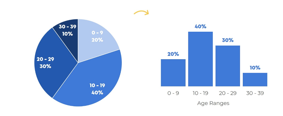
Pie charts are okay for nominal variables. Ordinal variables don’t belong in a pie chart.
Pie charts are okay when they add to 100%. I’ve seen pies that only add to 90% because the evaluator deleted the “other” category and forgot to recalculate the new percentages. Oops.
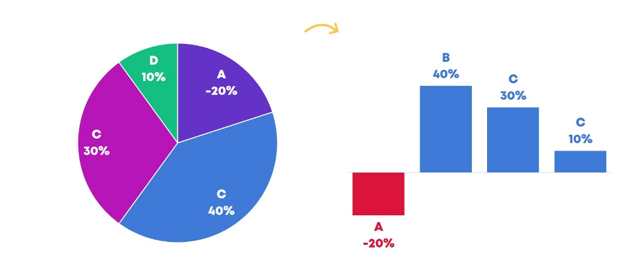
Pie charts are okay when they contain positive numbers. No negative numbers, please.
Pie charts are okay for a single point in time. Patterns over time belong in line graphs, dot plots, or stacked columns.
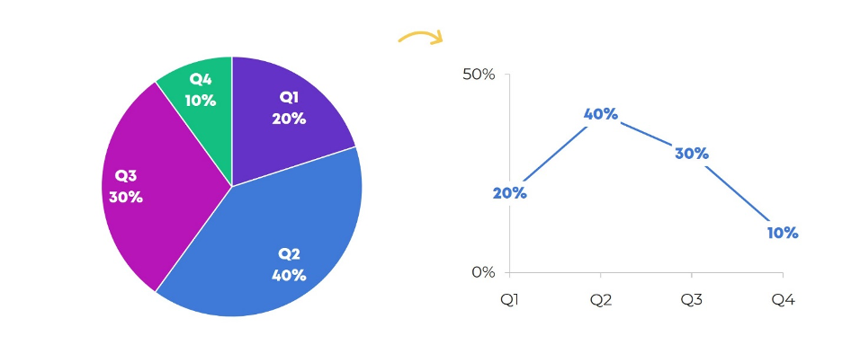
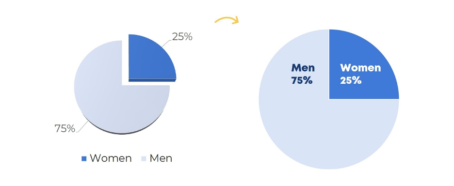
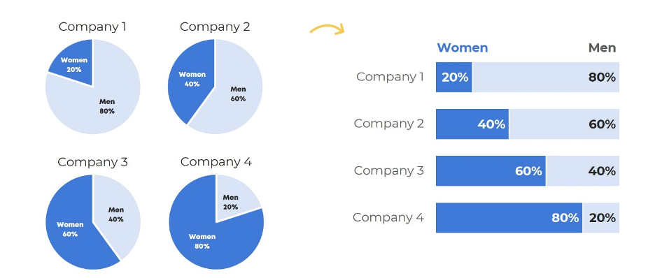
Pie charts are okay when they only have two slices. Three’s fine, if you must. Four slices is pushing it.
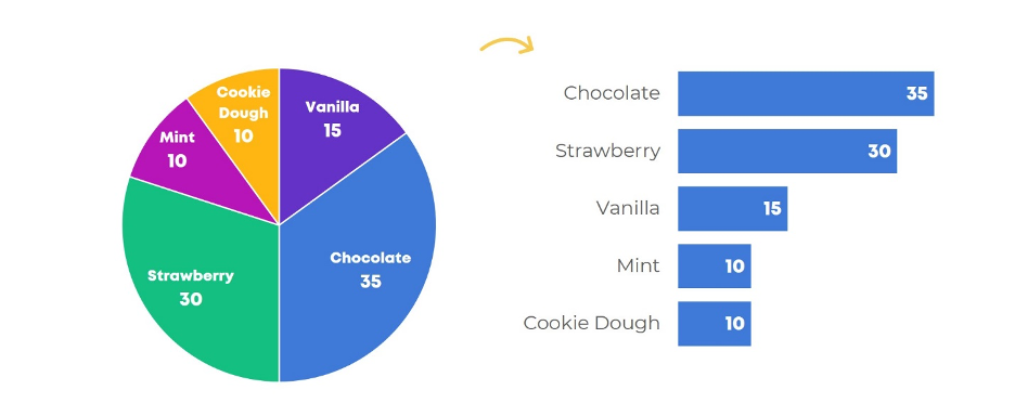
Pie charts are okay when there’s just one pie. It’s time-consuming to zig-zag our eyes across multiple pies.
Finally, while I don’t consider this to be a strict guideline, pie charts tend to be easiest to read with common fractions, like a one-fourth vs. three-fourths pie.
Given these guidelines, I only use pie charts to show two-slice binary data (e.g., students who graduated on time vs. those who didn’t, or adults who speak Spanish as their primary language vs. those who don’t).
Rad Resource: Library of Pie Chart Makeovers
My dream is to build the largest library of before/after pie chart makeovers known to humankind.
Here are a few of my favorite pie chart makeovers from that collection:
- Monitoring project budgets with a one-page dashboard
- Transforming the demographics section of an evaluation report
- Comparing four quarters’ worth of program output
- Making sure donut charts are aren’t accidentally misrepresenting the data
Rad Resource: Complimentary Mini Course
Nowadays, I don’t lose much sleep over pie charts. Those 100-page Dusty Shelf Reports definitely keep me up at night. Check out our complimentary mini course, Soar Beyond the Dusty Shelf Report, for dataviz and reporting inspiration.
Do you have questions, concerns, kudos, or content to extend this aea365 contribution? Please add them in the comments section for this post on the aea365 webpage so that we may enrich our community of practice. Would you like to submit an aea365 Tip? Please send a note of interest to aea365@eval.org. aea365 is sponsored by the American Evaluation Association and provides a Tip-a-Day by and for evaluators. The views and opinions expressed on the AEA365 blog are solely those of the original authors and other contributors. These views and opinions do not necessarily represent those of the American Evaluation Association, and/or any/all contributors to this site.