Hi! We are Emily Love, Heidi Masching, Breanne Burton, and Danielle Kulina, evaluators with Goshen Consulting. At Goshen, one of our goals is to ensure clarity in our data sharing. By transforming data into accessible and actionable reports for our clients, we are able to do just that. One of our favorite ways to present data is through Canva, an online graphic design tool. Whether we are creating a presentation to share our annual work, or an infographic to recap results, Canva allows us to create simple yet effective summaries and reports for our clients.
Below, we are sharing some of the best ways we utilize Canva, along with some cool tricks we’ve learned along the way.
Hot Tips
Simple Tools, Impactful Results
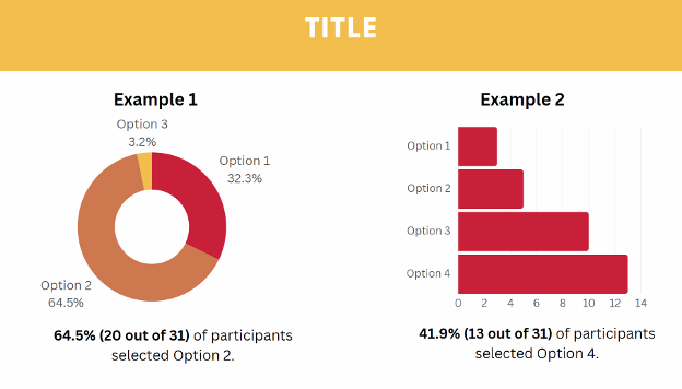
Canva’s easy-to-read chart designs make interpreting and sharing data straightforward and impactful. Donut charts are best used for items with three response options or less, while bar charts are better for items with four or more responses.

Build Your Brand
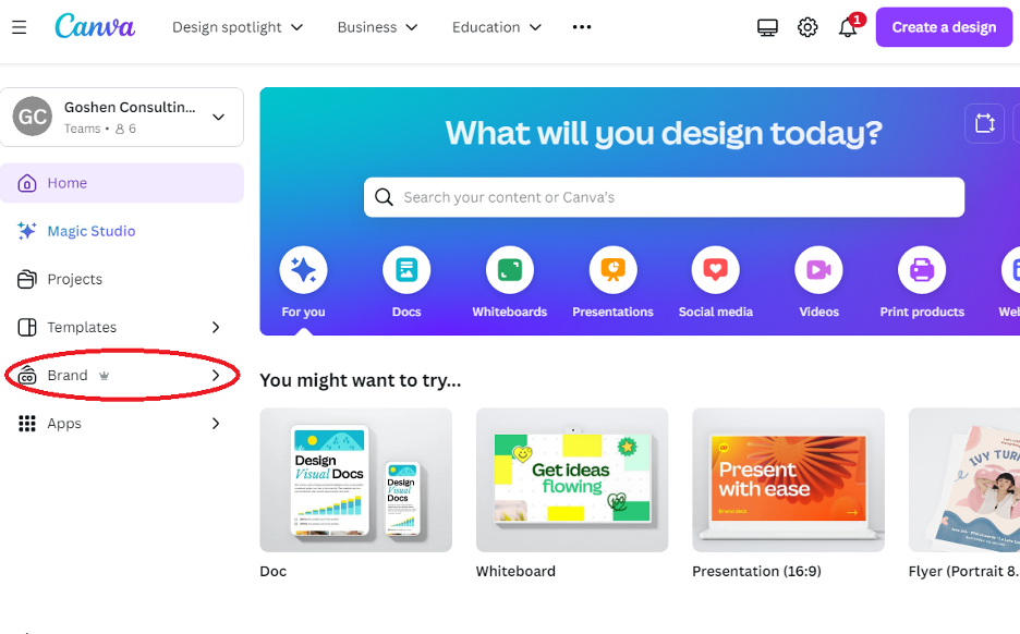
Canva makes it easy to build your brand. To incorporate your company’s colors into your data-sharing designs, create Brand Kits/Templates to keep your designs aligned across projects. To add in your branding colors, head to the Canva homepage, select the main menu graphic in the top left corner, and select the brand option in the main menu. Here, you can add your brand’s colors and branding guidelines.

Infographics

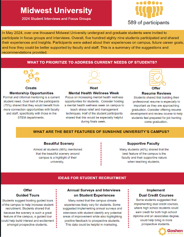
One-page infographics can be especially effective in sharing data in a clear and approachable way. Canva provides the tools necessary to make your data easy-to-read and aesthetically pleasing. Whether you utilize one of the pre-built templates or create your own, you can easily plug your findings into an infographic to share data with your clients. To start, go to Canva’s homepage, click “Design,” and select the design option of your choice. Once there, from the left side of your screen you can find various templates and elements (i.e., tables, charts, graphics, and images) to customize your infographic.
Cool Tricks
Collaboration
Canva makes it easy to collaborate with team members on designs. In the top-right corner of your design page, click on the share button, add your team members, and select the level of access you’d like them to have (can edit, can comment, or can view).
Pubic View Links
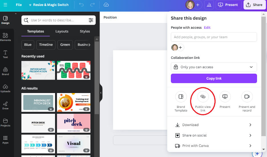
Avoid sending multiple emails with data updates and choose a public view link in Canva instead. Creating a public view link allows multiple people to view your design in real time. Once created, clients can click on the link to instantly access what you’ve designed. As a plus, you can make updates to your existing design as new data comes in, and those with the public view link will always have access to the most up-to-date version.
To create a public view link, in your presentation project click on “Share” in the top right corner of your screen. The public view link option will be available in a drop down box.

The American Evaluation Association is hosting Goshen Consulting, an independent consulting firm. Do you have questions, concerns, kudos, or content to extend this AEA365 contribution? Please add them in the comments section for this post on the AEA365 webpage so that we may enrich our community of practice. Would you like to submit an AEA365 Tip? Please send a note of interest to AEA365@eval.org. AEA365 is sponsored by the American Evaluation Association and provides a Tip-a-Day by and for evaluators. The views and opinions expressed on the AEA365 blog are solely those of the original authors and other contributors. These views and opinions do not necessarily represent those of the American Evaluation Association, and/or any/all contributors to this site.
