Hi! Our names are Carrie Wiley and Matt Reeder and we are Senior Research Scientists at the Human Resources Research Organization (HumRRO). We would like to share an abbreviated version of our demonstration session presented at the 2016 annual meeting in Atlanta on how to create map data in R. It sounds like a daunting task, but it is far easier than it seems.
In addition to the many tools and resources that exist to help guide evaluators to create more effective tables and graphs, geographic mapping could also be a great benefit to identify and demonstrate geographical patterns. The use of Geographic Information System (GIS) mapping as an effective evaluation tool might be perceived by many as a rather intimidating technique, since most evaluators are not formally trained in GIS. In our work, we often deal with naturally occurring large-scale data (e.g., state-level data, school districts, counties, ZIP codes) that can be displayed in more effective ways than a traditional table. Drawing maps really just requires coordinates, and for very basic maps, R provides those coordinates in a nicely formatted file.
Hot Tips:
All you need to get started is:
- R: https://cran.r-project.org/
- RStudio (a user-friendly Integrated Development Environment): https://www.rstudio.com
- Internet connection!
GIS Basics:
In order to map data, you need to draw boundaries. Those boundary data are in shapefiles (.shp) which contain latitude and longitude coordinates of the boundaries you want to draw. The Census Bureau TIGER files (Topologically Integrated Geographic Encoding and Referencing) make various cartographic boundary shapefiles available for download, or you can use built-in R packages that essentially pull the data for you.
Mapping the Data:
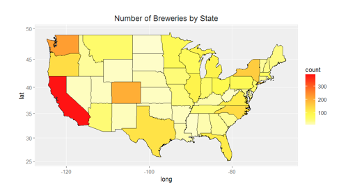
Our example plots a heatmap of the number of craft breweries in each state.
- Retrieve the publicly available craft brewery directory: https://www.brewersassociation.org/directories/breweries/
2. Install the following R packages:
a. library(dplyr)
b. library(ggplot2)
c. library(mapproj)
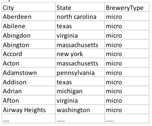
3. Data excerpt:
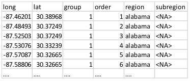
4. Load the boundary data from maps() (a ggplot() dependency):
a. states <- map_data(“state”)
b. Data excerpt:
5. Get counts of breweries by state and merge with the coordinates file:
6. Plot the heatmap:
So, based on this map, if you are an avid fan of craft beer, California, Washington, and Colorado are good places to check out. Of course, these are raw counts—creating a heatmap that accounts for population density would be more useful. If you are a coffee drinker, find a publicly available coffee shop database and practice your new skills plotting a heatmap of coffee shops!
Rad Resources:
Using different combinations of R packages and Census data, you can make heatmaps by county, and school districts, and bubble charts by ZIP code.
Useful Census data:
- County Business Patterns: https://www.census.gov/data/datasets/2014/econ/cbp/2014-cbp.html
- State, county, city, ZIP code data
- Various Census shapefiles: https://www.census.gov/cgi-bin/geo/shapefiles/index.php
- School districts
- Urban areas
- ZIP code tabulation areas (ZCTAs)
- Others
Useful R packages
- library(zipcode)
- library(maps)
The American Evaluation Association is celebrating Ed Eval TIG Week with our colleagues in the PreK-12 Educational Evaluation Topical Interest Group. The contributions all this week to aea365 come from our Ed Eval TIG members. Do you have questions, concerns, kudos, or content to extend this aea365 contribution? Please add them in the comments section for this post on the aea365 webpage so that we may enrich our community of practice. Would you like to submit an aea365 Tip? Please send a note of interest to aea365@eval.org. aea365 is sponsored by the American Evaluation Association and provides a Tip-a-Day by and for evaluators.


