Greetings! My name is Sarah Mason and I am a Ph.D. student in the Evaluation & Applied Research Methods program at Claremont Graduate University. My research focuses on the effectiveness of data visualization techniques, and my goal is to make sure that the communication strategies evaluators use have as much empirical support as the programs we evaluate.
Last year a bunch of us got together at AEA to talk about our research and experience with data visualization (AEA 2014 session #DVR2). Here’s a summary of what we found.
- Lesson learned: We need more empirical data on the effects of data visualization in evaluation! One experiment with members of the public showed visual data reports were no more influential than text-based reports in shaping readers’ attitudes. But we need more research to understand how and why these findings occurred.
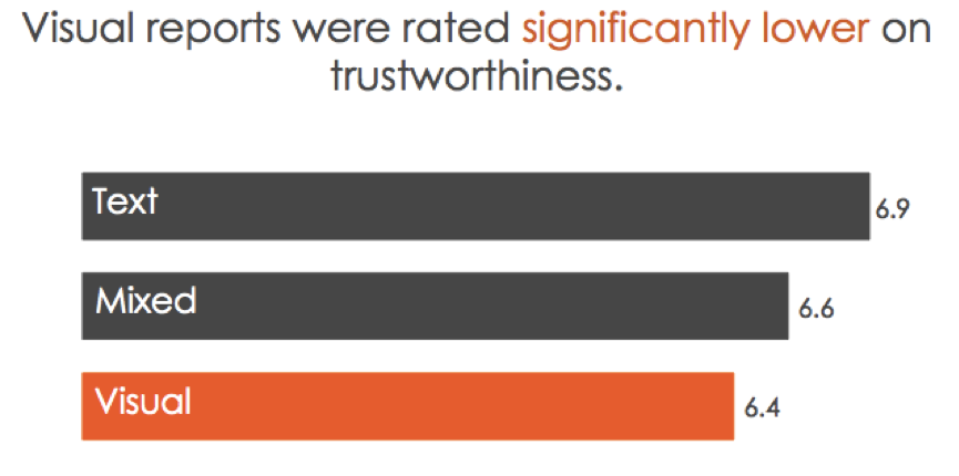
- Lesson learned: One data visualization does not fit all! This same experiment showed that members of the general public viewed visual reports as less credible and of lower quality than text-only reports. Tailoring your data visualization to your audience is essential if you want to get your message across.
Rad Resource: Using MTurk to field-test your reporting strategies is a fast and low-cost way of trialing your visualizations before sending them to clients < https://www.mturk.com/mturk/welcome>
- Lesson learned: One key to understanding the effectiveness of data visualization is knowing how it alters the cost structure of a task: whether it makes processing information easier or more difficult. Not all data visualizations are equal, and unless we’re careful our visualization efforts may make this processing task harder!
Rad Resource: Colin Ware’s book on Information Visualization offers a great overview of the theoretical foundations for data visualization techniques and strategies <http://www.amazon.com/Information-Visualization-Third-Edition-Technologies/dp/0123814642>
- Lesson learned: Adding interactivity to PDF documents is one way to tailor reports so readers can choose their own reading adventure.
Rad Resource: Nicole Lobb Dougherty’s presentation at AEA 2014 was a great introduction to adding simple interactivity to PDFs http://comm.eval.org/viewdocument/?DocumentKey=cd2aa473-f749-40c7-a3ca-d943d79828d2
- Lesson learned: Actively working with the media to develop visual materials they can use can help to make sure your message gets across to a wider audience.
Rad resource: Robin Kipke’s presentation at AEA 2014 offered an insightful overview on how the Tobacco Control Evaluation Center worked with the media to communicate evaluation findings to the general public.
The American Evaluation Association is celebrating Data Visualization and Reporting (DVR) Week with our colleagues in the DVR Topical Interest Group. The contributions all this week to aea365 come from DVR TIG members. Do you have questions, concerns, kudos, or content to extend this aea365 contribution? Please add them in the comments section for this post on the aea365 webpage so that we may enrich our community of practice. Would you like to submit an aea365 Tip? Please send a note of interest to aea365@eval.org. aea365 is sponsored by the American Evaluation Association and provides a Tip-a-Day by and for evaluators.


Hi! Great article. I was trying to access additional information about the experiment that compared use of text-based versus visual reports (first hyperlink) but it appears I do not have access. Is there another way to access this information? I have a student doing an independent study on this very topic and she’d love to see this study. Thanks!
Hi Melissa
Thanks for your message. Here’s another link to the PPT that should be accessible to the public: http://matildaresearch.com/Mason_DataViz_AEA2014.pdf
Glad you enjoyed the post!
Sarah
Looking forward to seeing more of your research Sarah!
Kylie
Great work. Evaluators don’t do enough evaluating of our own best practices.