
Hello! I am Jill Lipski Cain with the Improve Group. This blog post promotes the use of a style guide to make a report both purposeful and aesthetically-pleasing. I think of a style guide as a thoughtful plan that considers best practices in data visualization, delivery tone, and highlighting the important information. I’ll be using the example of a report our team recently developed for MNsure, Minnesota’s marketplace for choosing health insurance coverage. This 100-page report includes qualitative and quantitative findings, special treatment to specific content, and a robust appendix. Because of the report’s comprehensiveness, I needed a plan for how all of these bits and pieces would create a semblance of a whole, while at the same time giving the reader breathing room through negative space and use of photos. So, before you find yourself sweating over font choices at the 11th hour, consider the following:

Hot Tips:
Choose a tone for the look and feel. This includes up to three colors and two fonts, header and body styles, spacing, portrait or landscape, margins, and use of columns (if any). For MNsure, I created two style guides: one with an earthy-soft feel and another with a bold, modern flavor of mint green, cherry red, and dark grey (we chose this option). Here is an example of how to layout these reporting elements:
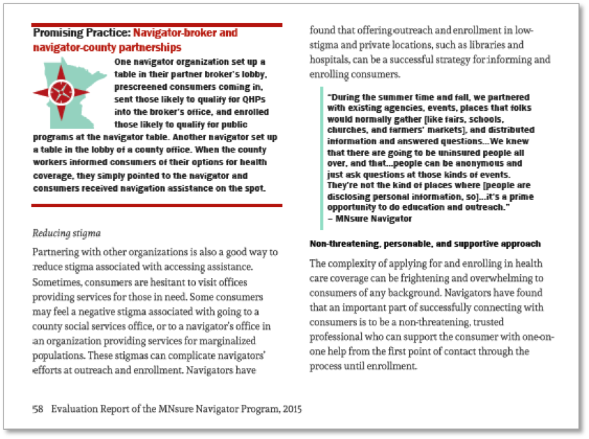
Determine how to distinguish content. Reports with multiple types of content (quotes, stories, findings, recommendations, etc.) need forethought as to how to inform the reader of the change in content and allow them quick access to specific content she or he is interested. Below is an example of how we treated text, quotes, and special callouts we captioned as a “Promising Practice” accompanied by a unique icon.
Lessons Learned: TEAMWORK!
Teamwork with roles and communication is paramount to pulling off a beautiful and functional deliverable. As the designer, it was essential to know the content and context; otherwise, the design and choice of images would have missed an opportunity to bolster the messages, or worse, misrepresented the content. As a team, for example, we brainstormed key words and situations that best represented the content of the report sections. From there, I was able to narrow my photo search and come up with a lot of good options for the team to choose from.
And by communicating as a team, my colleagues were able to inform me as to which bars in the charts should standout (i.e. filled in a red among gray bars) to avoid the default of highlighting the most extreme bar on a chart. The design has to direct the reader to what is important, otherwise it falls short of the message.
The American Evaluation Association is celebrating Data Visualization and Reporting (DVR) Week with our colleagues in the DVR Topical Interest Group. The contributions all this week to aea365 come from DVR TIG members. Do you have questions, concerns, kudos, or content to extend this aea365 contribution? Please add them in the comments section for this post on the aea365 webpage so that we may enrich our community of practice. Would you like to submit an aea365 Tip? Please send a note of interest to aea365@eval.org. aea365 is sponsored by the American Evaluation Association and provides a Tip-a-Day by and for evaluators.
Jill, this is such great advice and example. Thank you!