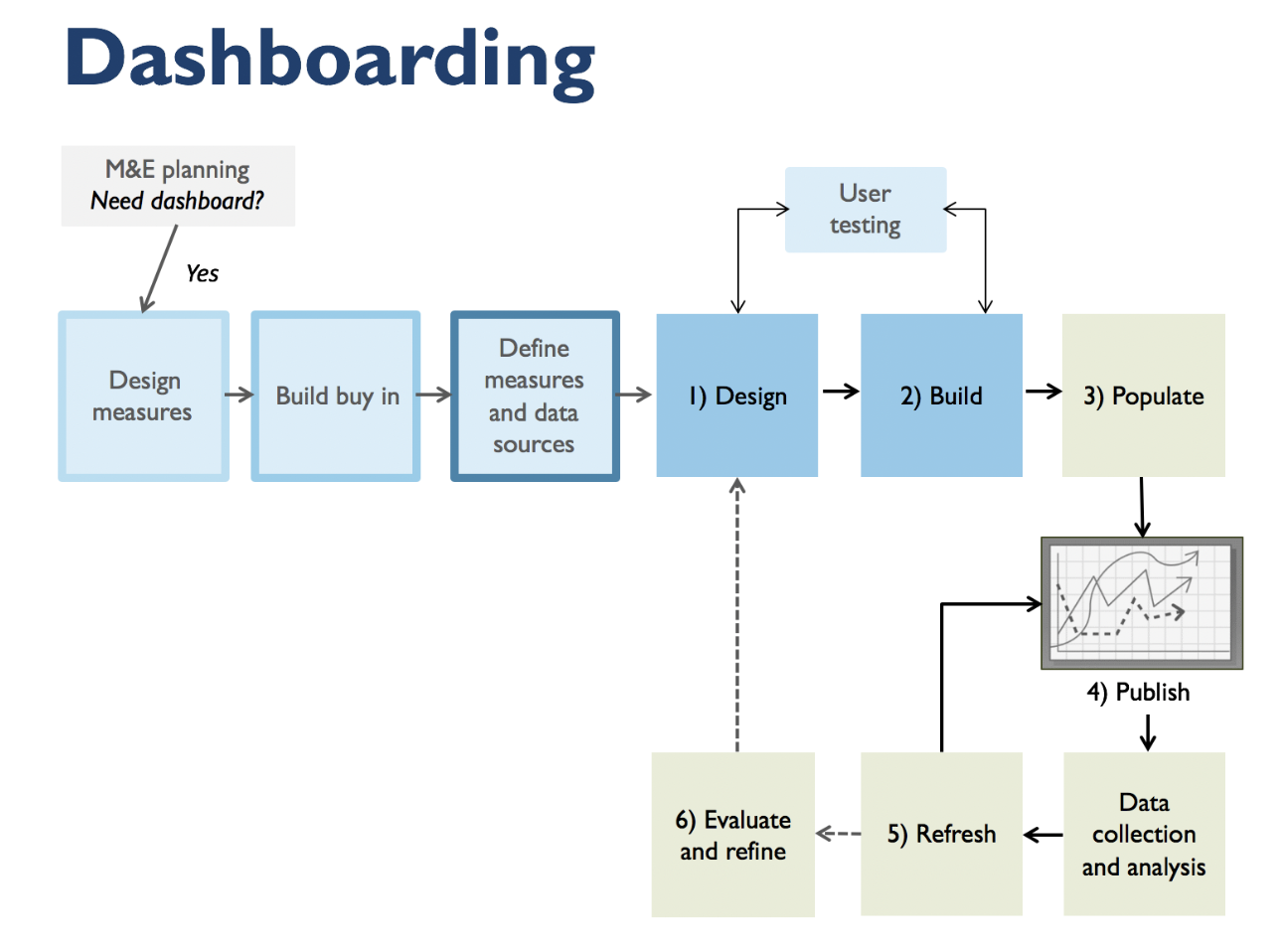
My name is Veronica S. Smith. I am founder and principal of data2insight–a consultancy with the imperative to help people use data to create high performing teams and solve the complex problems of our age. I coined the term ‘dashboarding’ in a chapter of a 2013 New Directions for Evaluation volume on data visualization. Dashboarding is defined as the process of designing, developing and using a dashboard.
The way that evaluators can employ dashboarding to speak truth to power is to ensure that stakeholders in positions of power are measuring what is meaningful and providing credible, timely, and relevant feedback for high quality team decisions and continuous improvement.
The field guide I am writing features case studies from evaluators, researchers, and other consultants. This post is a sneak preview from one case study provided by evaluator Korinne C. when she was a director of evaluation and research at a non-profit application development organization start up in 2015. Korinne provided hot tips based on her experience on a project that provided useful, accurate reporting on vaccination activity and increased field staff productivity in a health services organization providing services in West Africa.
Hot Tip #1: Get crystal clear on the dashboard’s purpose
It is common for stakeholders to want a dashboard to do many things. In Korinne’s case, headquarters, field staff, and facility staff each had different needs. The more features a dashboard has, the more explanations are needed for users. You want to make it easy for users to get what they need quickly and easily so they can be more effective in their work. One key to achieving this level of functionality is to start with a design specification. In a design specification meeting, you will want to ask questions like:
- How frequently will the dashboard be updated?
- What is the nature of the users?
- What are the required measures?
- What context is needed to make sense of the measures?
- What are potential responses to the measures? What key decisions are being made as a result?
- What is the hierarchy of importance of the measures?
- How are the measures related, if at all? How should they be grouped or sequenced?
- What technology will be used to view the dashboard? What is the screen resolution and ratio?
Hot Tip #2: Build in ample time for user testing
Watching people testing the dashboard and seeing what seems to be intuitive to people, and what needs to actually be written out or described is helpful. It helps evaluators see what users really need to know and what questions they want/need to answer. An audit feature on the dashboard is also helpful to continue to not only identify issues and support people as they take the dashboard into the field, but also to evaluate dashboard use, inform further development of the tool, and continually improve its usefulness.
Rad Resources: Check out data2insight’s website resources for doing better with data!
The American Evaluation Association is celebrating Data Visualization and Reporting (DVR) Week with our colleagues in the DVR Topical Interest Group. The contributions all this week to aea365 come from DVR TIG members. Do you have questions, concerns, kudos, or content to extend this aea365 contribution? Please add them in the comments section for this post on the aea365 webpage so that we may enrich our community of practice. Would you like to submit an aea365 Tip? Please send a note of interest to aea365@eval.org. aea365 is sponsored by the American Evaluation Association and provides a Tip-a-Day by and for evaluators.


I truly liked reading this article, it’s really good. I might have a couple suggestions though, but don’t want to cause a debate 😀 Keep up the great work, and ’til later! Regards