
Thank you for subscribing to aea365! AEA is aware of the issue impacting email receipt of aea365 blog posts. Our RSS Feed provider has announced a reduction in maintenance which has unfortunately resulted in sporadic email receipt of daily posts. AEA is transitioning to a new provider and intend to roll out a new, improved service in early September 2022! Until then, please continue to regularly check back to aea365 for daily tips, tricks, and resources for evaluators by evaluators. You may also add AEA365 blog’s feed URL – https://aea365.org/blog/feed/ – to your favorite RSS! Stay tuned for additional details! For questions, please contact AEA at info@eval.org.
Hello again! I am Lauren Serpe, chair of AEA’s Democracy, Human Rights and Governance (DRG) topical interest group, and Deputy Technical Director of the global Learning, Evidence and Impact team at Pact.
Increasingly, DRG evaluators have employed complexity-aware methods such as Outcome Mapping and Outcome Harvesting as methods that serve multiple functions: Fill gaps in indicators or constraints of quantitative data, uncover unintended and positive/negative outcomes, and empower project communities/partners to tell their stories of change.
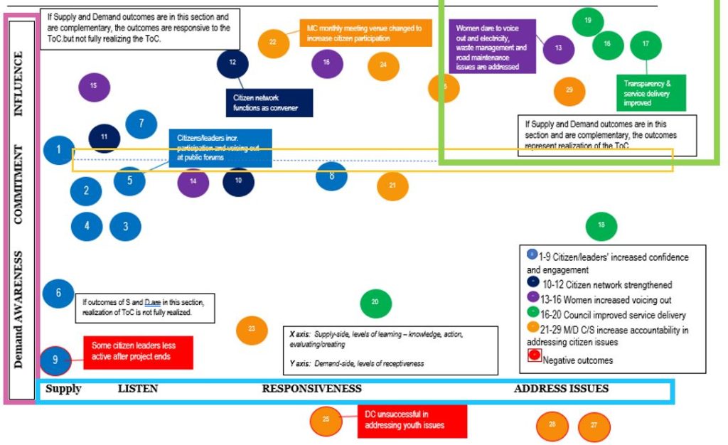
Evaluators have faced a common challenge in effectively communicating the method and findings in a concise and interesting way to different stakeholders. Multiple Pact projects have implemented Outcome Harvesting, and we have experimented to improve our use of visualization and analysis techniques. This has ranged from displaying simple frequencies of the outcomes collected like intended vs unintended consequences or the main stakeholder group experiencing the change. We progressed to visualizing outcome statements on the project theory of change (ToC) (see image below, showing outcome statements visualized using the ToC for a governance project that worked with citizens (y-axis) and government (x-axis).
At the European Evaluation Society (EES) Conference in June 2022, Pact led a reflection session with other Outcome Harvesting practitioners that resulted in a list of best practices in analyzing and visualizing Outcome Harvesting data. We have committed to continuing this discussion and sharing experiences and resources via the Outcomeharvesting.net Forum, a website with resources and an email listserv anyone can join to ask questions, exchange ideas and learn from other Outcome Harvesting practitioners.
Hot Tips
- For more nuance in the contribution analysis portion of Outcome Harvesting, respondents can assign the project’s contribution to the outcome on one of three categories: high, medium or low, or if the outcome occurred as a result of the project’s sole contribution, with some organizations’ influence, or not at all. Others use a 7-point scale with each contribution level well-defined, in contrast to a 1-10 scale where only 1 and 10 are defined. Evaluators can also ask about contribution of specific activities or approaches to the outcome to give more detailed insight into success project approaches.
- As outcome statements are also assigned a significance, a practitioner suggested matching high significance with high contribution and focusing analysis and visualization on this overlap.
- Triads have been found useful when facilitating discussions like sensemaking with the stakeholders providing the outcomes.
- Some practitioners noted specific chart types they like to use to visualize Outcome Harvesting data: Use outcome webs + colors show the significance; a web can show facilitating factors (and spillover factors); and spectrum display in Excel can be used to show each outcome on grid on a spectrum.
- One of the most critical pieces to a rigorous Outcome Harvesting process is the substantiation of outcomes. The standard is to substantiate 20% of outcomes, but practitioners face a challenge explaining why a sample is sufficient and how the data is also triangulated with other project data. When facing time or resource constraints, some practitioners have approached substantiation differently—such as substantiating internally with project staff checks—while being transparent about the reasons for any limitations of this approach.
- Finally, practitioners should share Outcome Harvesting analysis for stakeholder feedback to get their impressions and inputs on the analysis and how to make the data actionable for the project.
Rad Resources
- Outcomeharvesting.net
- Outcome Harvesting brief by Ricardo Wilson-Grau and Heather Britt
- Outcome Harvesting: Principles, Steps, and Evaluation Applications. By: Ricardo Wilson-Grau
- Better Evaluation: Outcome Harvesting
The American Evaluation Association is hosting Democracy, Human Rights & Governance TIG Week with our colleagues in the Democracy, Human Rights & Governance Topical Interest Group. The contributions all this week to aea365 come from our DRG TIG members. Do you have questions, concerns, kudos, or content to extend this aea365 contribution? Please add them in the comments section for this post on the aea365 webpage so that we may enrich our community of practice. Would you like to submit an aea365 Tip? Please send a note of interest to aea365@eval.org. aea365 is sponsored by the American Evaluation Association and provides a Tip-a-Day by and for evaluators. The views and opinions expressed on the AEA365 blog are solely those of the original authors and other contributors. These views and opinions do not necessarily represent those of the American Evaluation Association, and/or any/all contributors to this site.