Hi, I’m Craig Wiles, Senior Consultant at Public Sector Consultants in Lansing, Michigan. I provide research and evaluation services for clients in health and human services, education and the environment. I am sharing a tip on how to use Tableau as part of a data exploration process with a group of stakeholders.
To begin, I did the heavy statistical lifting outside of Tableau, so this would not lapse into a data-mining exercise. In this case, I worked with a state-level stakeholder group to identify data sources, research priorities, and statistically significant correlations in the data. Once we had our short list of correlated variables to explore in more detail, we convened a series of two hour, interactive data exploration sessions. At these sessions, we used Tableau to visually display the data (in this case, educational data), identify high and low performing school districts, and look for other obvious patterns or outliers in the data.
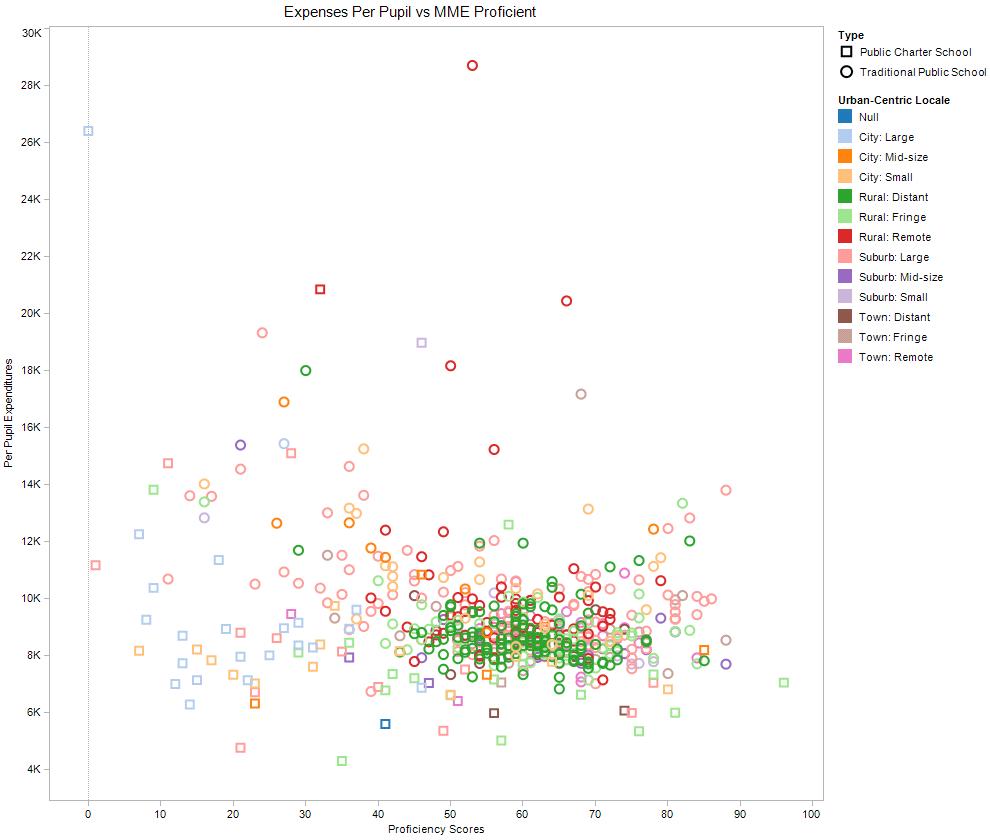
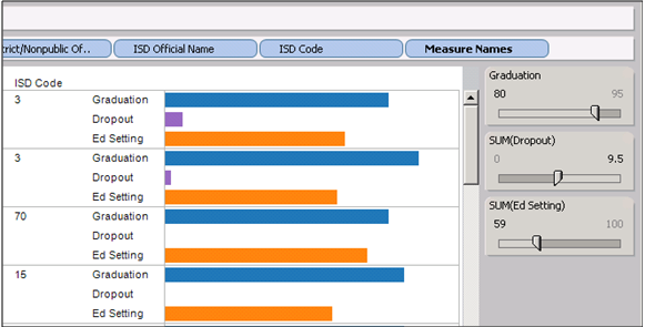
We tended to use stacked bar charts and scatter plots to help with this visual part of the data exploration. One tool in Tableau that was especially helpful in this context was the filter bar. Using the filter tool, we were able to adjust the range of scores we were looking for in our combination of variables according to tolerances set by the stakeholders. For example, we looked for school districts that had a high graduation rate, low dropout rate, and a higher ratio of students with disabilities in general education classrooms.
I recommend using Tableau for data exploration because it is:
- Visual,
- Interactive, and
- Builds capacity and ownership.
I could have presented this data in charts and graphs and led a typical ‘sit-and-get’ meeting and landed at the same place (conceptually) at the end of the day. This kind of visual and interactive process, however, really helped to engage my stakeholders, especially those that are usually averse to numbers and data. Ultimately, this was as much about the process as it was about the data.
After our interactive sessions, this group began a series of local focus group conversations with voluntary school districts to further explore the relationships we identified. This qualitative data has provided depth of detail and rich context to the quantitative relationships we explored together.
Using the filter tool:
Using a scatter plot:

Do you have questions, concerns, kudos, or content to extend this aea365 contribution? Please add them in the comments section for this post on the aea365 webpage so that we may enrich our community of practice. Would you like to submit an aea365 Tip? Please send a note of interest to aea365@eval.org . aea365 is sponsored by the American Evaluation Association and provides a Tip-a-Day by and for evaluators.


I know this is late…and you didn’t ask me, but in case someone else stumbled on this discussion and wondered where the line between “good” and “bad” data mining is, I think the line is drawn at whether or not there is a reason to (a) data mine, and (b) include the variables you’ve chosen. Is the study a-theoretical and exploratory? In that case, you might want to test out everything to see what comes out as being significant. Second, is there a conceptual or theoretical reason for you including variables or is it just a matter of throwing in every piece of data you have to see what correlated with something, anything?
Just my two cents worth.
Re “so this would not lapse into a data-mining exercise”
In some quarters (evaluation generally?) data mining seems to be seen as a bad thing.
But elsewhere there is a whole industry devoted to the development and use of data mining algorithms. I think there are some tools therein which could be useful, even for evaluators (see http://www.mandenews.blogspot.com/2012_04_01_archive.html)
How do you tell the difference between when data mining is “good” versus “not good” ?
regards, rick davies
Rick,
You make an excellent point, and I am intrigued by the decision tree tools you provided. I’m not sure I have hard and fast rules, but I can offer some additional clarification about our process.
Because Tableau is visual, there is going to be an element of picking and choosing – I think this is both good and bad. We wanted to engage our stakeholders in exploring the data, but didn’t want them to come away with misconceptions that led to ineffective allocation of resources.
In this case, we were trying to avoid having the visual nature of our exploration in Tableau lead to over-generalizations or identification of spurious relationships (we considered that to be bad). That’s why we developed a process to establish statistically correlated variables up front, and then (after relationships, clusters or outliers were identified visually), go back and verify/test again to see if the new observations were statistically significant (such as an outlier high-performing school district or cluster of low-performing school districts in a scatter plot).
Craig