
I am Amelia Kohm, Ph.D., the founder of Data Viz for Nonprofits (DVN) in Chicago. DVN helps organizations to effectively and beautifully present their data on websites, reports, slide decks, interactive data dashboards and more. Data visualizations can provide something that photos and case studies—for all of their visceral appeal—cannot. Context. Charts, maps, and graphs give us the critical context that we cannot see in a photo or in a story about one person. They show how prevalent a problem is, where it is occurring, or the impact of a program over time.
Data visualizations, of course, also have a downside. A chart, map, or graph is an abstraction that aggregates the stories of many individuals. And, as Joshua Smith points out: “It’s really hard to tell a powerful story in aggregate when all of the humans and all of their lives and moments and emotions are plotted under a single data point, often represented through a behavioral variable, e.g. “sales”, or “likes”. In aggregate, we lose all the parts and pieces that make characters relatable and memorable.”
So can we have the best of both worlds? Can we put photos and other information about real people into data visualizations? Yes! Consider one of these Hot Tips for Data Visualization:
1) Follow Individuals Through The Data
The idea is to explain an issue, a problem, or a situation through the stories of select individuals. Ludovic Tavernier explains the situation of Somali refugees through the stories of two Somali women. Ayaan and Shamshi, in a series of visualizations entitled Two Years Late. Tavernier labels particular data points to show where Ayaan and Shamshi fit into the larger picture.
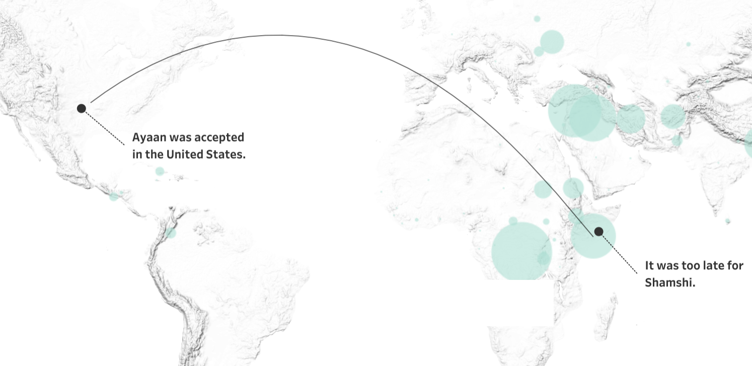
Source: Ludovic Tavernier (on Tableau Public)
3) Dot = Person
Another approach is to make each mark (e.g. dot, square, bar) represent an actual person and allow the viewer to scroll over marks to learn more about these individuals. This is Eve Thomas’ strategy in Stop and Search which shows the disproportionate rate at which Black people are stopped and searched in London.
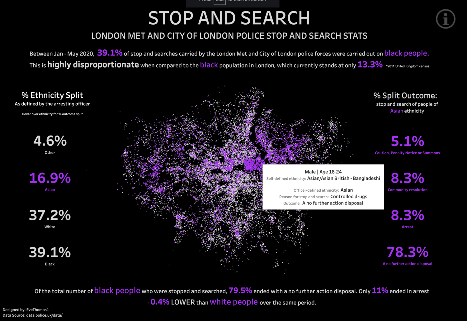
Source: Eve Thomas (on Tableau Public)
3) Show Both The Forest and The Trees
Perhaps the simplest strategy is to include both aggregated data (the forest) and disaggregated data (the trees) in the same visualization. The chart below shows the number of absences for both individual students and the average number of absences across all students.
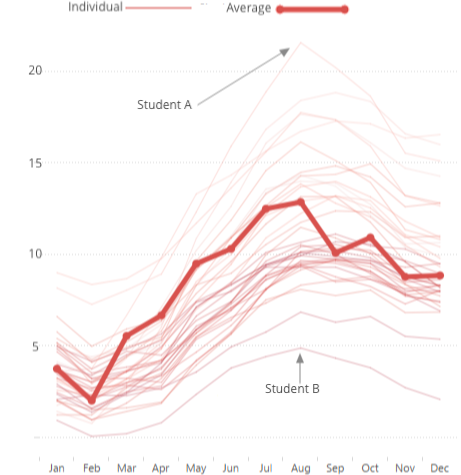
Source:Data Viz for Nonprofits
What do you think of these strategies? What are your strategies for displaying data about people?
The American Evaluation Association is celebrating Chicagoland Evaluation Association (CEA) Affiliate Week. The contributions all this week to aea365 come from CEA members. Do you have questions, concerns, kudos, or content to extend this aea365 contribution? Please add them in the comments section for this post on the aea365 webpage so that we may enrich our community of practice. Would you like to submit an aea365 Tip? Please send a note of interest to aea365@eval.org. aea365 is sponsored by the American Evaluation Association and provides a Tip-a-Day by and for evaluators.
Hi Amelia!
I am a Professional Master of Education student currently taking a course on program inquiry and evaluation. We recently had an opportunity to create a program evaluation design on a social program.
Your article outlines one of the issues that I had while deciding on how to present and share results. I chose the beneficiary assessment model, which focuses so much on the experience of the client and community. Categorizing and reducing participant stories to a single data point seemed like a disservice after asking them to share their most personal experiences.
I appreciated your suggestions for bringing real people into the visualizations. I can appreciate how displaying individuals in the pictures or by showing individuals as part of the greater whole will help eliminate the impersonalization of the data. I wonder if this could help the buy in of all stakeholders since they will be to more clearly see the people as individuals and not just as numbers. Visualizing in this way also makes the intangible, tangible for those who have trouble conceptualizing statistics.
I recently came across a website, Visual Capitalist (https://www.visualcapitalist.com/) that turns stats into really incredible visuals. I have found several helpful ones to use with my students. They have come up with some really creative ways to display information.
Jennie
Pingback: Anti-racism Pledge: 3-month Update » RK&A