
The posts for this week come from the Digital Data & Technology AEA Conference Working Group, and share how digital data and technology are factoring into reshaping evaluation.
Hi, I’m Amanda Makulec, MPH, the Executive Director of the Data Visualization Society and member of the AEA 2022 Digital Data and Technology working group.
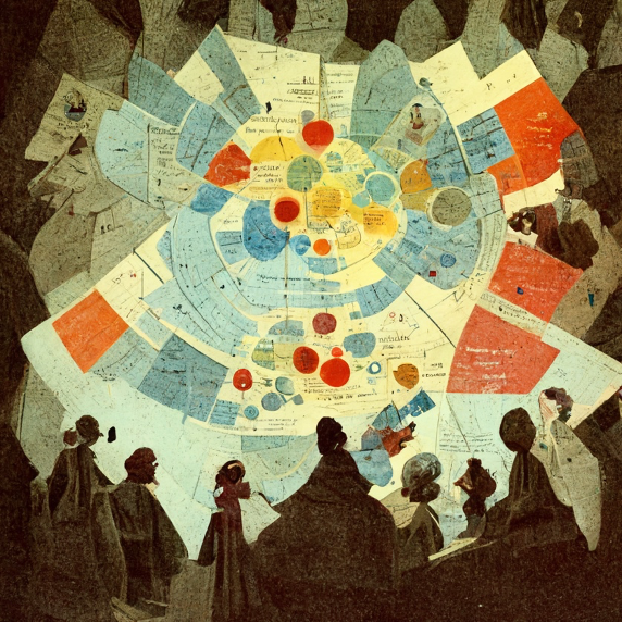
Reading charts and graphs has increasingly become a key task, not just in workplaces or when reading academic papers, but as we engage with the world around us. Yet we still see knowledge gaps around basic statistical concepts or how to evaluate the accuracy of a graphic, both here in the US and around the world.
Whether you talk about that gap as an issue of data literacy, numeracy, graphicacy, or something else, recognizing it exists should inform how we evolve educational systems and how we, as professionals, disseminate our learning. Thinking about the theme of this year’s AEA Conference—(Re)shaping Evaluation Together—and the goals around creating a more inclusive, decolonized field of practice raises three big questions for me.
What role do we play as evaluators and researchers in addressing the gap in data fluency? As evaluators, we are in the market of knowledge generation, exploring complex questions, and sharing our learning.
We’re also key players in study design and data collection. How data is collected and who is represented in that data is critically important to understand and communicate. Books like Data Feminism and Invisible Women have highlighted the ways women are systematically missing from large datasets used to inform medical research, product development, and policymaking. Researchers, data ethics experts, and advocates have pointed to the ways exclusion goes further for other historically marginalized populations, who can be targeted or have stereotypes perpetuated because of issues of bias and how data can encode systemic racism.
As we evolve our work to increasingly blend in open datasets and big data, we must interrogate how a dataset was built. We can be transparent on why we include various datasets in our analyses—in language that is more accessible than the technical jargon of a methods section—but also what data we chose not to use because of issues of bias or collection methods.
Who do we leave behind or exclude when we require data fluency to engage with the world? In the US, we’re not many decades beyond when there were literacy tests in order to cast a vote in an election. With our enthusiasm for data and information, are we inadvertently building new ways to exclude historically marginalized groups, who may not have the same access to education and resources?
As we think about ways to help a wider public engage with information, we need to meet people where they are, encourage their questions, and think broadly about the ways in which access to advanced education is a costly privilege not accessible to many. We should consider other paths to learn data skills that are more broadly accessible, like Coursera, and support inclusive initiatives around data literacy like Be Data Lit.
How can we use data visualization to connect people to information? While charts can lie, they’re also one of our best tools for communicating complex information in engaging and meaningful ways.
We can create more effective charts of evaluation findings by learning fundamental principles of data viz that help us go beyond tool defaults. We can think broader about information visualization, incorporating more frameworks, graphics, and visual metaphors into our publications. And whether we’re creating a bar chart or a conceptual graphic, we must be mindful of the many pitfalls around different visualization types that may misrepresent underlying patterns in information: specifically, bringing an equity lens into our visualization design efforts.
Rad Resources
Explore the resources from We All Count for plain language around data collection, analysis, and use.
If you’re looking to learn more about data literacy and visualization, industry leaders who share resources on this topic frequently include Sarah Nell-Rodriguez, Allen Hillery, and Bridget Cogley, all of whose insights and conversations influenced this article.
The American Evaluation Association is hosting Digital Data & Technology Week with our colleagues in AEA’s Digital Data & Technology Working Group. The contributions all this week to AEA365 come from working group members. Do you have questions, concerns, kudos, or content to extend this AEA365 contribution? Please add them in the comments section for this post on the AEA365 webpage so that we may enrich our community of practice. Would you like to submit an AEA365 Tip? Please send a note of interest to AEA365@eval.org. AEA365 is sponsored by the American Evaluation Association and provides a Tip-a-Day by and for evaluators. The views and opinions expressed on the AEA365 blog are solely those of the original authors and other contributors. These views and opinions do not necessarily represent those of the American Evaluation Association, and/or any/all contributors to this site.