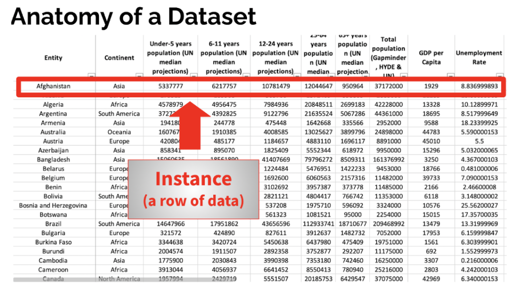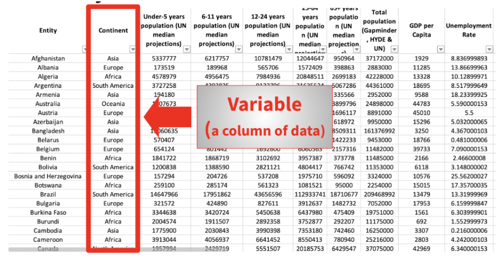
Hi everyone! My name is Elizabeth (Liz) DiLuzio, Lead Curator for AEA365. Today, I want to talk about data management. While I am no data analyst by training, I do have a lot of experience working with nonprofit, government, and foundation staff on their journey with data. I wrote a post a few years ago examining the data storage tipping point between spreadsheets and databases. Sometimes, however, moving right into a database isn’t a viable option. Whether it’s a financial constraint, a staffing limitation, or you’re a funder who doesn’t want to impose another database on your beneficiaries, an investment into dashboarding software might provide a nice intermediary step for you.
As shared in my previous post, spreadsheets are excellent data storage options under many circumstances, including when:
- There are only a few people who need to access the data.
- There is a small amount of data.
- The data are relatively simple in their organizational structure.
- The solution is not expected to be long term.


The larger the number of instances and/or variables in your Excel spreadsheets, the more difficult it becomes to locate, isolate, and analyze your data of interest. Enter dashboarding software, which gives you the ability to quickly summarize (think: PivotTables) and create relationships between (think: VLOOKUP, HLOOKUP, INDEX MATCH, PowerQuery, and more) multiple spreadsheets by drawing their data into this common platform. Relationships you create are easily saved and are not vulnerable to changes in column positions or additional rows of data the way that formulas can be.
When analyzing your data, it’s easy to switch between frequency tables for a quick pull of aggregate numbers and sophisticated, polished visualizations for sharing. What’s more: if sharing internally, these platforms enable the viewer to view the data behind the visualization without the ability to edit (think: mess up) the data.
Which Software Do I Choose?
In general, the UX (user experience) for all three platforms are very similar. If you know how to use one, you can figure out how to use the others. I generally recommend Google Data Studio as a good testing ground because it’s free. You can read posts about Data Studio here and here.
If your organization is not Google-based, it’s best to stick with de-identified data for security purposes. PowerBI is a natural preference for organizations that are Microsoft-based, with the understanding that PowerBI Online is free to use but not to share (unless you download your visualizations as a PDF). Tableau is probably the most popular option. Their payment structure is the opposite of PowerBI’s in that you pay for development licenses and then can share visualizations for free with Tableau Reader. I’m also a big fan of Tableau Prep, a separate program that enables you to automate data cleaning necessary before visualizing your data.
The American Evaluation Association is hosting Integrating Technology into Evaluation Topical Interest Group (ITE TIG) Week. The contributions all this week to AEA365 come from the ITE TIG members. Do you have questions, concerns, kudos, or content to extend this AEA365 contribution? Please add them in the comments section for this post on the AEA365 webpage so that we may enrich our community of practice. Would you like to submit an AEA365 Tip? Please send a note of interest to AEA365@eval.org. AEA365 is sponsored by the American Evaluation Association and provides a Tip-a-Day by and for evaluators. The views and opinions expressed on the AEA365 blog are solely those of the original authors and other contributors. These views and opinions do not necessarily represent those of the American Evaluation Association, and/or any/all contributors to this site.
