We are Rakesh Mohan, Lance McCleve, Tony Grange, Bryon Welch, and Margaret Campbell of the Office of Performance Evaluations, an independent agency of the Idaho State Legislature.
Last year, the Legislature asked us to explain how funds move through the Department of Health and Welfare—the agency with the state’s largest budget. Legislators, including budget committee members, had difficulty understanding the department’s financial information. Given agency complexities and its sheer number of financial transactions (over two million in 2013), no one in recent history had brought together the separate parts of its financial records to explain how the parts function.
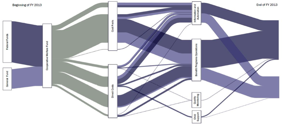
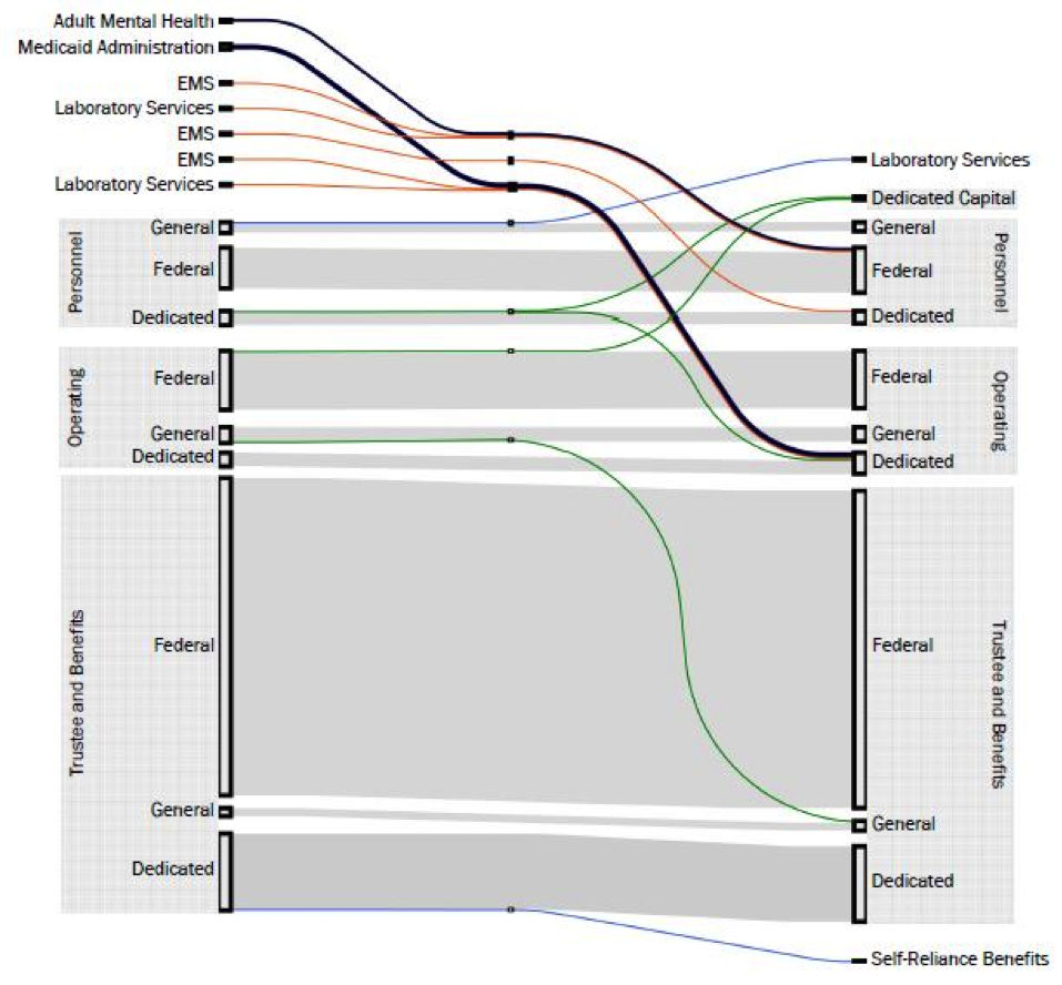
Communicating the flow of dollars was the trickiest piece of the study. We considered narratives, tables, and traditional flowcharts. Ultimately, we used Sankey diagrams that helped stakeholders visualize funds moving through the department making them the most useful features of our report.
One diagram shows how dollars flow through a program over a year.
The second diagram illustrates funds flowing into, out of, and within a program.
Sankey diagrams depict resources within a system by mapping their flow from an initial set of values to a final set of values. They were especially useful because the lines have widths proportional to their value throughout the system. Legislators could easily see the proportion of each fund throughout the flow. Initially we tried to create the diagrams in Visio, but manually sizing each line was extremely laborious.
Department officials were surprised how clearly our report presented complex aspects of their fund management. They are now using our report for in-house training. They also had us train them on creating Sankey diagrams for future reporting. The feedback from three key stakeholders further illustrates the usefulness of Sankey:
“This…really, really was a fine body of work.”
Representative Maxine Bell, Cochair, Joint Finance-Appropriations Committee
“The study does much to further enhance the transparency and understandability of the largest budget in state government.”
State Controller Brandon Woolf
“[The report] will provide valuable assistance for future planning.”
Governor Butch Otter
Hot Tips:
- We used 11×17 paper so the diagram would be big enough to show detail and keep the same orientation as the text.
- Subtle colors within similar families were more effective than contrasting colors. We also made colors transparent to clarify intersecting lines.
- We wanted to edit text during publishing, so we imported the diagram as an image and added text within the publishing software.
Rad Resources:
- We purchased e!sankey, which comes in two versions. The pro version allowed us to link to data in Excel.
- Google Charts Sankey
- Sankey Diagram History
The American Evaluation Association is celebrating Data Visualization and Reporting (DVR) Week with our colleagues in the DVR Topical Interest Group. The contributions all this week to aea365 come from DVR TIG members. Do you have questions, concerns, kudos, or content to extend this aea365 contribution? Please add them in the comments section for this post on the aea365 webpage so that we may enrich our community of practice. Would you like to submit an aea365 Tip? Please send a note of interest to aea365@eval.org. aea365 is sponsored by the American Evaluation Association and provides a Tip-a-Day by and for evaluators.


Rakesh, Lance, Tony, Bryon, and Margaret — great work!
Thank you much, Ann. Sorry for the late acknowledgement.
Pingback: Why Are Evaluators So Tentative about the Advocacy Aspect of Our Profession? (Guest Post by Rakesh Mohan) | Evaluspheric Perceptions
Thank you much, Sheila. Sorry for the late acknowledgement.