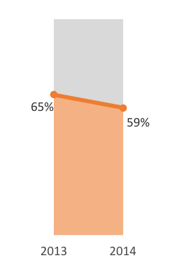
Hello, friends! My name is Yuqi Wang, and I work at Innovation Network. I love figuring out different ways to visualize data, and I want to show you how simple it is to create one of my favorite graphs in Excel—what I like to call the “filled-in bar chart.”
- Set up your data
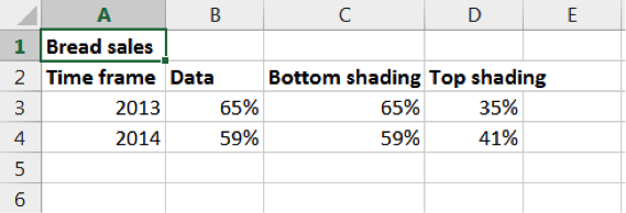
List the two time frames in Column A in excel, and label the column “Time frame.” In Column B, enter the two corresponding data points, and label it “Data.”
Hot Tip: This graph works best with percentages, so other than time frames, make sure the rest of your data points are in percentages.
Next: to give our chart the filled-in effect, label Column C “Bottom shading,” and enter the same numbers from Column B in the same order. Then label Column D “Top shading,” and enter the percentage you get when you subtract each of the numbers in Column C from 100%.
Your spreadsheet will look like this:
2. Visualize your data
Highlight the eight data points, and insert a chart. It doesn’t matter which one because we’ll be creating a combination chart. This step is to create a base for our finished graph.
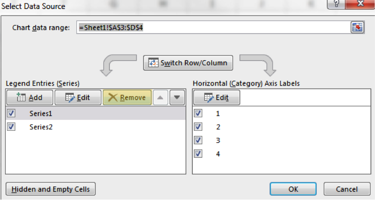
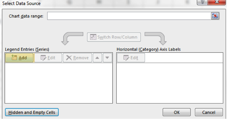
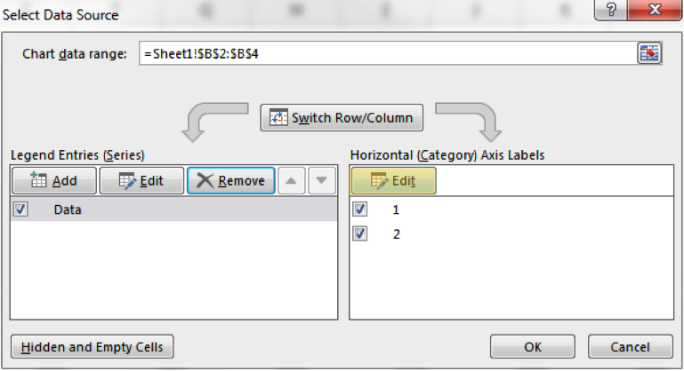
Right click on the chart, and click “Select Data.” Remove all the series under “Legend Entries” because we’re going to enter our own data sets. The prepopulated series will not create the type of graph we want.
Under “Legend Entries,” click on “Add.”
In “Series name”, select the cell that contains the word “Data,” and for “Series values” select the data set under “Data.” Click “Ok.”
Next, find the “Horizontal (Category) Axis Labels” section, and click on “Edit.”
In the “Axis label range” box, highlight the two timeframes, and click “Ok.”
Repeat the entire process for “Bottom shading” and “Top shading.”
3. Reformat your data
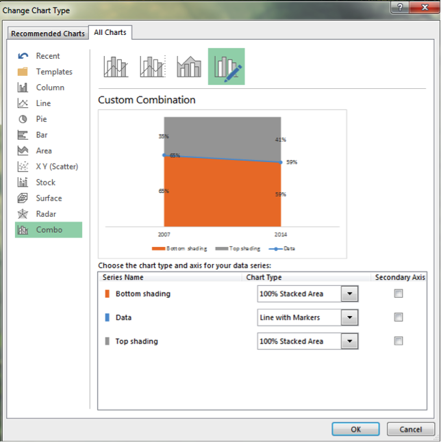
After you have your chart, right click on your graph, and select “Change Chart Type”. Under the list of charts, select “Combo,” and within that, choose “Custom Combination.”
“Bottom shading,” “Data,” and “Top shading” data will be displayed, along with the ability to change each data set’s chart.
Choose “100% Stacked Area” chart for “Bottom shading” and “Top shading.” Then choose the “Line with Markers” chart for your “Data.” Click “OK.”
You’re almost done! Delete the numbers you don’t want, delete the legend, and play with the chart size and colors!
Hot Tip: You can create a small multiples chart by copying and pasting multiple filled-in bar charts together!
Do you have questions, concerns, kudos, or content to extend this aea365 contribution? Please add them in the comments section for this post on the aea365 webpage so that we may enrich our community of practice. Would you like to submit an aea365 Tip? Please send a note of interest to aea365@eval.org . aea365 is sponsored by the American Evaluation Association and provides a Tip-a-Day by and for evaluators.



Hi Yuqi – great tip! I can already see some applications of this for our work.
I tried to recreate this in Excel but I believe I’m missing a step. Can you help? It appears my line is centered on the two bars rather than at each end, making it less neat and tidy than yours. Picture here: http://bit.ly/1OgmxS3
Thank you!
Hi Yuqi,
Nice visualization, but could you create the same thing easier using an Area Chart and changing the plot background colour?
Yes, especially since my version does not have combo charts. Thanks for the suggestion!
Except that I cannot figure out how to put narrow the resulting chart – space between 2013 and 2014.
Hi Yuqi. That is a cool chart! However, I only have Excel 2010 and there is no combo chart option. Do you have to have 2013 or 2016, or is it possible with 2010?
Yuqi- Thanks, this is a nifty tip !! I really like the top shading so that it gives a subtle reminder of the overall proportion.