My name is Jonathan Schwabish, and I’m a senior fellow at the Urban Institute, where I help colleagues improve how they visually communicate their work through better data visualizations and presentations.
The Urban Institute data visualization team will soon publish an updated data visualization style guide. Though the first official Urban Institute Data Visualization Style Guide was meant to be a living document, it hadn’t been substantially updated or revised since 2015. With a new style guide ready to roll—along with a series of open-source tools to develop consistent and effective charts, graphs, and diagrams—we can show you how rad a resource a style guide can be for you and your organization and how you can start your own.
Where to begin
A data visualization style guide helps ensure uniformity across charts, graphs, and tables and lessens the burden of figuring out various color, font, layout, language, and style considerations.
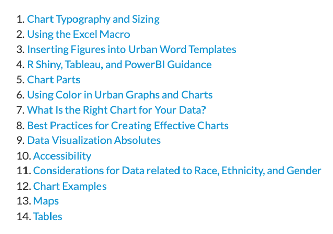
Our new guide consists of 14 parts, which admittedly is a lot, but one of our goals was to consolidate more than 10 years of data visualization, editorial, language, accessibility, and tool guidance into one place.

If you’re just beginning a style guide, all of these sections may not be necessary—start with basic guidance on color, font, and layout. For color, you should define the core palette, as well as a sequential (e.g., for when data range from low to high) and diverging (when values vary from a central value) palettes. For font, be sure to provide the actual font files (we use the open-source font Lato) and specific sizes, thicknesses (e.g., bold, regular, light), and positions (i.e., should titles be centered or left-aligned?) to place them in when creating a chart.

What else to include
We’ve also found that providing tools specific to Urban styles is helpful not only for consistency but also to help researchers new to data viz create something compelling. We built an open-source Excel add-in that can create and style Urban graphs with a click. (And yes, you will be able to get your own copy of the add-in to modify for your needs.) Urban staff built the urbnthemes R package, which extends R’s ggplot2 data visualization library with print and map themes, as well as tools that make plotting easier.
Effective storytelling hinges on accurate, illustrative data viz. Each section of our style guide aims to support accessibility, advance equity through design decisions, and represent the reality of the communities we seek to help. Adding sections on selecting the right chart for your data (the wrong chart can skew the truth—or mislead readers to an incorrect conclusion) and considerations for data related to race, ethnicity, and gender can help produce better data viz and support your organization’s mission.
We’ve made this guide public in the hope of creating a resource for other nonprofit and research organizations and to benefit the wider data visualization community. We plan to update and expand the guide depending on the changing needs of Urban staff members and evolving technologies, tools, and publication types. In the meantime, we invite you to explore the guide, download the resources, and modify and use the open-source tools.
Rad Resources
1. Urban Institute Data Visualization Style Guide
2. Introducing the Urban Institute Data Visualization Style Guide’s Open-Source Excel Add-In
3. Urban R Users Group and urbnthemes R package
The American Evaluation Association is hosting Urban Institute week. The contributions all this week to AEA365 come from staff at the Urban Institute, a nonprofit research organization that provides data and evidence to help advance upward mobility and equity. Do you have questions, concerns, kudos, or content to extend this AEA365 contribution? Please add them in the comments section for this post on the AEA365 webpage so that we may enrich our community of practice. Would you like to submit an AEA365 Tip? Please send a note of interest to AEA365@eval.org. AEA365 is sponsored by the American Evaluation Association and provides a Tip-a-Day by and for evaluators. The views and opinions expressed on the AEA365 blog are solely those of the original authors and other contributors. These views and opinions do not necessarily represent those of the American Evaluation Association, and/or any/all contributors to this site.
