Hi, I’m Ann K. Emery—an evaluator-turned-dataviz-designer.

Ann K. Emery
Humor me: Comment and let me know how you’d define the term “dashboard.”
Lesson Learned: There are Lots of Correct Definitions of Dashboards
A couple months ago, I asked my newsletter readers for their definitions:
- “A dashboard is an at-a-glance – and brief – document or interactive space that allows the user to provide easy to understand highlights about a specific topic (e.g., a project, issue, demographic, etc.) for a specific range of time. Typically, it is the most up-to-date information.” – an evaluator at a Department of Children and Families in the northeast U.S.
- “A tally of metrics every (monthly, quarterly, yearly). All countable, but not necessarily things that count.” – an evaluator in Alberta
- “This is a new term to me. Although I’ve heard it on the news and have a general idea about what it means, it’s not a term I use, and I don’t have a clear idea what it means. I have assumed that it’s some type of electronic platform where people present raw data for others to view.” – a communications specialist working with evaluators
- “A term clients always want but never understand. Must be flashy, constantly changing, and include 9,000 different data sources.” – an epidemiologist
(Yes, I love that last one, too!)
These are all correct definitions. But that’s the problem.
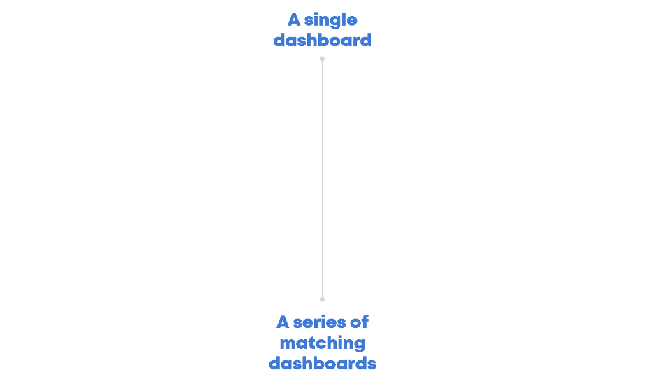
Hot Tip 1: Decide Whether You Need a Single Dashboard or a Series of Matching Dashboards
Here’s how we need to start talking about dashboards.
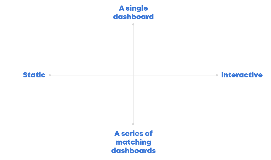
Do we need a single page/screen that provides a project overview? Or, do we need a series of matching dashboards (e.g., one per school)?

Hot Tip 2: Decide Whether Your Audience is Technical or Non-Technical
Static dashboards are PDFs, handouts, one-pagers, etc. They’re adored by non-technical audiences who appreciate having all the key info laid out for them.
Interactive dashboards are adored by technical audiences—the number-crunchers who love spending tons of time uncovering nuances in the data.

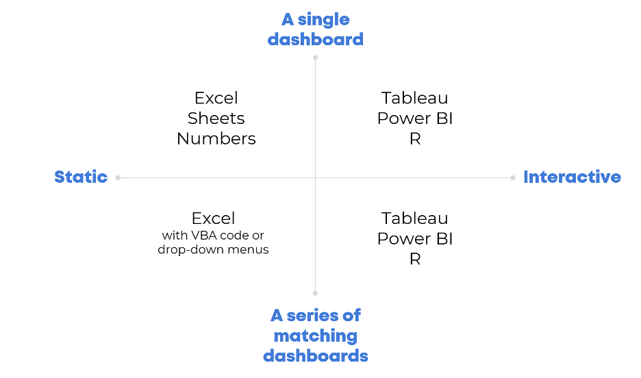
Hot Tip 3: Choose a Software Program Based on the Quadrant
Software decisions should come after these planning conversations—not before!
Need a static dashboard? Use a spreadsheet program like Excel, Sheets, or Numbers.
Need an interactive dashboard? Use an interactive dashboard program, like Tableau, Power BI, or R.

Lesson Learned: Too Many Interactive Dashboards Should Actually Be Static
“Senior leadership definitely doesn’t have the time to drill-around and look at it like I do. They always say they want the option to, but in reality they need a quick snapshot,” an HR coordinator told me recently. I agree 100%.
I used to design interactive dashboards for clients. I don’t anymore because I’m tired of making things that don’t get used. It’s a better use of the project’s budget–and my life energy–to design static dashboards that leaders actually need.
The next time you’re asked to design a dashboard, talk through these dashboard types with stakeholders. Then, comment below and let me know which type(s) you chose.
Do you have questions, concerns, kudos, or content to extend this aea365 contribution? Please add them in the comments section for this post on the aea365 webpage so that we may enrich our community of practice. Would you like to submit an aea365 Tip? Please send a note of interest to aea365@eval.org. aea365 is sponsored by the American Evaluation Association and provides a Tip-a-Day by and for evaluators.

great overview from Ann and super practical. will help in those conversations with bosses/clients “we need a dashboard” – as if that will solve other organizational issues…. thanks AEA for these 365s – easy to digest and thanks Ann for sharing her experience and insights