I’m Taj Carson, the President of Carson Research Consulting (CRC) in Baltimore, MD. CRC is a research and evaluation consulting firm and we’ve seen first-hand how neighborhood-level data is increasingly being used for tasks such as identifying community conditions and trends or measuring population-level outcomes in research and evaluation.
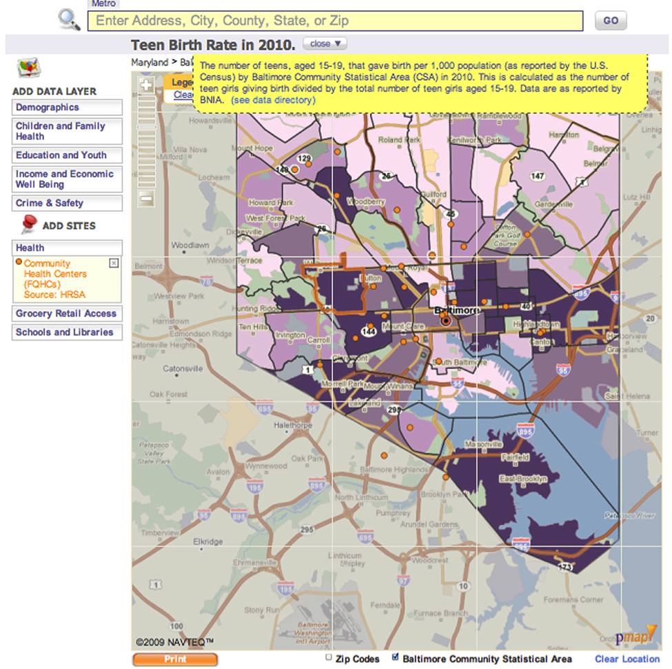
Recently, I was in a meeting where a group of human service providers met to discuss where to locate a program for pregnant and parenting teen mothers in Baltimore City. They realized that what they really needed to know was— which communities have the highest teen birth rates in Baltimore? A colleague went into a storage room and retrieved a huge, styrofoam-backed map from 2008, showing teen birth rates across the city, so the group could decide where to locate the program. While I was impressed with the fact that they valued data enough to use it in the early planning stages, and that they were actually able to remember where they had stashed a map from 2008, I was encouraged to get the word out about the DataMind as an interactive mapping tool that would allow them to see this information without rummaging around in a closet.
Lessons Learned:
- Creative, forward thinking program planners know when to bring data to the table to make decisions.
- While there is a wealth of available data on our communities, we are short on ways to visualize that information on the spot and identify patterns across different parts of the city.
- Visualizing several data sources together in an interactive map allows for a more complex understanding of data, even if it is on paper.
Rad Resource: The Baltimore DataMind is an interactive mapping tool that allows users to visualize data for Baltimore City neighborhoods to promote collaboration, advocacy, informed decisions, and effective policy making. Users can compare data across neighborhoods, create a community profile of a neighborhood, and combine data indicators and community resources and assets in one map. In the above-described situation, the Baltimore DataMind could have provided the information this group needed by looking at the “Teen Birth Rate” data in the Children and Family Health Indicators section of the map. They also could have mapped out the location of schools and community health centers in those neighborhoods. Hot Tips:
- You Don’t Have to be a GIS Expert: Neighborhood-level data could have easily been pulled up in theBaltimore Datamind “widget” in an easy-to-use interface developed by Policy Map.
- Data can be shared: The maps can be printed and then shared with neighborhood stakeholders, funders and community residents.
Do you have questions, concerns, kudos, or content to extend this aea365 contribution? Please add them in the comments section for this post on the aea365 webpage so that we may enrich our community of practice. Would you like to submit an aea365 Tip? Please send a note of interest to aea365@eval.org . aea365 is sponsored by the American Evaluation Association and provides a Tip-a-Day by and for evaluators.


Great post, but I couldn’t help but finish the sentence, “The maps can be printed and…” with “stored in a closet for 5 years.”
This article was forward to me by one of my peers in a mentoring list serve because he knows of my long-term commitment to using maps to support planning and leadership decisions intended to make more mentor-rich youth programs available in high poverty neighborhoods. I started using maps in 1994 and have been doing so, with mostly volunteer help, since then. I encourage you to take a look at the Tutor/Mentor Program Locator and Map Gallery at http://www.tutormentorprogramlocator.net. I’d love to join discussions with you and others of ways cities and businesses can use maps in this way.