I’m Susan Kistler, AEA’s Executive Director, and contributor of each Saturday’s aea365 post. Many moons ago, I taught survey design and worked as a consultant and trainer with a focus on evaluation planning and instrument development for nonprofit grantees. Today, I want to draw on that background to start an intermittent series on online surveying and to talk about one of the basics of online survey development – getting categorical and multiple choice questions in the right format for the online environment.
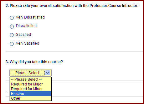
Hot Tip – Creating Categorical Questions: When you have a question for which you want respondents to choose one (and only one!) answer from a pre-defined list, the most common options are to use questions with radio buttons or, usually for a longer list, a pull-down menu. Here is an example of each from a post-course survey.
Lesson Learned: When a respondent selects a second answer, or changes an answer, for a forced-response question in either format, any other answers will automatically be deselected.
Lessons Learned: Radio buttons look like little bullets or unfilled dots. These are a consistent visual cue to your respondents that they can and should select only one answer.
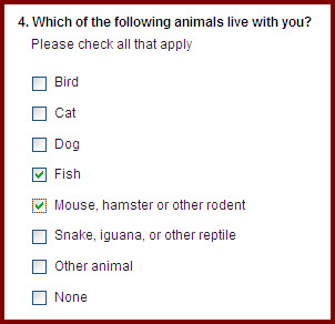
Hot Tip – Creating Multiple Choice Questions: When you have a question for which you want respondents to choose one or more answers from a pre-defined list, the most common option is a checkbox question, such as the following:
Lesson Learned: When a respondent selects a second answer, or changes an answer, when using a checkbox question, any previous responses remain selected.
Lessons Learned: Checkbox questions put a little checkbox to the left of each response option and insert checks in those boxes when selected. These are a consistent visual cue that it is acceptable to select more than one response – but it is still good practice to note that multiple selections are ok in the question instructions.
Hot Tip – Just say no! In some survey programs, you can set a pull-down menu to allow for more than one answer by having your respondents hold down a special key such as Ctrl or Shift when making a second (or third…) selection. I don’t recommend this for two reasons – (i) since pull-down menus are predominantly used for single selection responses, users reading quickly are likely to choose only one response; and (ii) the secondary selection keys often do not translate consistently (if at all) across web browsers, hardware (mac vs pc), and reading devices – especially mobile devices such as iPads.
Rad Resource: Amy Germuth offered a great workshop on Improving Survey Quality at this year’s AEA/CDC Summer Evaluation Institute. She has graciously shared her handouts here in the AEA Public eLibrary. While not explicitly focused on online surveying, her guidance is broadly applicable.
Coming Soon: Formatting qualitative response questions and key terms in online surveying
Do you have questions, concerns, kudos, or content to extend this aea365 contribution? Please add them in the comments section for this post on the aea365 webpage so that we may enrich our community of practice. Would you like to submit an aea365 Tip? Please send a note of interest to aea365@eval.org. aea365 is sponsored by the American Evaluation Association and provides a Tip-a-Day by and for evaluators.


Pingback: Shortcut Week: Corinne Poth on Skip Logic for Surveys | AEA365