My name is Susan Kistler and I am the American Evaluation Association’s Executive Director and aea365’s regular Saturday contributor.
AEA has a vibrant community on AEA’s LinkedIn Group, open to members and nonmembers alike. We wanted to take a look at the change in subscribers over time and to learn more about the group’s composition.
Hot Tip – LinkedIn Group Stats Dashboard: In November of 2011, LinkedIn launched a new group stats dashboard. Every group now has a dashboard that group members can view, and in many cases that the public can view as well. You can access AEA’s stats dashboard by clicking here.
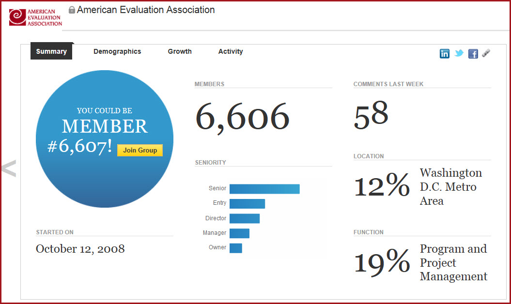
The dashboard includes summary statistics, demographics, growth information, and a weekly activity summary. The screenshot below shows the first page, but it is worth clicking through to explore a bit.
Lessons Learned – Examining the Dashboard: I had recently moderated an AEA Coffee Break Webinar featuring Veronica Smith speaking about designing data dashboards (if you are an AEA member, you can access the free recording in the archive here, if you aren’t, wouldn’t you like to join?). Was this one designed well, I asked myself?
It had current key performance indicators (KPIs). I could find the subscribers, basic information about their demographics, and the volume of discussion and comments in the past week. All useful. But a number of things were missing, most noticeably:
1. Filtering and drilldown: I couldn’t filter what I was seeing to look at a particular timeframe or drill down to learn more about the group’s subscribers from a particular region. We have noted that many of the new LinkedIn subscribers are international, hailing from many countries including a considerable representation from developing countries and countries in transition. However, I couldn’t find anything out about them – not even a breakdown of domestic versus international.
2. Longitudinal data: The dashboard offered very little longitudinal data to explore change over time, and what could be found required mousing over individual bars to understand. The annotations, red lines, and even the years in the snapshot below, I had to add myself in a graphics program. However, it was useful to be able to see the history across years. With a little work I could see the increase in average weekly subscribers in 2011 and again in 2012, and it made me want to learn more – but there was no way to segment and explore the newer versus older subscribers.
New Subscribers by Week Over Time
 At this point, I want to applaud LinkedIn for starting to help its group owners to understand more about their subscribers, but there is a long way to go. Using the dashboard made it clear that there are unanswered questions (why did we jump so much in the first two months of 2012?), but also that we’ll need to turn to other avenues for answers.
Have you seen a great public dashboard? One that needs improvements?
Do you have questions, concerns, kudos, or content to extend this aea365 contribution? Please add them in the comments section for this post on the aea365 webpage so that we may enrich our community of practice. Would you like to submit an aea365 Tip? Please send a note of interest to aea365@eval.org. aea365 is sponsored by the American Evaluation Association and provides a Tip-a-Day by and for evaluators.

