My name is Susan Kistler, AEA’s Executive Director, and I contribute each Saturday’s aea365 post. I love finding ways to make data understandable and useful. My very first aea365 post was on Data Visualization and I gave a presentation at the 2010 AEA/CDC Summer Evaluation Institute on the Democratization of Data Inquiry (the handout, with links to example tools, may be downloaded here).
Today, I want to take a different tack and think about the intersection of art, data, and representation, being careful not to imply that beautiful graphs are not art (Tufte immediately comes to mind). Yet I hope to move beyond the printed page or the webpage through providing two examples from recent museum exhibits.
Lessons Learned: In August of 2009, I attended Roman Ondak’s “Measuring the Universe” at the Museum of Modern Art in New York. The performance exhibition consisted of having docents mark the name, height, and date of people entering a large white walled room, with each exhibit goer standing against the wall. The result was a compelling representation of participatory research in which each person contributed a data point to the resulting artwork which built over the course of a couple of months to depict the distribution of heights of New York city museum goers. My two pictures above do not do the exhibition justice – see the MoMA exhibit online for more information. I found the piece to be powerful as was the eagerness with which museum-goers, from children to seniors, wanted to participate and be recognized via measurement and recording.
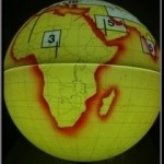
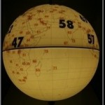
Lessons Learned: In July of 2010, I visited The Tech Museum in San Jose. They had a small exhibit full of internally lit globes. Upon each globe, someone had painstakingly painted or brushed colors, added text and numbers, and illustrated a range of demographic data – the glowing yellow one above shows percent of the world’s energy use by region and the browner one is life expectancy. Again, my flat pictures do not do justice to the beauty and intrigue of the globes around which visitors from many countries walked or ducked or stood on tip toe to locate their selves within the broader context. Like the MoMA exhibit, the globes created a compelling expression of data in a way with which users wanted to interact and learn.
My question is to aea365 readers to ask if you have examples to share of data representation that bridged the gap between tables and graphs and artistic expression. What have you done? What has worked? Share in the comments section of this post (click back to the post online if you are receiving this via email or RSS), or send me an email at susan@eval.org and perhaps we can develop an exhibit space!


I loved the post … particularly since I saw the MOMA exhibit last time I was in NYC. While I don’t know that it qualifies as data, I was reminded of Yoko Ono’s “Painting to Hammer A Nail” that was included in an exhibition at the Seattle Art Museum last year. You can see the evolution of the piece towards the end of this interactive link: http://www.seattleartmuseum.org/exhibit/interactives/target/targetFinal.asp
Enjoy, Dawn
Hi Susan,
I organized a topical discussion on the meaning of mental health in indigenous, island, and immigrant populations at a mental health conference last year. After two presentations by evaluators from Hawaii and Guam, I posted a large, blank map of the U.S. and territories on the wall and had participants place little post-its in the areas where they worked with various populations. After summarizing the picture on the map, participants broke into small groups to work through a series of questions.
At the time, the program I worked with had a pretty strong tribal track where mental health issues related to tribes were put forth. But there had not been a lot of talk about mental health issues pertaining to other, non-Western groups. The map got everyone moving around and provided a large-scale visual for folks to see where all the populations were, particularly immigrant populations that settled in various parts of the U.S.
Jennifer Dewey