I am Shirah Hecht and am an independent researcher and non-profit program evaluator. Qualitative data can be overwhelming, and challenging to reach valid conclusions. Here is the first of two methods to move qualitative data efficiently from analysis to presentation using common desktop software.
Excel’s Pivot tables lets you flexibly create subgroups and report standard quantitative summary measures on them. Learn about Excel Pivot Tables here. Use the simplest subgroup descriptors – count and percent – to categorize and summarize qualitative responses (i.e., narrative comments) in two steps.
STEP ONE. Create the dataset. Enter each comment into a cell, with “Comment” or the prompt-question as the header, and attach a unique ID to each. Then, reading each comment, develop and enter codes for meaningful themes. Each theme header is a “variable” for this new dataset.
The table shows sample results of this step: each response is in a cell in one column, with ID to the left. Each column header to the right names a theme identified, with codes you enter below.
STEP TWO. Analyze the results. “Pivot” the coded results, to find the number and percentage of comments in each thematic category.
Here’s a basic “recipe” for Pivoting the coded results.
- Place ID in the “Values” box (summary data) and use “Value Field Settings” to select COUNT.
- Enter ID again as COUNT. Then use “Show Values As” tab to select PERCENT IN COLUMN TOTAL.
- Place the theme you’d like to trace (e.g. “Theme1”) in the “Row Labels” box.
- Option: Place the comment header (“Comment”) in the “Row Labels” box also.
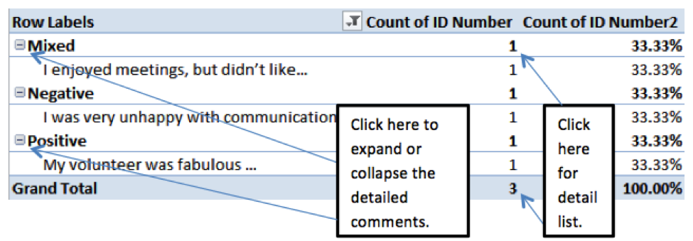
The resulting table shows the count and percent of responses in the different theme categories.
- Double-click on a COUNT: a new window will show all those comments.
- Re-code comments to clean categories conceptually; then refresh table.
- Re-group, re-order and re-label categories for analysis and reporting.
- Copy and paste comment lists or a table into your report.
This Pivot Table visual shows how you would see the three comments given above.
Lessons Learned:
- Copy focus group comments easily into Excel by typing in paragraphs: person, colon, comment.
- “Power through” coding. Keep concepts clear: does it go in this category or another one?
Hot Tips:
- Use one spreadsheet for each open-ended question.
- For multiple codes, duplicate the comment with a new ID.
- Create ID numbers for focus group comments, in discussion order.
Rad Resources: Pivot tables uses OLAP technology, which goes beyond the standard crosstab table. You can learn more about the connection between the two here.
My favorite text for writing surveys, which include open-ended questions: Seymour Sudman and Norman S. Bradburn, Asking Questions: A Practical Guide to Questionnaire Design.
Do you have questions, concerns, kudos, or content to extend this aea365 contribution? Please add them in the comments section for this post on the aea365 webpage so that we may enrich our community of practice. Would you like to submit an aea365 Tip? Please send a note of interest to aea365@eval.org . aea365 is sponsored by the American Evaluation Association and provides a Tip-a-Day by and for evaluators.


___123___Shirah Hecht on Common Desktop Software for Qualitative Data Analysis Part I: Pivot Tables in Excel: Open-Ended Survey Responses and Focus Group Comments – AEA365___123___
Thank you Jens Hansen! You are also absolutely correct. I have not yet figured out how to explain *how* to develop those codes fully, which come from processing the information in your head, in light of your goals…with, yes, multiple codes for a given bit of content. With limited space, that couldn’t be explored here, even if I could explain it clearly.
The part of “power through” that I do encourage is that, once you do have a sense of what themes you’re coding for, it’s easier to complete it without a lot of time-breaks in the middle. Otherwise, you may lose your “concept” that was driving your coding, which makes it hard to continue consistently and then to create a summary that reflects what you put in that category with some consistency.
Good on you, Shirah, for sharing simple approaches to a complex process in a straightforward manner. In a sense, after labeling your data, you’ve used Excel to cut and sort – a process that was used in yesteryear by researchers undertaking QL research for its own sake or for evaluation purposes.
Be cautious though, about the “Power Through” coding: it’s not always a straight forward matter of does it go in one category or another one? Sometimes it can go in both of them (as opposed to a mixed category).
Cheers
Jens