Hello! My name is Rhonda Williams, and I am a Research and Evaluation Analyst for Region 10 Education Service Center. I provide internal program evaluations in addition to external research and evaluation services for our partner school districts.
I was inspired by Ann K. Emery’s, A Two-Hour Turnaround: How to Transform a Text-Heavy Report into a Visual-Lite Report. Evaluation reports are a synthesis of technical information, which means care and attention should be given to their content and packaging. Evaluators do an excellent job of reporting findings that include important narratives, key metrics, and intentional recommendations. Yet, to facilitate a greater understanding of the data presented to stakeholders, extra steps should be taken to create final reports that are visually pleasing!
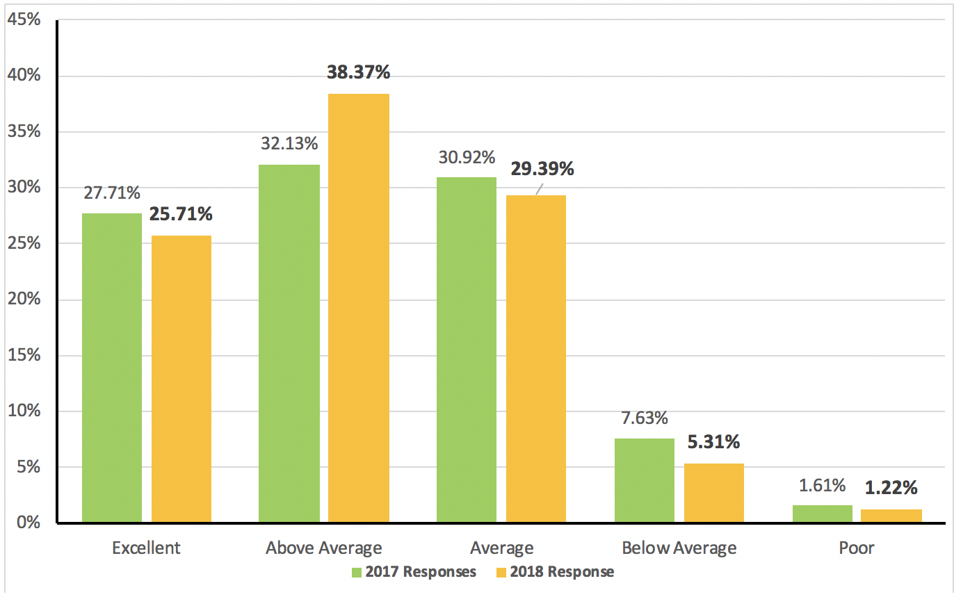
In my role, I have created several surveys linked to organizational strategic plans and priorities. These surveys were administered on more than one occasion to compare statistical differences. This information gives key leaders and stakeholders the ability to see areas for growth and opportunity. Since the data are compiled by the survey tool used, I took time to “jazz up” the reports to make the data more eye-catching. Some of the modifications are shown in the example below: I increased the thickness of both axes, and bolded the current year data and used contrasting colors to make current year data stand out.
After determining if the report readers are going to be executive-level, staff-level, or board members, appropriate versions of the final reports can be produced. For reports that will be disseminated to a large group of stakeholders and shared more broadly, perhaps even publically on a website, I place a greater emphasis on jazzing up the look of the report. I spend quite a bit of time in determining the type of footer, header, title, and section headers I want to use.
Additionally, I consider the organization’s branding and logo placement when presenting findings. Jazzing up evaluation reports requires extra time and effort, but the result is that your work presents findings that are relatable, understandable, visually pleasing, and more likely to make a lasting impact!
The American Evaluation Association is celebrating Southeast Evaluation Association (SEA) Affiliate Week with our colleagues in the SEA Affiliate. The contributions all this week to aea365 come from SEA Affiliate members. Do you have questions, concerns, kudos, or content to extend this aea365 contribution? Please add them in the comments section for this post on the aea365 webpage so that we may enrich our community of practice. Would you like to submit an aea365 Tip? Please send a note of interest to aea365@eval.org. aea365 is sponsored by the American Evaluation Association and provides a Tip-a-Day by and for evaluators.


Hi Rhonda,
I really appreciated this article on Jazzing up reports. As evaluators, there is a lot of time put into the planning, data collection and analysis and sometimes once the end is reached, we can rush to report the themes and findings. It is important that we give the deserved amount of time to reporting as it is, in theory, the most crucial step. It is important that the findings are presented in a way that is eyecatching and engaging to the audience so that they get the most out of the report. By engaging the audience more effectively, there is an increased likelihood that the findings will be implemented. Thanks for sharing!
I’m so sorry that my comment wasn’t clear. I wasn’t intending to criticise the writing in this specific report, I merely wanted to make a general comment about something to look out for. No offence was intended.
Hello Rhonda and thank you for this excellent post. I couldn’t agree more that report writers need to make the effort to ensure their reports are visually appealing. As you know, our first impressions about a document can influence our decision about whether to read the report straight away, or simply shelve it thinking “I’ll read that later. Sometimes later never arrives.
One thing I do find frustrating is when report writers spend a lot of time “jazzing up” their report but neglect to review the actual content. The report looks good but is written in incomprehensible jargon with large doses of passive voice and long run on sentences.
Ideally the report should look inviting and the writing should be clear and direct. I’m sure your reports are like that!
“The report looks good but is written in incomprehensible jargon with large doses of passive voice and long run on sentences” — ouch. Let’s not beat up too much on the report’s author. This was written by a very busy, very overwhelmed professor with dozens of reports on his plate. He did his best under challenging circumstances, and he’s trying to improve the writing and the visuals even more going forwards.