Hi! We are Sara Vaca (EvalQuality.com) and Pablo Vidueira (professor at the Universidad Politécnica de Madrid). Today we are going to talk about the benefits of using the latest advances in data visualization to improve ST tools.
Systems Thinking (ST) is the new paradigm in Evaluation which represents a significant mind-set shift and a powerful tool to tackle complex environments. It refers to the adoption of concepts, methodologies and tools coming from the systems field.
Lesson Learned: ST already use data visualization
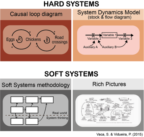
Among the wealth of tools, concepts and approaches within the systems field there are hard and soft systems approaches. Among soft systems, rich pictures and the soft systems methodology are widely used. In the hard systems side, system dynamics (SD) is one of the most famous systems approaches.
And all these tools already use data visualization: they depict ideas, relationships and concepts relying in shapes and figures more than a textual explanation.
Rad Resource: Knowing how graphical perception works
For many years vision researchers have been investigating how the human visual system analyses images. An important initial result was the discovery of a limited set of visual properties that are detected very rapidly and accurately by the low-level visual system.
An important discovery of early studies investigating how the human visual system analyzes images was the identification of a limited set of visual features that are detected very rapidly by low-level, fast-acting visual processes. These properties were initially called preattentive, since their detection seemed to precede focused attention, occurring within the brief period of a single fixation. Attention plays a critical role in what we see, even at this early stage of vision. The most relevant pre-attentive visual features are: orientation, length, width, closure, size, curvature, density, contrast, number, estimation and color.
Cool Trick: Using graphical perception principles to improve the ST tools 

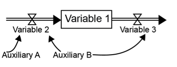
We are studying ST tools conventions of symbols and are working on variations to broaden its variety using simple features. For example: in the typical standard scheme for a Stock and Flow diagram, we are playing with the width of the arrows to represent the relevance of each variable. Thicker arrows (flow variable 2 and auxiliary A) would indicate bigger influence than thinner arrows (flow variable 3 and auxiliary B)
Another example would be replacing +/- symbols in causal loop diagrams by colors (green=positive, red=negative), to make the causal relationships between variables easier to interpret.
We think these improvements would make these tools more informative for those using them and more attractive for those new to them.
We welcome your reactions and hope to share an upcoming paper on this topic with you in Chicago!

The American Evaluation Association is celebrating Research on Evaluation (ROE) Topical Interest Group Week. The contributions all this week to aea365 come from our ROE TIG members. Do you have questions, concerns, kudos, or content to extend this aea365 contribution? Please add them in the comments section for this post on the aea365 webpage so that we may enrich our community of practice. Would you like to submit an aea365 Tip? Please send a note of interest to aea365@eval.org. aea365 is sponsored by the American Evaluation Association and provides a Tip-a-Day by and for evaluators.
