Hey all, I’m Stephanie Evergreen and I run AEA’s Potent Presentations Initiative and eLearning Initiatives. In a marriage of those two programs, we launched a new project called the Fab Five Reboot. I took five slides each from five of our best eStudy webinar presenters and revised them to better connect the content to a viewer’s mind. Each month I’ll share one presenter’s revised slides. Today let’s catch up with David Fetterman.
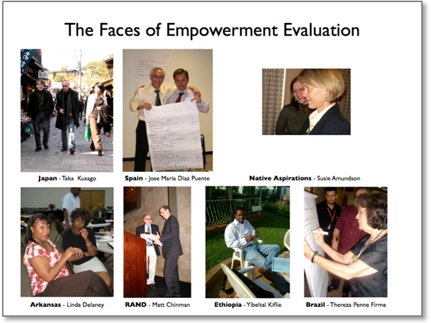
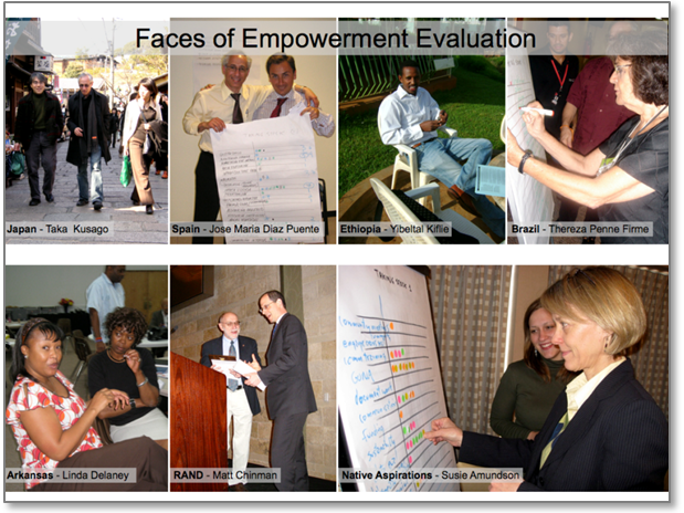
Lessons Learned: David Fetterman’s slides are naturally full of graphics. He’s a visual presenter who uses his slides as the backdrop to his dynamic delivery. My goal here was to standardize the use of the graphics and align everything better so it felt less chaotic and more crisp.

BEFORE

Hot Tips: In this slide, I standardized the size of each graphic. I expanded them to span the slide. Together these two actions make the slide feel more organized. I put the text on top of the picture – usually a tricky move – and made the fill color of the textbox a gray with 56% opacity so that some of the picture still shows through but the gray gives enough of a background to make the text legible.


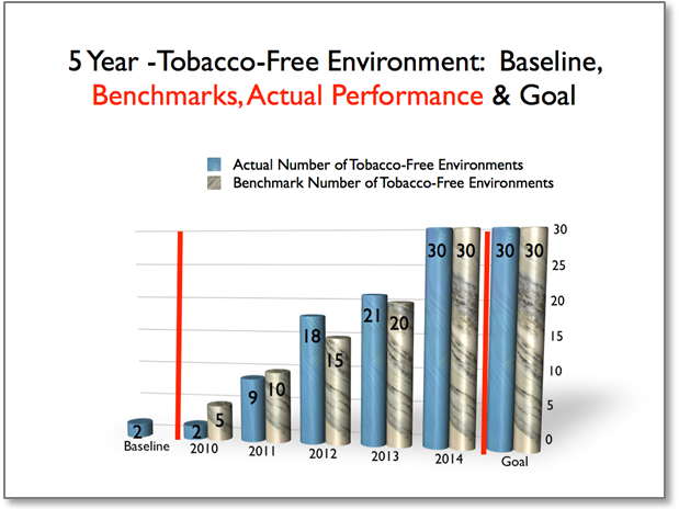
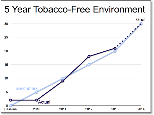
I also totally overhauled David’s graph. 3D is misleading so I switched to a 2D graph. Texture-based fills for the bars are also a distracting decoration, so I moved to solid colors. Since this is change over time, I switched to a line graph. I removed the legend and the second part of the title and replaced all that with simple labels. I also deleted the columns representing the goal, since those aren’t actual time points that were measured. I inserted a dotted line between 2013 and 2014 to show that it is a projection. Finally, I animated the graph so that the data points appear in a logical way, one line segment at a time, that matches David’s explanation of the data. In reaction to this revision, David said, “Your graph works nicely – once you get the hang of it because you can show folks how to measure or compare actual performance with benchmarks and goals.” He also liked the advantage of the bar chart, though, in that it can better visually show quantity. I made a bar chart version for his use as well, still animating each bar to appear one at a time.
Rad Resources: Read about all 5 revised slides on the Potent Presentations Initiative site and don’t miss David’s Empowerment Evaluation workshop at the annual conference.
Today’s post is first in a five part series sponsored AEA’s Potent Presentations Initiative (p2i). We’ll have one per month. Do you have questions, concerns, kudos, or content to extend this aea365 contribution? Please add them in the comments section for this post on the aea365 webpage so that we may enrich our community of practice. Would you like to submit an aea365 Tip? Please send a note of interest to aea365@eval.org. aea365 is sponsored by the American Evaluation Association and provides a Tip-a-Day by and for evaluators.

It was a pleasure working with Stephanie
Her ideas are on target, imaginative, and effective
Many thanks Stephanie
-David
Excellent post, Stephanie!