Greetings! I’m Nichole Stewart, a doctoral student in UMBC’s Public Policy program in the evaluation and analytical methods track. I currently work as an analyst, data manager, and evaluator across a few different sites including Baltimore Integration Partnership, Baltimore Workforce Funders Collaborative, and Carson Research Consulting Inc.
Lessons Learned: The Growing Role of Data Science for the “Little” Data in Program Evaluation. Evaluators are increasingly engaged in data science along every step of the evaluation cycle. Collecting participant-level data and developing indicators to measure program outputs and outcomes is now only a small part of the puzzle. Evaluators are working with more complex data sources (administrative data), navigating and querying data management systems (ETO), exploring advanced analytic methods (propensity score matching), and using technology to visualize evaluation findings (R, Tableau).
Evaluators Also Use Big Data. Large secondary datasets are appropriate in needs assessments and for measuring population-level outcomes. Community-level data, or data available for small levels of geography, provide context and can be used to derive neighborhood indicators. Evaluators must be able to not only access and manipulate this and other kinds of Big Data but to ultimately learn to use data science to maximize the value of the data.
Rad Resource: The American Community Survey (ACS) is an especially rich, although recently controversial, Big Data resource for evaluators. The survey offers a wide range of data elements for areas as small as the census block and as specific as the percent of carpoolers working in service occupations in a census tract.
Hot Tips:
- View the latest technical document for the ACS 5-Year estimates for a list of available data elements (p. 43).
- Visit the National Historical Geographic Information System to download Census and ACS data as well as GIS boundary files for mapping.
Rad Resource: The Census Bureau’s OnTheMap application is an interactive web-based tool that provides counts of jobs and workers and information about commuting patterns that I explored in an AEA Coffee Break webinar.
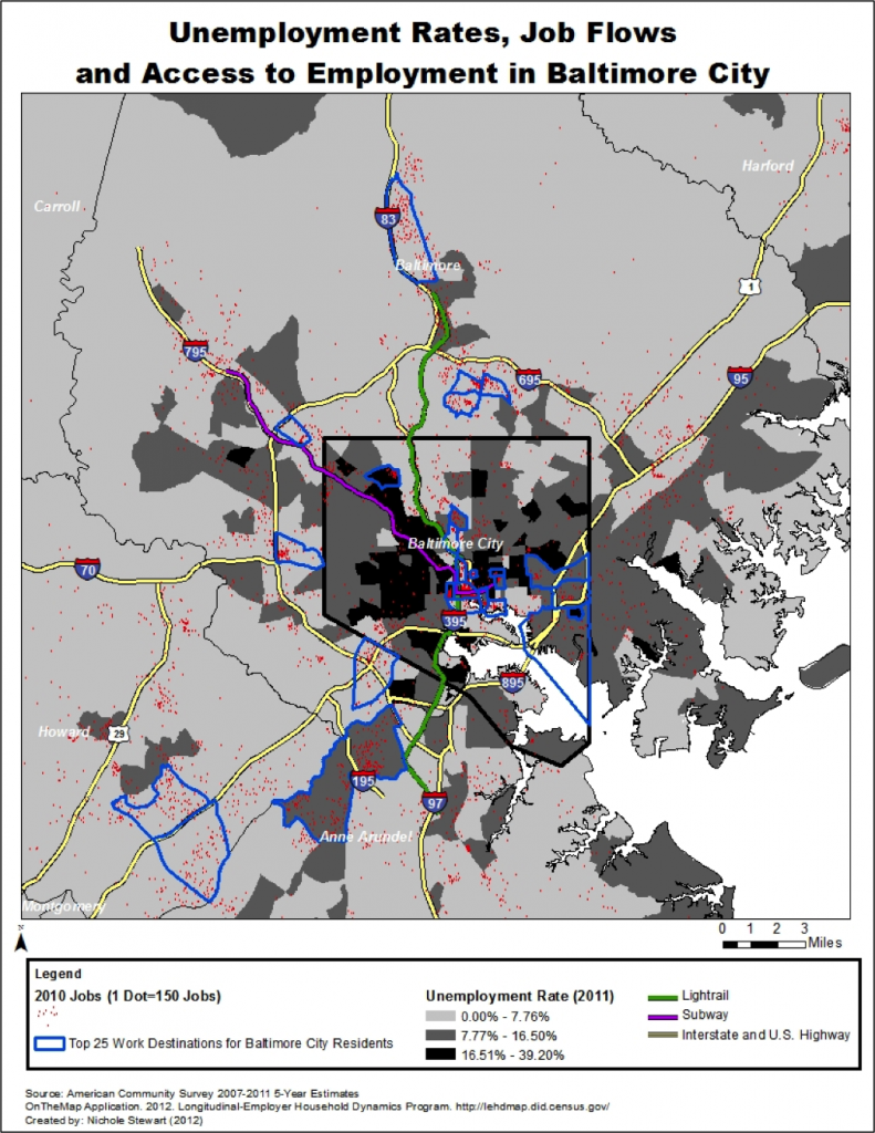
Lessons Learned: Data Science is Storytelling: Below is a map of unemployment rates by census tract from the ACS for Baltimore City and surrounding counties. This unemployment data is overlaid with data extracted from OntheMap depicting job density and the top 25 work destinations for Baltimore City residents. The map shows that 1) there are high concentrations of unemployed residents in inner-city Baltimore compared to other areas, 2) jobs in the region are concentrated in Downtown Baltimore and along public transportation lines and the beltway, and 3) many Baltimore City workers commute to areas in the surrounding counties for work. Alone, these two datasets are robust but their power lies in visualizing data and interpreting relevant intersections between them.
Do you have questions, concerns, kudos, or content to extend this aea365 contribution? Please add them in the comments section for this post on the aea365 webpage so that we may enrich our community of practice. Would you like to submit an aea365 Tip? Please send a note of interest to aea365@eval.org . aea365 is sponsored by the American Evaluation Association and provides a Tip-a-Day by and for evaluators.


data.gov is also a good source of official statistics. However, big data is not always externally generated. Sometimes projects organically produce rich data. For example, call logs, budget reports, traffic patterns, immunization records. However, non-probability source of data are suspetible to undercoverage.