Good Day! We are Linda Scheu and Angela Baldasare, evaluation and assessment professionals working in higher education, at the University of Arizona.
One of the things we have learned in our combined 20 years of experience in evaluation/assessment work is in the evaluation process planning, collecting, and analyzing the data are almost equally paramount. However, it is the data presentation that will ultimately initiate how data and resulting information are used.
This includes:
- Choosing the right method for sharing information: handout, report, slide presentation, etc.
- Setting up slides or report pages with good design principles
- Presenting charts/tables/graphs that are easy to read
Lesson Learned: Know what needs to be done with the information by end users.
Hot Tip: Slide shows are great to disseminate information, but paper reports are better for facilitating discussions.
Lesson Learned: Once the report/document is out of your hands, make it easy to share information. The report will go further if it is easy on the eyes and the results easily interpreted.
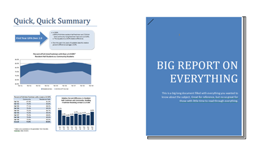
Hot Tip: Make an executive summary and make it modular so it can be extracted and presented on its own to stakeholders who do not have time to read big reports. Which would you read if you had 3 minutes? Which would you share?
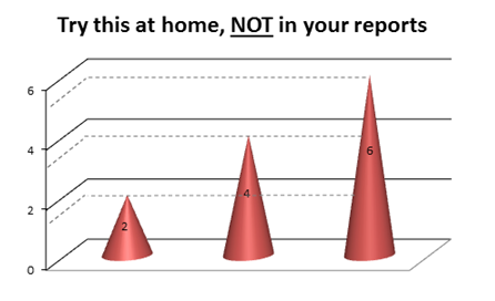
Lesson Learned: The human brain has the built-in fundamental ability to recognize shapes, lines, contours. Take advantage of this, but don’t overdo it! Make note that 3-D graphs can be misleading.
Hot Tip: Clean up your charts and graphs
The more in a chart, the more the reader must interpret. Remove all that is un-necessary. Ask yourself: Are all those gridlines necessary? Do I need to include the data labels? Do the labels help the reader? Are the labels better off in a table?
Hot Tip: Take great care when using or interpreting 3-D charts. One thing the human brain has difficulty with is interpreting area, it is much better at interpreting height.
Lesson Learned: Be consistent and make it easy for a reader to understand the organization of information
 Hot Tip: Like Symbols. Use symbols. Symbols help communicate complex ideas.
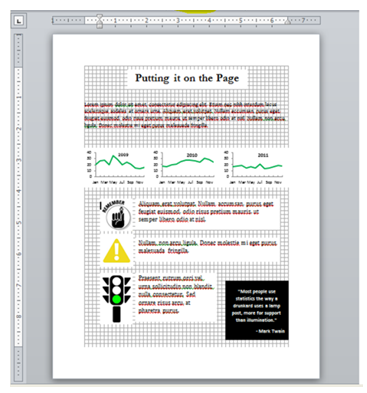
Hot Tip: Align, Align, Align your charts, symbols, text boxes etc.
Not only does it help with comparison across charts, it helps with aesthetics. MS Word has a gridlines option under the “View” tab to help you align your visuals.
Rad Resource: We created a quick handout for our presentation at the 2012 AEA Annual Conference with a few more tips for increasing report and presentation impact. Also check out the previous posts on the AEA365 blog! Download it from the AEA Public eLibrary.
Do you have questions, concerns, kudos, or content to extend this aea365 contribution? Please add them in the comments section for this post on the aea365 webpage so that we may enrich our community of practice. Would you like to submit an aea365 Tip? Please send a note of interest to aea365@eval.org. aea365 is sponsored by the American Evaluation Association and provides a Tip-a-Day by and for evaluators.


Linda and Angela:
Thank you for sharing the grid lines feature in MS Word. I will have to use it the next time I’m displaying figures side by side. This will save me a lot of anxiety!
On a separate note: I often struggle with axis labels. I came from a psychobiology background and throughout my entire undergraduate career, I was told to add them. However, with the trend towards the “less is more” (an Edward Tufte rule), I have had to change the way my data is presented. Though I can certainly see the difference that it makes, not all data scientists are created equal. If a client comes from the field of chemistry, they will insist on adding axis labels. I suppose the moral of the story is: know your audience.
Dear Linda and Angela, this is really helpful for everybody. Thank you!
We have translated your tips into Spanish and shared it with my Latin American networks. The Spanish version is as follows:
Lecciones aprendidas y consejos para hacer presentaciones de impacto:
1. La presentación de los datos es lo que finalmente incide en su utilización. Esto incluye:
–La elección del método adecuado para el intercambio de información: folleto, informe, presentación de diapositivas, etc.
–La configuración de diapositivas o páginas del informe con los principios de un buen diseño
–La presentación de gráficos / cuadros que sean fáciles de leer
2. Que quienes usen la información finalmente sepan qué hacer con ella: Las presentaciones de diapositivas son excelentes para difundir información, pero los informes en papel son mejores para facilitar los debates.
3. Permita que la información sea fácil de compartir cuando el informe / documento salga de sus manos: El informe se difundirá más si es agradable a la vista y los resultados son fáciles de interpretar.
–Haga un resumen ejecutivo modular para que pueda ser extraído y presentado por partes a quienes no tienen tiempo para leer informes grandes. ¿Qué leería usted si sólo tuviera 3 minutos? ¿Qué compartiría?
4. El cerebro humano tiene la capacidad fundamental de reconocer las formas, líneas y curvas. Tome ventaja de esto, pero no exagere!
Tome nota que los gráficos en 3-D pueden ser engañosos.
–Limpie sus cuadros y gráficos: Cuanto más se presente en un gráfico, más deberá interpretar quien lo lee. Quite todo lo innecesario.
Pregúntese: ¿Se necesitan todas estas líneas de la cuadrícula? ¿Es necesario incluir los rótulos de los datos? ¿Estos rótulos ayudan al lector? ¿Sería mejor quitarlos del cuadro?
5. Sea consistente y facilite al lector comprender la organización de la información
–Use símbolos. Ellos ayudan a comunicar ideas complejas.
–Alinear, Alinear, Alinear los gráficos, símbolos, cuadros de texto, etc. Esto no sólo ayuda con la comparación entre gráficos, sino también con la estética. MS Word tiene una opción en la pestaña “Ver” para ayudarle a alinear sus imágenes.
Linda and Angela, I attended your excellent session at AEA12. It was well-presented, informative, and enjoyable as was evidenced when people rushed the stage when you offered handouts and business cards! I especially love the graphics – “Quick, quick summary” and “Big report on everything.” Your examples really drive the points home. Thanks so much for sharing on aea365!