Happy Saturday readers! I’m Liz Zadnik, aea365 Outreach Coordinator and Saturday contributor with some tips on using images in blog posts. Breaking up paragraphs with high-quality stock images, graphics, and/or visualizations help readers stay on your site, digest information, and motivate them to share your brilliance with the world.
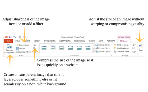
Cool Trip: Get to know your computer’s already-installed image editor. Did you know PowerPoint (or Keynote for Mac users) has image-editing capabilities? You can remove backgrounds, crop, recolor, and create an image that’s perfect for your needs and branding. You can edit or create an image in the application and then “Save as a Picture” to your desktop for later use. Just make sure the image is one that can be edited and shared. We’ll cover that in a second.

You don’t need Photoshop to create beautiful images that will be engaging and look professional. Try not to be intimidated by “photo editing” and exercise those creative muscles!
Hot Tips: Selecting an image may seem easy enough, but there are a number of things to keep in mind:
- Check out the quality of the image. You may have seen the letters “dpi” accompany an image – this means dots (or pixels) per inch and gives you a sense of how crisp an image is. For example, something that is five inches wide and 1000 pixels high would have 200dpi. The higher the resolution, the more likely you are to be able to zoom in or crop without losing that “crispness.”
- Find candid and casual shots of people. Move away from traditional stock photography to an image where the reader can imagine they’re a part of things.
- Make sure the image size fits with your webpage columns. If you have a blog, check to see you how wide your main content column is – this will help you in avoiding images slipping over into your sidebar or messing with text. It’s also important to make sure the image is aligned in such a way that text isn’t broken up along the side.
- Avoid images with watermarks. First off, these are copyrighted or protected images for subscribers to stock photography sites and providers. I understand that Creative Commons licensing can get confusing, but we need to respect our creator colleagues. Secondly, it also doesn’t look very professional.

Lesson Learned: Something I’ve been trying to work on is making sure images are accessible using alternative text (“alttext”). This includes crafting thoughtful and brief descriptions of images for folks using screen readers and other navigation devices, as well as when images cannot load on a specific page. Visitors don’t lose the essence of your post just because they can’t access the visual content.
Do you have questions, concerns, kudos, or content to extend this aea365 contribution? Please add them in the comments section for this post on the aea365 webpage so that we may enrich our community of practice. Would you like to submit an aea365 Tip? Please send a note of interest to aea365@eval.org . aea365 is sponsored by the American Evaluation Association and provides a Tip-a-Day by and for evaluators.
