Hi, I’m Elissa Schloesser founder and principal graphic designer at Visual Voice. I specialize in helping organizations visually communicate complex information, concepts and ideas—including evaluation methods, theories and findings.
Rad Resource: Data Stories is a podcast that covers topics on data visualization. I highly recommend it to anyone interested in the field. A recent episode, titled Disinformation Visualization explores the “darker side” of data visualization.
I found this discussion particularly thought provoking and relevant to anyone communicating data. It challenges you to think critically about the data visualizations you create and consume.
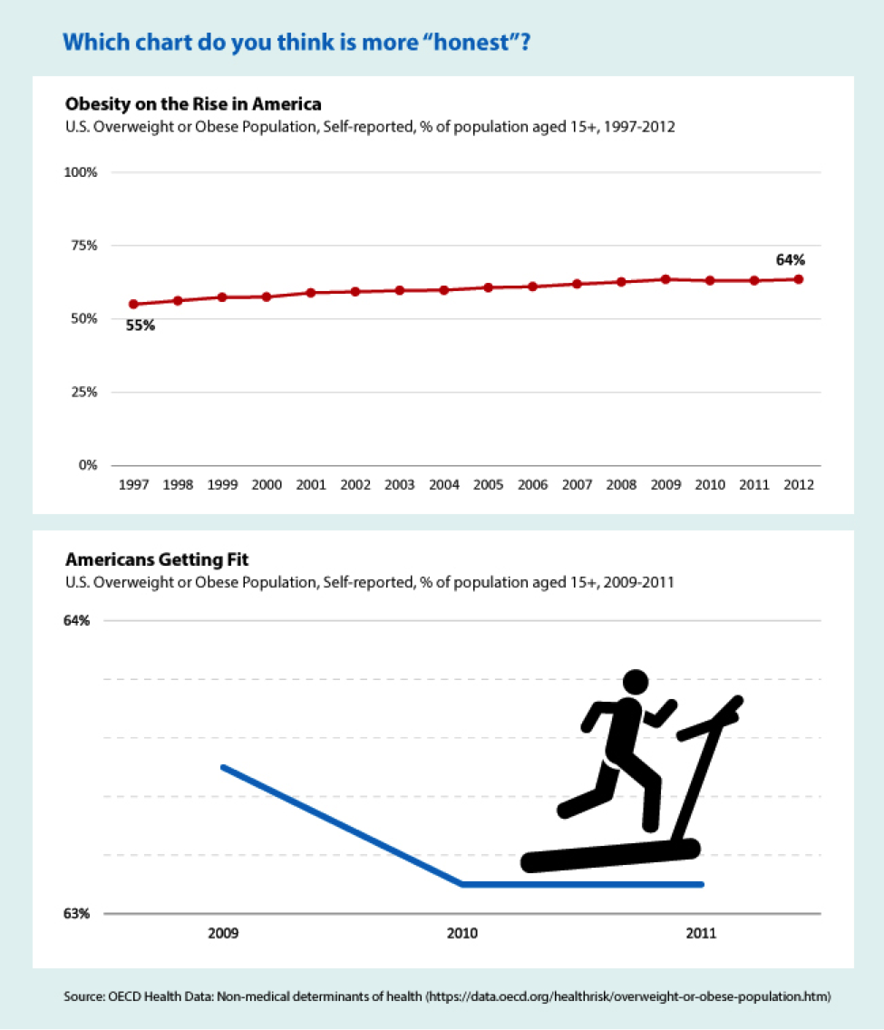
Hot Tip: Can you spot a misinformed chart? Below is an example of two charts created from the same dataset.
This example is a little extreme, but I included it to show how data could be manipulated in visualizations.
Both are technically correct, but they strive to tell a different story based on how the data is represented.
Hot Tip: Spot misinformed data visualizations by considering these three things:
- CONTENT: How was the data was gathered?
- Before the data is even visualized consider how it was collected.
- STRUCTURE: How was the data structured or sampled?
- Does the visualization only represent certain years or a particular age group?
- PRESENTATION: How was the data presented?
- Does iconography, colors, annotations, etc. used influence your perception of the data?
Lessons Learned: Think of data visualizations as “visual arguments” rather than “visual evidence”.
Do you have questions, concerns, kudos, or content to extend this aea365 contribution? Please add them in the comments section for this post on the aea365 webpage so that we may enrich our community of practice. Would you like to submit an aea365 Tip? Please send a note of interest to aea365@eval.org . aea365 is sponsored by the American Evaluation Association and provides a Tip-a-Day by and for evaluators.


I think there should be a fourth point added to your list:
INTERPRETATION: How is the data interpreted by the designer?
In the second graph, the visualization is pretty clear: it’s someone exercising. There is no way to assume this from a two-year 1% drop in obesity rates.
This aspect certainly coincides with the structure and may actually be the same as the presentation issue, but the fact that the author/designer is making that assumption for you, it’s very influential for the audience.
Great post!!!
Great bit of advice and Ioved the example you provided.
Yep, you can lie with visuals or statistics. With statistics, you’d just talk about the absolute or percentage change from one year to next, without the other years for context. I think this is good to point out, but I don’t agree with labelling visual evidence as “visual arguments”, if that is to mean that this is on a lower plane than “evidence”. Evidence presented visually is easier to see than numbers in a table. Evidence presented as the result of a statistical test is “harder” evidence. Different uses, different advantages. Moreover, visual evidence can lead you to test relationships statistically, once you see that they may be there.