Greetings, I’m Ann K. Emery. I consult, instruct, and write on all things data visualization. One of the most common questions I receive during workshops and webinars is, “Ann, where do I start?”
Cool Tricks: As you’re overhauling your visualizations, these three edits are guaranteed to give you the biggest bang for your buck.
Remove unnecessary ink.
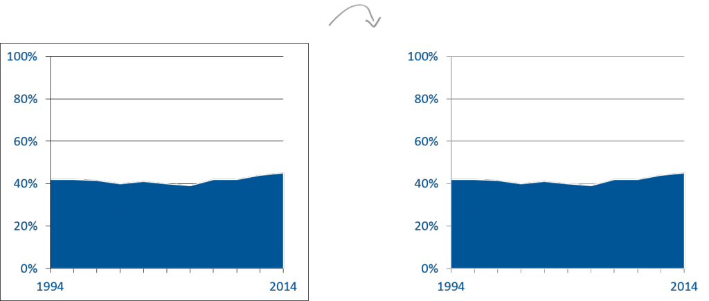
I immediately begin deleting or lightening everything without a purpose: the border, the grid lines, and the tick marks. Visualization guru Edward Tufte calls this strategy the data:ink ratio; we’re intentionally removing any ink that isn’t directly related to the data itself. These edits ensure our viewers will focus attention where we need it: on the actual patterns, not on the software program’s outdated and clunky lines.
Read Muted Grid Lines: Small Details, Big Difference to explore before/after remakes in more detail and watch Removing Tick Marks and Grid Lines for a how-to lesson in Excel.
Customize your color palette.
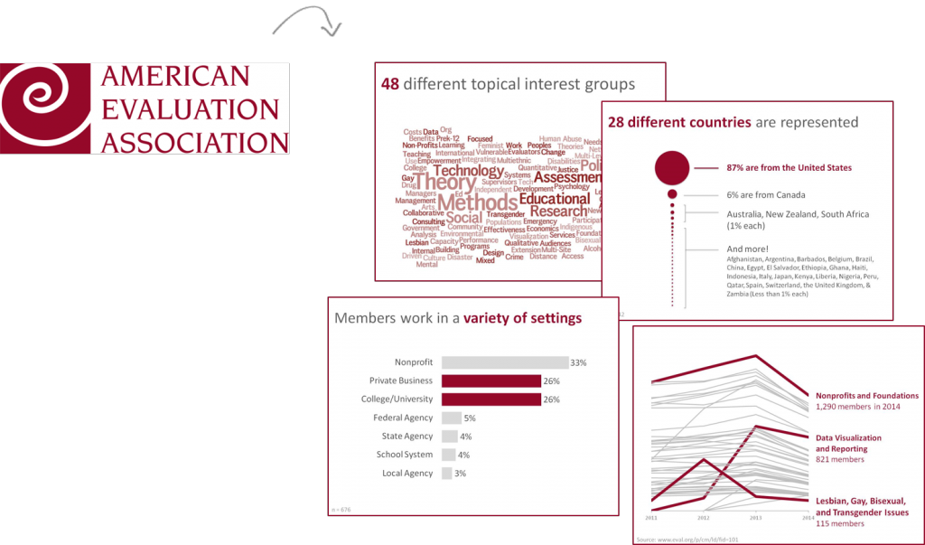
Next, I swap my software program’s random color scheme for a customized palette.
- As a consultant, I’m typically following my client’s branding. I scroll through the organization’s website, look at their logo, and skim publicly-available reports that were created with the aid of a graphic designer.
- In my former role as an internal evaluator, I would match my chart colors to my organization’s own logo and branding.
- When I create graphs through my role with AEA’s Data Visualization and Reporting Topical Interest Group, I match AEA’s exact shade of burgundy—RGB code 149:8:4—rather than sloppily choosing any old shade of red.
Editing color codes is simple. Newer versions of Excel on both PCs and Macs have built-in eyedropper tools. If you’re using an older version of Excel, follow the Uganda Evaluation Capacity Development Project’s step-by-step instructions for using a free tool called Instant Eyedropper.
Write a descriptive title and subtitle.
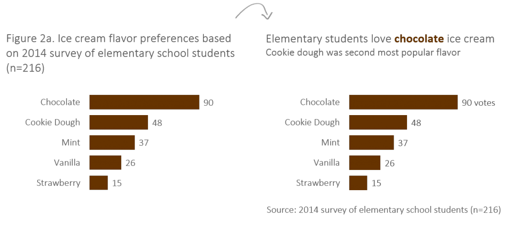
Today’s viewers want and deserve brevity, everyday language, and text that describes something about the actual finding—so that even the quickest report-skimmers will walk away having digested and retained the report’s contents. Bonus points: Select an important word or two from the title and make that word stand out (“chocolate” is in bold text and matches the graph’s dark brown color scheme). Then, add a one- or two-sentence subtitle (“Cookie dough was second most popular flavor”).
Rad Resource: Want to master these skills and more? I’m leading a pre-conference workshop at the Eastern Evaluation Research Society’s conference in April 2015. Bring your laptop so we can build these charts and more from scratch. See you there!
The American Evaluation Association is celebrating Eastern Evaluation Research Society (EERS) Affiliate Week. The contributions all this week to aea365 come from EERS members. Do you have questions, concerns, kudos, or content to extend this aea365 contribution? Please add them in the comments section for this post on the aea365 webpage so that we may enrich our community of practice. Would you like to submit an aea365 Tip? Please send a note of interest to aea365@eval.org. aea365 is sponsored by the American Evaluation Association and provides a Tip-a-Day by and for evaluators.


Hi Ann –
Love the checklist; very helpful. Would you be willing to share it as a PDF? I can/have enlarged the .png you shared, but it gets a bit fuzzy when I enlarged it myself. Anything to help my “old” eyes would be greatly appreciated! 😀
Kirsten
Hi Barry,
Thanks for raising this issue. Is the problem that this particular summary title is not a valid summary – or that summary titles are a bad idea? A better title might be “Chocolate was the most popular icecream flavor”. This doesn’t specifically refer to the diversity of other choices which would need to come from visual inspection by the reader, as they would if the title was in the standard format.
Or are you arguing that our reports should not aim to present a clear narrative through titles, along with enough data for readers to disagree with, or elaborate on, this narrative?
The example here of the chocolate ice cream chart heading is very misleading, and illustrates the danger of style trumping substance. The new suggested heading states that “Elementary students love chocolate ice cream.” It is true that 90 students prefer chocolate, but 126 do not! The generalization suggested by the heading is incorrect, since some students loved any of the any flavors. By omitting something about a plurality of students (which is all that could be said accurately about chocolate), the heading is powerful but wrong. In addition, if we want our reporting to be unbiased, it is safer to provide the purely descriptive heading in the other figure, and let the reader or the ensuing text draw conclusions. I am somewhat mystified how this sort of example made its way into an AEA tip.